Introducing v5 with Material You
React Native Paper v5 is all about adopting the new Material Design 3 aka Material You. It was released in October 2021 after intense work and effort to make Material You follow a more expressive approach to design.
Paper now supports both Material Design 2 and 3 through the configuration described in Versioning and is compatible with a handful of API changes.
Migration guide to Material You 5.0
Version 5.0 brings support for the next Material Design iteration branded as Material You (in fact being Material Design v3 or in short MD3) into the react-native-paper library. All the components were refined according to the official design kit on figma and adjusted in terms of visuals by changes in colors, typography and animations.
Below you can find the most important information about the components whose API may have changed API has been changed due to supporting new props, renaming existing ones or some deprecations. Hopefully, based on the presented required changes, migration to the latest version should be smooth. Enjoy!
Installation
- The
v5has been oficially released as a stable version, which means it will be installed by default from thenpm. In order to do that, open a Terminal in your project's folder and run:
- npm
- Yarn
npm install react-native-paper
yarn add react-native-paper
- From
v5there is a need to install react-native-safe-area-context for handling safe area.
- npm
- Yarn
npm install react-native-safe-area-context
yarn add react-native-safe-area-context
Additionaly for iOS platform there is a requirement to link the native parts of the library:
npx pod-install
Theming
Versioning
Introducing Material You (MD3) into react-native-paper doesn't mean dropping previous Material Design (MD2)! On the contrary, both of them will be supported, however, not simultaneously. To specify which design system components should follow in the app, there is a newly created property in the theme called version which can accept only one of two values:
- 3 – (default) new Material You (MD3),
- 2 - previous Material Design (MD2).
theme: {
  /* ... */
  version: 3 | 2
}
Read more about using Material Design 2 in our Material Design 2 theming guide
Colors
New theme introduces a new color palette along with new namings reflecting design color tokens, but written in camel case. Palette contains a set of five key colors, where primary, secondary and tertiary are classified into accent colors. The second group of colors is neutral and neutral variant colors used for defining surface or background roles as well as specifying high and medium emphasis text and icons. Additionally, the color system includes a semantic color role for error.
Each accent and error colors has a group of related tones. The tones are mapped to roles that create contrast and visual interest when applied to elements in the UI.
Dynamic colors are not supported yet
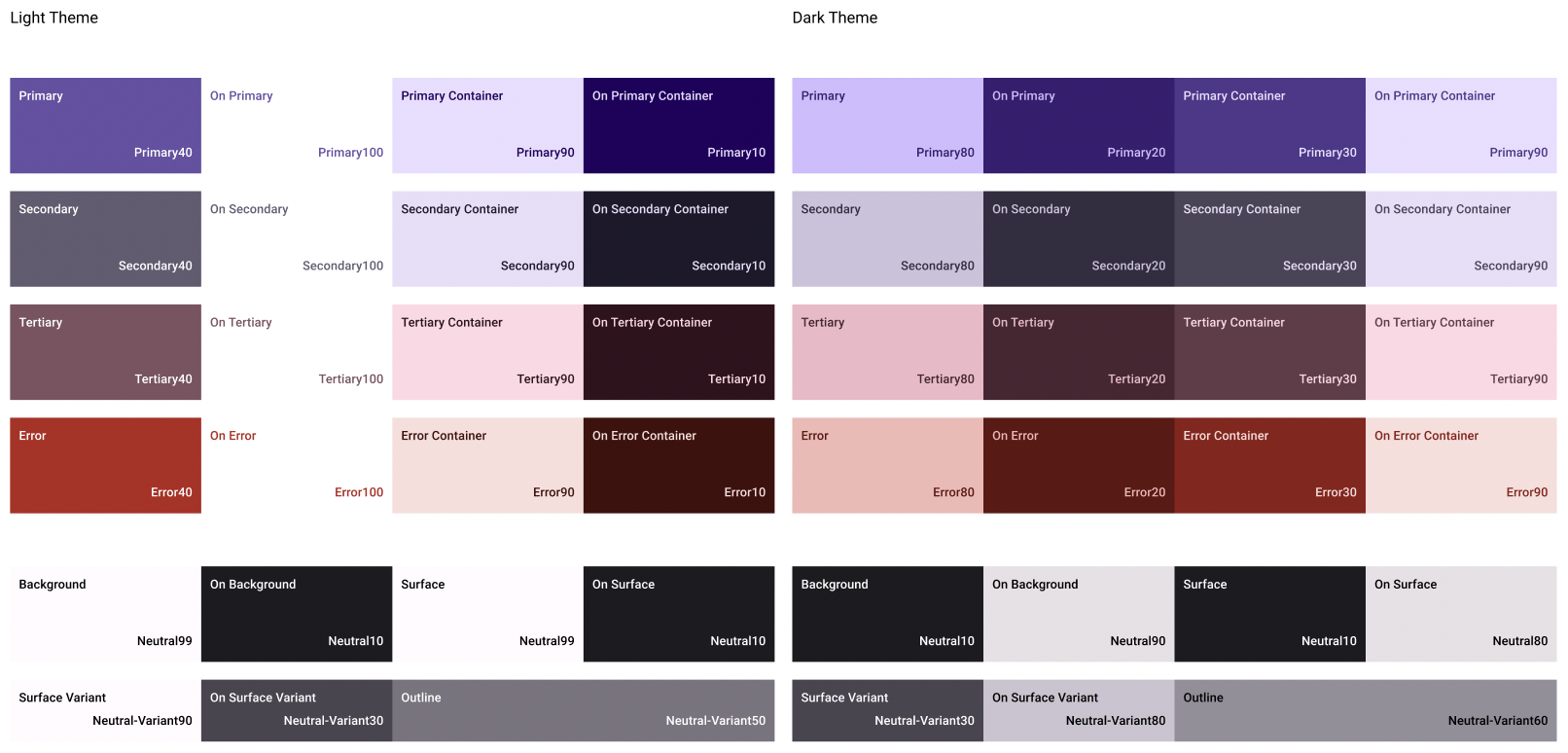
Colors theme structure should follow the default palette and contain the following properties:
theme: {
  /* ... */
  colors: {
    primary,
    primaryContainer,
    secondary,
    secondaryContainer,
    tertiary,
    tertiaryContainer,
    surface,
    surfaceVariant,
    surfaceDisabled,
    background,
    error,
    errorContainer,
    onPrimary,
    onPrimaryContainer,
    onSecondary,
    onSecondaryContainer,
    onTertiary,
    onTertiaryContainer,
    onSurface,
    onSurfaceVariant,
    onSurfaceDisabled,
    onError,
    onErrorContainer,
    onBackground,
    outline,
    shadow,
    inverseOnSurface,
    inverseSurface,
    inversePrimary,
    backdrop,
    elevation: {
      level0,
      level1,
      level2,
      level3,
      level4,
      level5
    }
  }
}
👉 You can find more about color on the Material You website
Typography
A new way of approaching typography introduces one component <Text> which accepts prop variant. Variant defines appropriate text styles for type role and its size. The updated type scale organizes styles into five roles that are named to describe their purposes: Display, Headline, Title, Label and Body along with three display styles large, medium, and small. In total, there are fifteen variants that are MD3 compliant and are reflecting design typography tokens written in camel case.
If any component uses Paper's Text component, without specified variant, then default variant is applied.
<Text variant="displayLarge">Display Large</Text>
<Text variant="displayMedium">Display Medium</Text>
<Text variant="displaySmall">Display small</Text>

<Text variant="headlineLarge">Headline Large</Text>
<Text variant="headlineMedium">Headline Medium</Text>
<Text variant="headlineSmall">Headline Small</Text>

<Text variant="titleLarge">Title Large</Text>
<Text variant="titleMedium">Title Medium</Text>
<Text variant="titleSmall">Title Small</Text>

<Text variant="bodyLarge">Body Large</Text>
<Text variant="bodyMedium">Body Medium</Text>
<Text variant="bodySmall">Body Small</Text>

<Text variant="labelLarge">Label Large</Text>
<Text variant="labelMedium">Label Medium</Text>
<Text variant="labelSmall">Label Small</Text>
Take a look at the suggested replacement diff:
- <Headline>Headline</Headline>
+ <Text variant="headlineSmall">Headline</Text>

- <Title>Title</Title>
+ <Text variant="titleLarge">Title</Text>

- <Subheading>Subheading</Subheading>
+ <Text variant="titleMedium">Subheading</Text>

- <Paragraph>Paragraph</Paragraph>
+ <Text variant="bodyMedium">Paragraph</Text>

- <Caption>Caption</Caption>
+ <Text variant="bodySmall">Caption</Text>
👉 You can find more about typography on the Material You website
Configure fonts
The existing utility called configureFonts was adjusted to help users configure their theme fonts in both version, that's why that function, as of today, is going to accept the object with the follwing properties as an argument:
configureFonts(params)
| NAME | TYPE | REQUIRED |
|---|---|---|
| params | object | No |
Valid params keys are:
config(MD2FontsConfig | MD3FontsConfig) - fonts config object appropriate to the MD versionisV3(boolean) - whether adjusting theme fonts for v3. Default it true.
To use your current font config from v2 and migrate to v3 there are two requirements:
- the font config previously passed directly into function has to be passed into the params object property called
config - the params object property
isV3has to be set tofalse
- configureFonts(fontConfig)
+ configureFonts({config: fontConfig, isV3: false})
If you want to check how to use configureFonts on MD3, check the Fonts guide.
Components
Appbar (Top app bar)
Appbar and Appbar.Header in the latest version can be used in four various modes due to new prop mode:
small- Appbar with default height (64) (default),medium- Appbar with medium height (112),large- Appbar with large height (152),center-aligned- Appbar with default height (64) and center-aligned title.
<Appbar mode="center-aligned">
  /* ... */
</Appbar>
To make it easier for users to build the BottomBar, formed on the Appbar components, we have added a property safeAreaInsets:
<Appbar safeAreaInsets={{ bottom: 47 }}>
  /* ... */
</Appbar>
It's worth noting that by default the theme version 3 Appbar and Appbar.Header don't have a shadow. However, it can be added by passing prop elevated into the component:
<Appbar elevated>
  /* ... */
</Appbar>
Appbar.Action
Appbar.Action received new prop isLeading, which defines whether it's the leading button and should be placed at the beginning of the Appbar.
<Appbar.Action isLeading icon="magnify" onPress={() => {}} />
Appbar.Content
New design guidelines indicate there is no subtitle in Appbar.Content, that's why there are two deprecations and the following props won't be supported anymore: subtitle and subtitleStyle.
- <Appbar.Content title="Title" subtitle="Subtitle" styles={styles.subtitle} />
+ <Appbar.Content title="Title" />
Banner, Searchbar and Snackbar
According to the updates in Surface on the top of which Banner, Searchbar and Snackbar are implemented, all three component received elevation prop to adjust its value.
- <Snackbar style={{elevation: 1}}>Hello</Snackbar>
+ <Snackbar elevation={1}>Hello</Snackbar>
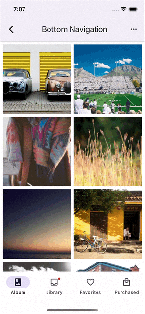
BottomNavigation (Navigation bar)
For the sake of new animation of pill shape, indicating active destination, and assisting icon change from outlined to filled, there are three changes within navigationState.routes property items:
coloris deprecated since color is constant and the same for all routes,iconis renamed tofocusedIcon, as the name implies, with theme version 3 it's the outline icon used as focused tab icon and with theme version 2 it's a default icon,unfocusedIcon(optional) is the filled icon used as the unfocused tab icon, compatible with theme version 3.
unfocusedIcon is optional, if you can't find outline icon equivalent, omit that prop, so focusedIcon will be displayed in both active and inactive state.
routes: [
- { key: "album", title: "Album", icon: "image-album", color: "#3F51B5" },
+ { key: "album", title: "Album", focusedIcon: "image-album" },
- { key: "library", title: "Library", icon: "inbox", color: "#009688" },
+ { key: "library", title: "Library", focusedIcon: "inbox", unfocusedIcon: "inbox-outline" },
- { key: "favorites", title: "Favorites", icon: "heart", color: "#795548" },
+ { key: "favorites", title: "Favorites", focusedIcon: "heart", unfocusedIcon: "heart-outline; },
- { key: "purchased", title: "Purchased", icon: "shopping-cart", color: "#607D8B" },
+ { key: "purchased", title: "Purchased", focusedIcon: "shopping-cart" },
]
The compact prop was also introduced, working with both themes. It indicates whether tabs should be spread across the entire width, especially in a horizontal mode.
<BottomNavigation compact />
It's worth to mention that default value of prop shifting depends on the theme version:
- 3 - it's `false`,
- 2 - it's `true` when there are more than 3 tabs.
Two additional props that control the scene animation were introduced that control the animation of the tabs when sceneAnimationEnabled is true:
sceneAnimationType: "opacity" | "shifting" | undefined- defines the animation type for the scene.shiftingenables a new animation where navigating to a scene will shift it horizontally into view. Bothopacityandundefinedhave the same effect, fading the scene into view.sceneAnimationEasingallows specifying a custom easing function for the scene animation.
On a final note, please be aware that BottomNavigation with theme version 3 doesn't have a shadow.
Button
Button's property mode has been expanded with two additional options:
elevated- button with a background color and elevation, used when absolutely necessary e.g. button requires visual separation from a patterned background,container-tonal- button with a secondary background color, an alternative middle ground between contained and outlined buttons.
<>
  <Button icon="camera" mode="elevated" onPress={onPress}>
    Elevated
  </Button>
  <Button icon="camera" mode="container-tonal" onPress={onPress}>
    Container tonal
  </Button>
</>
The property color is deprecated, but in its place two new props called buttonColor and textColor are introduced:
buttonColor- custom button's background color,textColor- custom button's text color.
- <Button mode="text" color="red" onPress={onPress}>Custom text color</Button>
+ <Button mode="text" textColor="red" onPress={onPress}>Custom text color</Button>
- <Button mode="contained" color="red" onPress={onPress}>Custom text color</Button>
+ <Button mode="contained" buttonColor="red" onPress={onPress}>Custom background color</Button>
Please be aware that along with theme version 3, by default text in the Button component isn't uppercased and contained button doesn't have any shadow (use then elevated).
Card
The Card component's property mode has been expanded with one additional option called contained, which applies to the card's specified background color without any elevation and border.
<Card mode="contained" />
Card.Title
Since there is no one right way to make a card, there is also no one right way for specifying a title and subtitle variant. Therefore two new props come in handy:
titleVariant- title text variant defines appropriate text styles for type role and its size.subtitleVariant- subtitle text variant defines appropriate text styles for type role and its size.
<Card.Title
  titleVariant="headlineMedium"
  subtitleVariant="bodyLarge"
/>
Checkbox
Checkbox.Item
Checkbox.Item similarly to RadioButton.Item has been expanded with the prop called labelVariant, which defines appropriate text styles for type role and its size.
<Checkbox.Item
  labelVariant="titleLarge"
>
Chip
To properly compose Chip component and adjust into required type, there are three new props that will come in handy:
compact- sets smaller horizontal paddings around the label, useful forChipcontaining only the label,elevated- indicating whetherChipshould be elevated,showSelectedOverlay- defining whether to display an overlay on a selected button.
<>
  <Chip compact>Compact Chip</Chip>
  <Chip icon="camera" elevated>Elevated Chip</Chip>
  <Chip icon="camera" selected showSelectedOverlay>Chip with selected overlay</Chip>
</>
Dialog
Dialog.Icon
Dialog.Icon is another freshly added component presenting an icon within a Dialog, placed at the top of the content.
It's working only with theme version 3.
<Portal>
  <Dialog visible={visible} onDismiss={hideDialog}>
    <Dialog.Icon icon="alert" />
  </Dialog>
</Portal>
Divider
Divider component received two new props:
bold- divider is bolded,horizontalInset- divider has horizontal insets on both sides.
Additionally prop inset was renamed to leftInset.
- <Divider inset />
+ <Divider leftInset />
Drawer
Drawer.CollapsedItem (Navigation rail)
Drawer.CollapsedItem is a newly created side navigation component that can be used within Drawer, representing a destination in the form of an action item with an icon and optionally label.
It's working only with theme version 3.
<Drawer.Section>
  <Drawer.CollapsedItem
    focusedIcon="inbox"
    unfocusedIcon="inbox-outline"
    label="Inbox"
  />
  <Drawer.CollapsedItem
    focusedIcon="star"
    unfocusedIcon="star-outline"
    label="Starred"
  />
</Drawer.Section>
Drawer.Section
With the latest version, there is a possibility to specify whether Drawer.Section should have a separator, in form of Divider component, displayed at the end of the section. To adjust it, a new property called showDivider was introduced, which by default is true:
<Drawer.Section showDivider={false}>
  <Drawer.CollapsedItem
    focusedIcon="inbox"
    unfocusedIcon="inbox-outline"
    label="Inbox"
  />
  <Drawer.CollapsedItem
    focusedIcon="star"
    unfocusedIcon="star-outline"
    label="Starred"
  />
</Drawer.Section>
FAB
FAB, AnimatedFAB and FAB.Group in the latest version can be used with four variants and two modes, thanks to two new props:
variantdefines color mappings variant for combinations of container and icon colors. Can be one of: primary (default), secondary, tertiary or surface.
<FAB variant="tertiary" />
modespecifies whether a button should be flat or elevated:flat- button without a shadow,elevated- button with a shadow.
<FAB mode="flat" />
FAB
Additionaly FAB may be applied in one of three available sizes, thanks to new prop size:
small- FAB with small height (40),medium- Appbar with default medium height (56),large- Appbar with large height (96).
<FAB size="large" />
However, if you would like to have your own size of FAB, there is a new prop called customSize:
<FAB customSize={64}>
Accordingly to introducing size="small", prop small was deprecated.
- <FAB small />
+ <FAB size="small" />
FAB.Group
There is also deprecation in one of the actions properties, namely small prop is deprecated and replaced in favour of the default size="small".
- <FAB.Group actions={[{ icon: "plus", small }]} />
+ <FAB.Group actions={[{ icon: "plus" }]} />
Additionally, the action item property previously known as labelStyle was renamed to containerStyle since it's tied mostly with the container styles. At the same time, labelStyle is still available with the new role related to styling item label.
- <FAB.Group actions={[{ icon: "plus", labelStyle: styles.customStyle }]} />
+ <FAB.Group actions={[{ icon: "plus", containerStyle: styles.customStyle, labelStyle: styles.newLabelStyle }]} />
IconButton
IconButton received two new props:
selectedsets alternative combination of icon and container color,
<IconButton selected>
containerColorcustom background color of the icon container.
<IconButton containerColor="red">
At the same time, the color prop was renamed to iconColor.
- <IconButton color="red" />
+ <IconButton iconColor="red" />
Menu
Menu.Item
Menu.Item received two new props:
densesets smaller item height for more condensed layout,trailingIconwhich handles displaying an icon at the end of the item row.
<Menu.Item dense trailingIcon="chevron-up">
At the same time, by analogy to the second new prop, the icon prop was renamed to leadingIcon.
- <Menu.Item icon="redo" onPress={() => {}} title="Redo" />
+ <Menu.Item leadingIcon="redo" onPress={() => {}} title="Redo" />
RadioButton
RadioButton.Item
RadioButton.Item has been expanded with the prop called labelVariant, which defines appropriate text styles for type role and its size.
<RadioButton.Item
  labelVariant="titleLarge"
>
SegmentedButtons
SegmentedButtons is a completely new component introduced in the latest version. It allows people to select options, switch views, or sort elements. It supports single and multiselect select variant and provide a lot
of customization options.
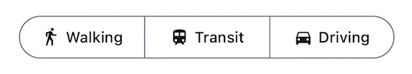
const MyComponent = () => {
  const [value, setValue] = React.useState('');

  return (
      <SegmentedButtons
        value={value}
        onValueChange={setValue}
        buttons={[
          {
            value: 'walk',
            label: 'Walking',
          },
          {
            value: 'train',
            label: 'Transit',
          },
          {
            value: 'drive',
            label: 'Driving',
          },
        ]}
      />
  );
};
Snackbar
Snackbar due to the optional close affordance, in form of IconButton (located on the right side of action button), received three new props:
icon- icon to display whenonIconPressis defined. Default will becloseicon.onIconPress- function to execute on icon button press. The icon button appears only when this prop is specified.iconAccessibilityLabel- accessibility label for the icon button.
Surface
Surface component received one new prop:
elevation- accepts values from0to5and applies background color and shadows to theSurfacecomponent. Supports both iOS and Android.
Previously elevation was passed inside the style prop. Since it supported not only Android, but also iOS, we decided to extract it from style and create a separate elevation prop for that.
- <Surface style={{ elevation: 1 }} />
+ <Surface elevation={1} />
TextInput
TextInput.Icon
The property name was renamed to icon, since the scope and type of that prop is much wider than just the icon name – it accepts also the function which receives an object with color and size properties and
- <TextInput.Icon name="magnify" />
+ <TextInput.Icon icon="magnify" />
Tooltip
Component displayed upon tapping and holding a screen element or component used to present an informative text label identifying an element, such as a description of its function.
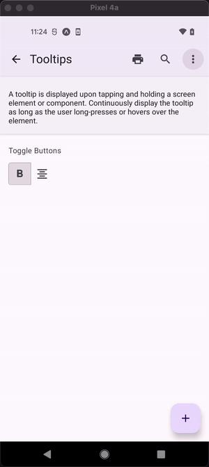
<Tooltip title="Selected Camera">
  <IconButton icon="camera" selected size={24} onPress={() => {}} />
</Tooltip>
Credits
With this, that’s a wrap.The update wouldn't happen without a group of great React Native experts I'm happy to work with. From this place I would like to thank:
- Daniel Szczepanik for his commitment, effort and collaborative work on adjusting components,
- Olimpia Zurek for her contribution and help,
- Aleksandra Desmurs-Linczewska, Jan Jaworski and Kewin Wereszczyński for checking and testing changes as well as providing valuable feedback,
- Bruno Castro for creating a long-awaited
Tooltipcomponent, - Muhammad Hur Ali for various bug fixes and
Listsubcomponents adjustments,
and, last but not least, Satya Sahoo for his mentoring during the process.