Using BottomNavigation with React Navigation
The createMaterialBottomTabNavigator has been deprecated as of react-native-paper@5.14.0. Instead, use @react-navigation/bottom-tabs version 7.x or later, combined with BottomNavigation.Bar to achieve a Material Design look.
For implementation details, see the dedicated example.
A material-design themed tab bar on the bottom of the screen that lets you switch between different routes with animation. Routes are lazily initialized - their screen components are not mounted until they are first focused.
This wraps the BottomNavigation component from react-native-paper, however if you configure the Babel plugin, it won't include the whole library in your bundle.
To use this navigator, ensure that you have @react-navigation/native and its dependencies (follow this guide):
👉 For a complete example please visit
createMaterialBottomTabNavigatorsnack
API Definition
To use this tab navigator, import it from react-native-paper/react-navigation:
import { createMaterialBottomTabNavigator } from 'react-native-paper/react-navigation';

const Tab = createMaterialBottomTabNavigator();

function MyTabs() {
  return (
    <Tab.Navigator>
      <Tab.Screen name="Home" component={HomeScreen} />
      <Tab.Screen name="Settings" component={SettingsScreen} />
    </Tab.Navigator>
  );
}
👉 For a complete usage guide please visit Tab Navigation
Props
The Tab.Navigator component accepts following props:
id
Optional unique ID for the navigator. This can be used with navigation.getParent to refer to this navigator in a child navigator.
initialRouteName
The name of the route to render on first load of the navigator.
screenOptions
Default options to use for the screens in the navigator.
backBehavior
This controls what happens when goBack is called in the navigator. This includes pressing the device's back button or back gesture on Android.
It supports the following values:
firstRoute- return to the first screen defined in the navigator (default)initialRoute- return to initial screen passed ininitialRouteNameprop, if not passed, defaults to the first screenorder- return to screen defined before the focused screenhistory- return to last visited screen in the navigator; if the same screen is visited multiple times, the older entries are dropped from the historynone- do not handle back button
shifting
Whether the shifting style is used, the active tab icon shifts up to show the label and the inactive tabs won't have a label.
By default, this is true when you have more than 3 tabs. Pass shifting={false} to explicitly disable this animation, or shifting={true} to always use this animation.
labeled
Whether to show labels in tabs. When false, only icons will be displayed.
activeColor
Custom color for icon and label in the active tab.
inactiveColor
Custom color for icon and label in the inactive tab.
barStyle
Style for the bottom navigation bar. You can pass custom background color here:
<Tab.Navigator
  initialRouteName="Home"
  activeColor="#f0edf6"
  inactiveColor="#3e2465"
  barStyle={{ backgroundColor: '#694fad' }}
>
  {/* ... */}
</Tab.Navigator>
If you have a translucent navigation bar on Android, you can also set a bottom padding here:
<Tab.Navigator
  initialRouteName="Home"
  activeColor="#f0edf6"
  inactiveColor="#3e2465"
  barStyle={{ paddingBottom: 48 }}
>
  {/* ... */}
</Tab.Navigator>
theme
Enables the customization of default theme attributes (e.g. colors) or facilitates the utilization of a personalized custom theme.
Options
The following options can be used to configure the screens in the navigator:
title
Generic title that can be used as a fallback for headerTitle and tabBarLabel.
tabBarIcon
Function that given { focused: boolean, color: string } returns a React.Node, to display in the tab bar.
tabBarColor In v5.x works only with theme version 2.
Color for the tab bar when the tab corresponding to the screen is active. Used for the ripple effect. This is only supported when shifting is true.
tabBarLabel
Title string of a tab displayed in the tab bar. When undefined, scene title is used. To hide, see labeled option in the previous section.
tabBarBadge
Badge to show on the tab icon, can be true to show a dot, string or number to show text.
tabBarAccessibilityLabel
Accessibility label for the tab button. This is read by the screen reader when the user taps the tab. It's recommended to set this if you don't have a label for the tab.
tabBarTestID
ID to locate this tab button in tests.
Events
The navigator can emit events on certain actions. Supported events are:
tabPress
This event is fired when the user presses the tab button for the current screen in the tab bar. By default a tab press does several things:
- If the tab is not focused, tab press will focus that tab
- If the tab is already focused:
- If the screen for the tab renders a scroll view, you can use
useScrollToTopto scroll it to top - If the screen for the tab renders a stack navigator, a
popToTopaction is performed on the stack
- If the screen for the tab renders a scroll view, you can use
To prevent the default behavior, you can call event.preventDefault:
React.useEffect(() => {
  const unsubscribe = navigation.addListener('tabPress', (e) => {
    // Prevent default behavior

    e.preventDefault();
    // Do something manually
    // ...
  });

  return unsubscribe;
}, [navigation]);
Helpers
The tab navigator adds the following methods to the navigation prop:
jumpTo
Navigates to an existing screen in the tab navigator. The method accepts following arguments:
name- string - Name of the route to jump to.params- object - Screen params to pass to the destination route.
navigation.jumpTo('Profile', { name: 'Michaś' });
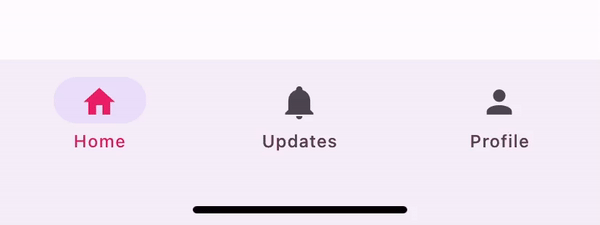
Example
import { createMaterialBottomTabNavigator } from 'react-native-paper/react-navigation';
import MaterialDesignIcons from '@react-native-vector-icons/material-design-icons';

const Tab = createMaterialBottomTabNavigator();

function MyTabs() {
  return (
    <Tab.Navigator
      initialRouteName="Feed"
      activeColor="#e91e63"
      barStyle={{ backgroundColor: 'tomato' }}
    >
      <Tab.Screen
        name="Feed"
        component={Feed}
        options={{
          tabBarLabel: 'Home',
          tabBarIcon: ({ color }) => (
            <MaterialDesignIcons name="home" color={color} size={26} />
          ),
        }}
      />
      <Tab.Screen
        name="Notifications"
        component={Notifications}
        options={{
          tabBarLabel: 'Updates',
          tabBarIcon: ({ color }) => (
            <MaterialDesignIcons name="bell" color={color} size={26} />
          ),
        }}
      />
      <Tab.Screen
        name="Profile"
        component={Profile}
        options={{
          tabBarLabel: 'Profile',
          tabBarIcon: ({ color }) => (
            <MaterialDesignIcons name="account" color={color} size={26} />
          ),
        }}
      />
    </Tab.Navigator>
  );
}