ActivityIndicator
Activity indicator is used to present progress of some activity in the app. It can be used as a drop-in replacement for the ActivityIndicator shipped with React Native.
Usage
import * as React from 'react';
import { ActivityIndicator, MD2Colors } from 'react-native-paper';

const MyComponent = () => (
  <ActivityIndicator animating={true} color={MD2Colors.red800} />
);

export default MyComponent;
Props
animating
Type: boolean
Default value: true
Whether to show the indicator or hide it.
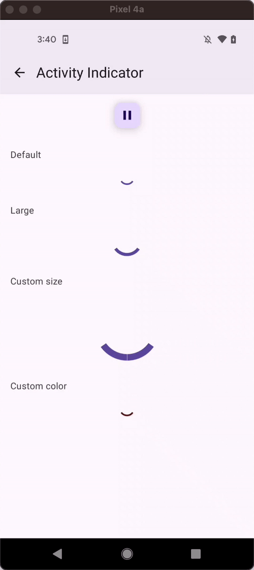
color
Type: string
The color of the spinner.
size
Type: 'small' | 'large' | number
Default value: 'small'
Size of the indicator.
hidesWhenStopped
Type: boolean
Default value: true
Whether the indicator should hide when not animating.
style
Type: StyleProp<ViewStyle>
theme
Type: ThemeProp
Theme colors
| mode | borderColor |
|---|---|
| - | theme.colors.primary |
If a dedicated prop for a specific color is not available or the style prop does not allow color modification, you can customize it using the theme prop. It allows to override any color, within the component, based on the table above.
Example of overriding primary color:
<ActivityIndicator theme={{ colors: { primary: 'green' } }} />