Menu
Menus display a list of choices on temporary elevated surfaces. Their placement varies based on the element that opens them.
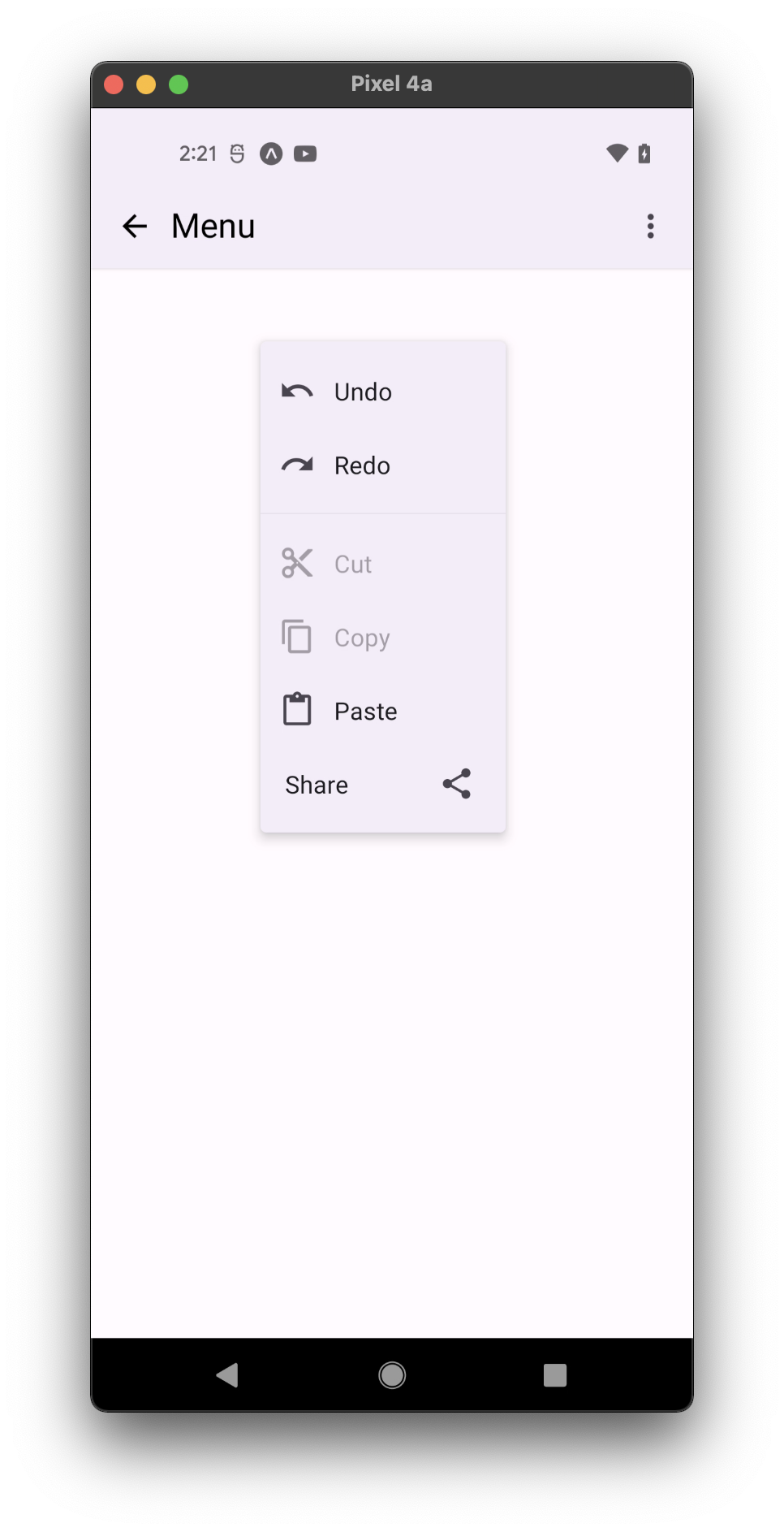
- with icons
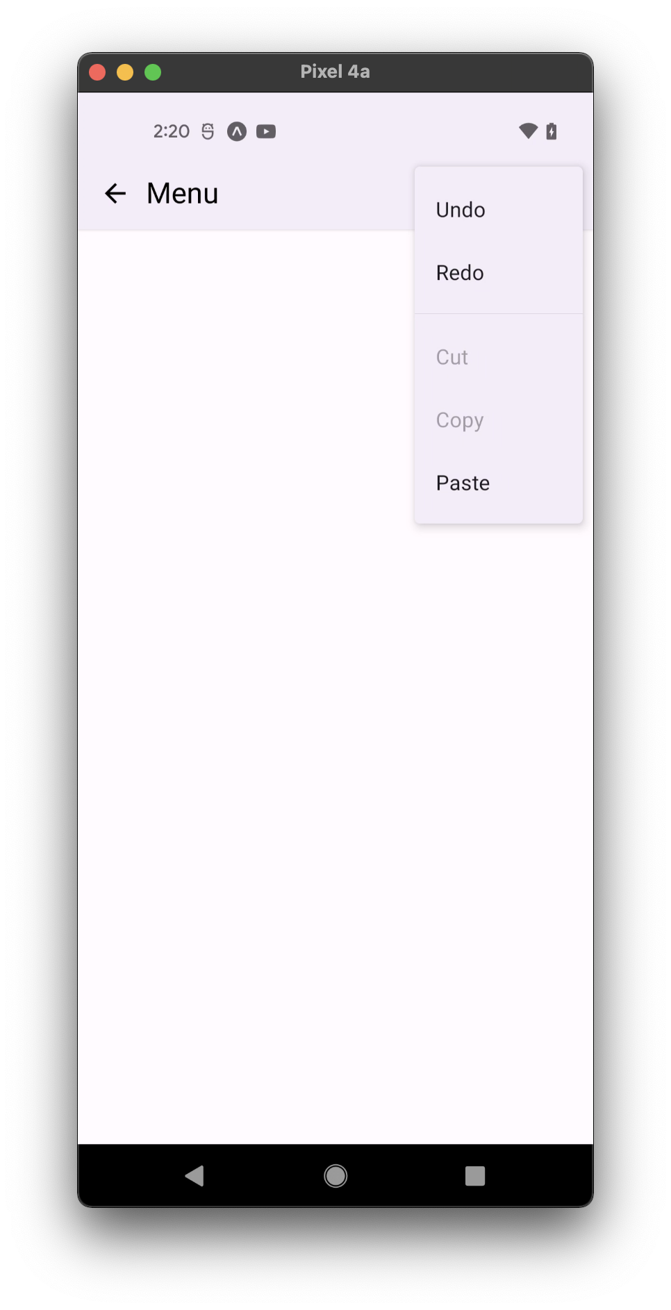
- without icons
Usage
import * as React from 'react';
import { View } from 'react-native';
import { Button, Menu, Divider, PaperProvider } from 'react-native-paper';

const MyComponent = () => {
  const [visible, setVisible] = React.useState(false);

  const openMenu = () => setVisible(true);

  const closeMenu = () => setVisible(false);

  return (
    <PaperProvider>
      <View
        style={{
          paddingTop: 50,
          flexDirection: 'row',
          justifyContent: 'center',
        }}>
        <Menu
          visible={visible}
          onDismiss={closeMenu}
          anchor={<Button onPress={openMenu}>Show menu</Button>}>
          <Menu.Item onPress={() => {}} title="Item 1" />
          <Menu.Item onPress={() => {}} title="Item 2" />
          <Divider />
          <Menu.Item onPress={() => {}} title="Item 3" />
        </Menu>
      </View>
    </PaperProvider>
  );
};

export default MyComponent;
Note
When using Menu within a React Native's Modal component, you need to wrap all
Modal contents within a PaperProvider in order for the menu to show. This
wrapping is not necessary if you use Paper's Modal instead.
Props
visible (required)
Type: boolean
Whether the Menu is currently visible.
anchor (required)
Type: React.ReactNode | { x: number; y: number }
The anchor to open the menu from. In most cases, it will be a button that opens the menu.
anchorPosition
Type: 'top' | 'bottom'
Whether the menu should open at the top of the anchor or at its bottom. Applied only when anchor is a node, not an x/y position.
statusBarHeight
Type: number
Default value: APPROX_STATUSBAR_HEIGHT
Extra margin to add at the top of the menu to account for translucent status bar on Android.
If you are using Expo, we assume translucent status bar and set a height for status bar automatically.
Pass 0 or a custom value to and customize it.
This is automatically handled on iOS.
onDismiss
Type: () => void
Callback called when Menu is dismissed. The visible prop needs to be updated when this is called.
overlayAccessibilityLabel
Type: string
Default value: 'Close menu'
Accessibility label for the overlay. This is read by the screen reader when the user taps outside the menu.
children (required)
Type: React.ReactNode
Content of the Menu.
contentStyle
Type: Animated.WithAnimatedValue<StyleProp<ViewStyle>>
Style of menu's inner content.
style
Type: StyleProp<ViewStyle>
elevation
Type: MD3Elevation
Elevation level of the menu's content. Shadow styles are calculated based on this value. Default backgroundColor is taken from the corresponding theme.colors.elevation property. By default equals 2.
Available in v5.x with theme version 3
theme (required)
Type: InternalTheme
keyboardShouldPersistTaps
Type: ScrollViewProps['keyboardShouldPersistTaps']
Inner ScrollView prop
testID
Type: string
Default value: 'menu'
testID to be used on tests.
Theme colors
| mode | backgroundColor |
|---|---|
| - | theme.colors.elevation.level2 |
If a dedicated prop for a specific color is not available or the style prop does not allow color modification, you can customize it using the theme prop. It allows to override any color, within the component, based on the table above.
Example of overriding primary color:
<Menu theme={{ colors: { primary: 'green' } }} />