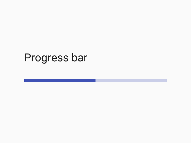
ProgressBar
Progress bar is an indicator used to present progress of some activity in the app.
Usage
import * as React from 'react';
import { ProgressBar, MD3Colors } from 'react-native-paper';

const MyComponent = () => (
  <ProgressBar progress={0.5} color={MD3Colors.error50} />
);

export default MyComponent;
Props
animatedValue
Type: number
Animated value (between 0 and 1). This tells the progress bar to rely on this value to animate it.
Note: It should not be used in parallel with the progress prop.
progress
Type: number
Default value: 0
Progress value (between 0 and 1).
Note: It should not be used in parallel with the animatedValue prop.
color
Type: string
Color of the progress bar. The background color will be calculated based on this but you can change it by passing backgroundColor to style prop.
indeterminate
Type: boolean
If the progress bar will show indeterminate progress.
visible
Type: boolean
Default value: true
Whether to show the ProgressBar (true, the default) or hide it (false).
fillStyle
Type: Animated.WithAnimatedValue<StyleProp<ViewStyle>>
Style of filled part of the ProgresBar.
style
Type: StyleProp<ViewStyle>
theme
Type: ThemeProp
testID
Type: string
Default value: 'progress-bar'
testID to be used on tests.
Theme colors
| mode | tintColor | trackTintColor |
|---|---|---|
| - | theme.colors.primary | theme.colors.surfaceVariant |
If a dedicated prop for a specific color is not available or the style prop does not allow color modification, you can customize it using the theme prop. It allows to override any color, within the component, based on the table above.
Example of overriding primary color:
<ProgressBar theme={{ colors: { primary: 'green' } }} />