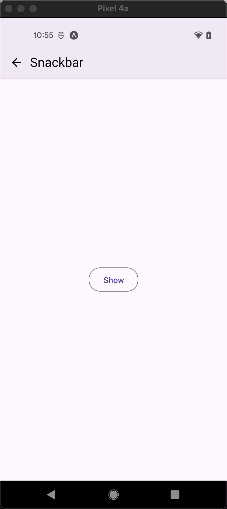
Snackbar
Snackbars provide brief feedback about an operation through a message rendered at the bottom of the container in which it's wrapped.
Note: To display it as a popup, regardless of the parent's position, wrap it with a Portal component – refer to the example in the "More Examples` section.
Usage
import * as React from 'react';
import { View, StyleSheet } from 'react-native';
import { Button, Snackbar } from 'react-native-paper';

const MyComponent = () => {
  const [visible, setVisible] = React.useState(false);

  const onToggleSnackBar = () => setVisible(!visible);

  const onDismissSnackBar = () => setVisible(false);

  return (
    <View style={styles.container}>
      <Button onPress={onToggleSnackBar}>{visible ? 'Hide' : 'Show'}</Button>
      <Snackbar
        visible={visible}
        onDismiss={onDismissSnackBar}
        action={{
          label: 'Undo',
          onPress: () => {
            // Do something
          },
        }}>
        Hey there! I'm a Snackbar.
      </Snackbar>
    </View>
  );
};

const styles = StyleSheet.create({
  container: {
    flex: 1,
    justifyContent: 'space-between',
  },
});

export default MyComponent;
Props
visible (required)
Type: boolean
Whether the Snackbar is currently visible.
action
Type: $RemoveChildren<typeof Button> & {
label: string;
}
Label and press callback for the action button. It should contain the following properties:
label- Label of the action buttononPress- Callback that is called when action button is pressed.
icon Available in v5.x with theme version 3
Type: IconSource
Icon to display when onIconPress is defined. Default will be close icon.
rippleColor Available in v5.x with theme version 3
Type: ColorValue
Color of the ripple effect.
onIconPress Available in v5.x with theme version 3
Type: () => void
Function to execute on icon button press. The icon button appears only when this prop is specified.
iconAccessibilityLabel Available in v5.x with theme version 3
Type: string
Default value: 'Close icon'
Accessibility label for the icon button. This is read by the screen reader when the user taps the button.
duration
Type: number
Default value: 7000
The duration for which the Snackbar is shown.
onDismiss (required)
Type: () => void
Callback called when Snackbar is dismissed. The visible prop needs to be updated when this is called.
children (required)
Type: React.ReactNode
Text content of the Snackbar.
elevation Available in v5.x with theme version 3
Type: 0 | 1 | 2 | 3 | 4 | 5 | Animated.Value
Default value: 2
Changes Snackbar shadow and background on iOS and Android.
maxFontSizeMultiplier
Type: number
Specifies the largest possible scale a text font can reach.
wrapperStyle
Type: StyleProp<ViewStyle>
Style for the wrapper of the snackbar
contentStyle
Type: StyleProp<ViewStyle>
Style for the content of the snackbar
style
Type: Animated.WithAnimatedValue<StyleProp<ViewStyle>>
ref
Type: React.RefObject<View>
theme
Type: ThemeProp
testID
Type: string
TestID used for testing purposes
More Examples
Toggle to grab more examples
Theme colors
| mode | iconColor |
|---|---|
| - | theme.colors.inverseOnSurface |
If a dedicated prop for a specific color is not available or the style prop does not allow color modification, you can customize it using the theme prop. It allows to override any color, within the component, based on the table above.
Example of overriding primary color:
<Snackbar theme={{ colors: { primary: 'green' } }} />