Surface
Surface is a basic container that can give depth to an element with elevation shadow.
On dark theme with adaptive mode, surface is constructed by also placing a semi-transparent white overlay over a component surface.
See Dark Theme for more information.
Overlay and shadow can be applied by specifying the elevation property both on Android and iOS.
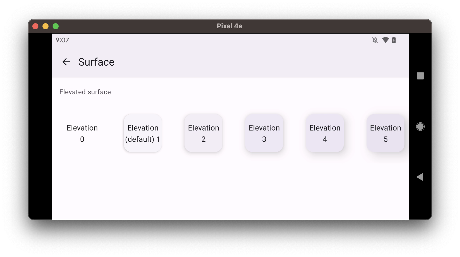
- elevated
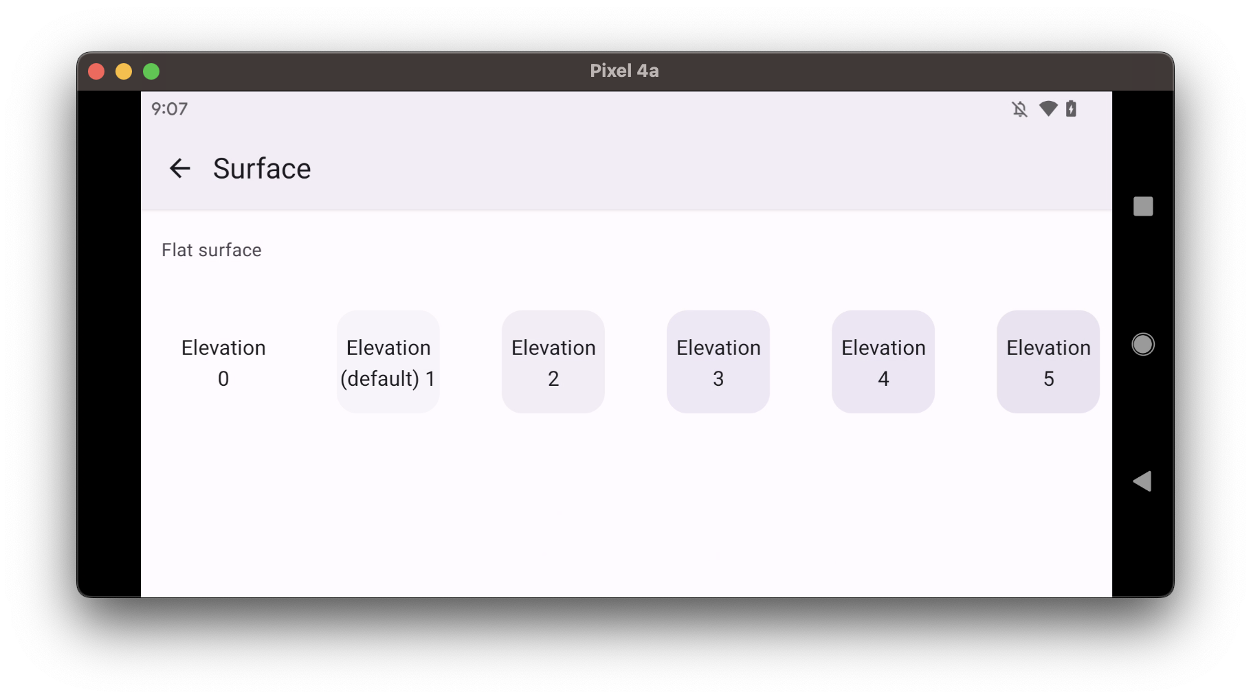
- flat
Usage
import * as React from 'react';
import { Surface, Text } from 'react-native-paper';
import { StyleSheet } from 'react-native';

const MyComponent = () => (
  <Surface style={styles.surface} elevation={4}>
     <Text>Surface</Text>
  </Surface>
);

export default MyComponent;

const styles = StyleSheet.create({
  surface: {
    padding: 8,
    height: 80,
    width: 80,
    alignItems: 'center',
    justifyContent: 'center',
  },
});
Props
children (required)
Type: React.ReactNode
Content of the Surface.
style
Type: Animated.WithAnimatedValue<StyleProp<ViewStyle>>
elevation Available in v5.x with theme version 3
Type: 0 | 1 | 2 | 3 | 4 | 5 | Animated.Value
Default value: 1
Changes shadows and background on iOS and Android. Used to create UI hierarchy between components.
Note: If mode is set to flat, Surface doesn't have a shadow.
Note: In version 2 the elevation prop was accepted via style prop i.e. style={{ elevation: 4 }}.
It's no longer supported with theme version 3 and you should use elevation property instead.
mode Available in v5.x with theme version 3
Type: 'flat' | 'elevated'
Default value: 'elevated'
Mode of the Surface.
elevated- Surface with a shadow and background color corresponding to setelevationvalue.flat- Surface without a shadow, with the background color corresponding to setelevationvalue.
theme
Type: ThemeProp
testID
Type: string
Default value: 'surface'
TestID used for testing purposes
ref
Type: React.RefObject<View>
Theme colors
| mode | backgroundColor |
|---|---|
| flat | theme.colors.elevation[elevation] |
| elevated | theme.colors.elevation[elevation] |
If a dedicated prop for a specific color is not available or the style prop does not allow color modification, you can customize it using the theme prop. It allows to override any color, within the component, based on the table above.
Example of overriding primary color:
<Surface theme={{ colors: { primary: 'green' } }} />