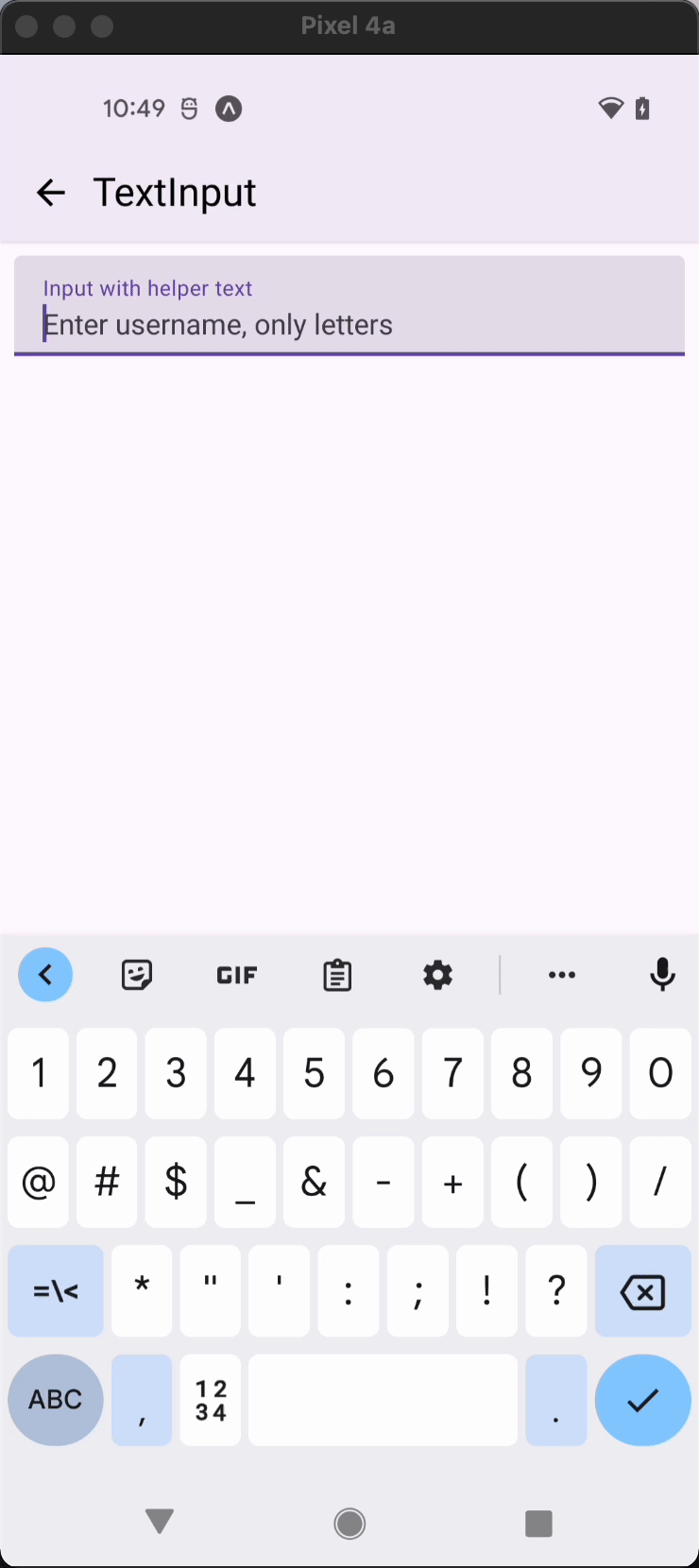
HelperText
Helper text is used in conjuction with input elements to provide additional hints for the user.
Usage
import * as React from 'react';
import { View } from 'react-native';
import { HelperText, TextInput } from 'react-native-paper';

const MyComponent = () => {
  const [text, setText] = React.useState('');

   const onChangeText = text => setText(text);

  const hasErrors = () => {
    return !text.includes('@');
  };

 return (
    <View>
      <TextInput label="Email" value={text} onChangeText={onChangeText} />
      <HelperText type="error" visible={hasErrors()}>
        Email address is invalid!
      </HelperText>
    </View>
  );
};

export default MyComponent;
Props
type
Type: 'error' | 'info'
Default value: 'info'
Type of the helper text.
children (required)
Type: React.ReactNode
Text content of the HelperText.
visible
Type: boolean
Default value: true
Whether to display the helper text.
padding
Type: 'none' | 'normal'
Default value: 'normal'
Whether to apply padding to the helper text.
disabled
Type: boolean
Whether the text input tied with helper text is disabled.
style
Type: StyleProp<TextStyle>
theme
Type: ThemeProp
testID
Type: string
TestID used for testing purposes
Theme colors
| mode | textColor |
|---|---|
| disabled | theme.colors.onSurfaceDisabled |
| default | theme.colors.onSurfaceVariant |
| error | theme.colors.error |
If a dedicated prop for a specific color is not available or the style prop does not allow color modification, you can customize it using the theme prop. It allows to override any color, within the component, based on the table above.
Example of overriding primary color:
<HelperText theme={{ colors: { primary: 'green' } }} />