Banner
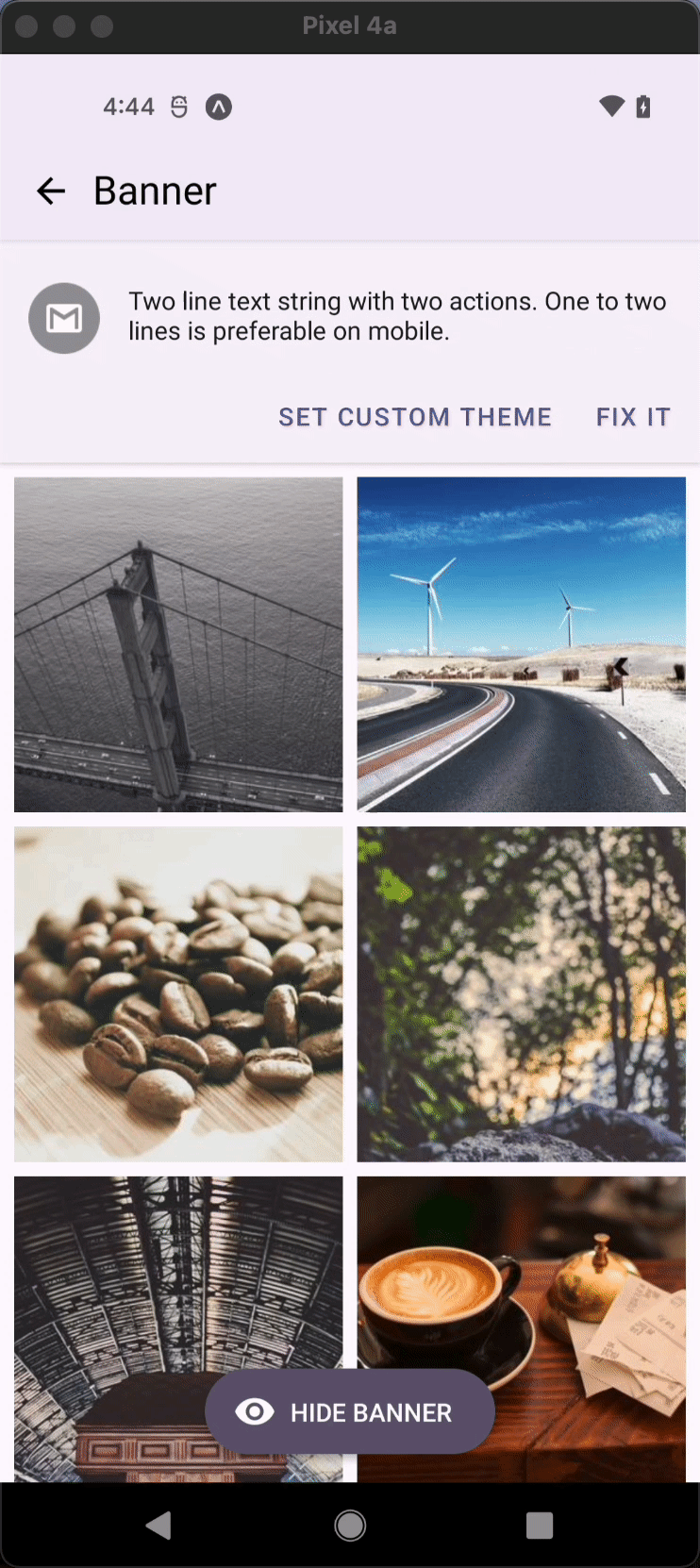
Banner displays a prominent message and related actions.
Usage
import * as React from 'react';
import { Image } from 'react-native';
import { Banner } from 'react-native-paper';

const MyComponent = () => {
  const [visible, setVisible] = React.useState(true);

  return (
    <Banner
      visible={visible}
      actions={[
        {
          label: 'Fix it',
          onPress: () => setVisible(false),
        },
        {
          label: 'Learn more',
          onPress: () => setVisible(false),
        },
      ]}
      icon={({size}) => (
        <Image
          source={{
            uri: 'https://avatars3.githubusercontent.com/u/17571969?s=400&v=4',
          }}
          style={{
            width: size,
            height: size,
          }}
        />
      )}>
      There was a problem processing a transaction on your credit card.
    </Banner>
  );
};

export default MyComponent;
Props
visible (required)
Type: boolean
Whether banner is currently visible.
children (required)
Type: React.ReactNode
Content that will be displayed inside banner.
icon
Type: IconSource
Icon to display for the Banner. Can be an image.
actions
Type: Array<
{
label: string;
} & $RemoveChildren<typeof Button>
>
Default value: []
Action items to shown in the banner. An action item should contain the following properties:
label: label of the action button (required)onPress: callback that is called when button is pressed (required)
To customize button you can pass other props that button component takes.
contentStyle
Type: StyleProp<ViewStyle>
Style of banner's inner content. Use this prop to apply custom width for wide layouts.
elevation Available in v5.x with theme version 3
Type: 0 | 1 | 2 | 3 | 4 | 5 | Animated.Value
Default value: 1
Changes Banner shadow and background on iOS and Android.
maxFontSizeMultiplier
Type: number
Specifies the largest possible scale a text font can reach.
style
Type: Animated.WithAnimatedValue<StyleProp<ViewStyle>>
ref
Type: React.RefObject<View>
theme
Type: ThemeProp
onShowAnimationFinished
Type: Animated.EndCallback
Default value: () => {}
Optional callback that will be called after the opening animation finished running normally
onHideAnimationFinished
Type: Animated.EndCallback
Default value: () => {}
Optional callback that will be called after the closing animation finished running normally
Theme colors
| mode | textColor | action textColor |
|---|---|---|
| - | theme.colors.onSurface | theme.colors.primary |
If a dedicated prop for a specific color is not available or the style prop does not allow color modification, you can customize it using the theme prop. It allows to override any color, within the component, based on the table above.
Example of overriding primary color:
<Banner theme={{ colors: { primary: 'green' } }} />