Badge
Badges are small status descriptors for UI elements. A badge consists of a small circle, typically containing a number or other short set of characters, that appears in proximity to another object.
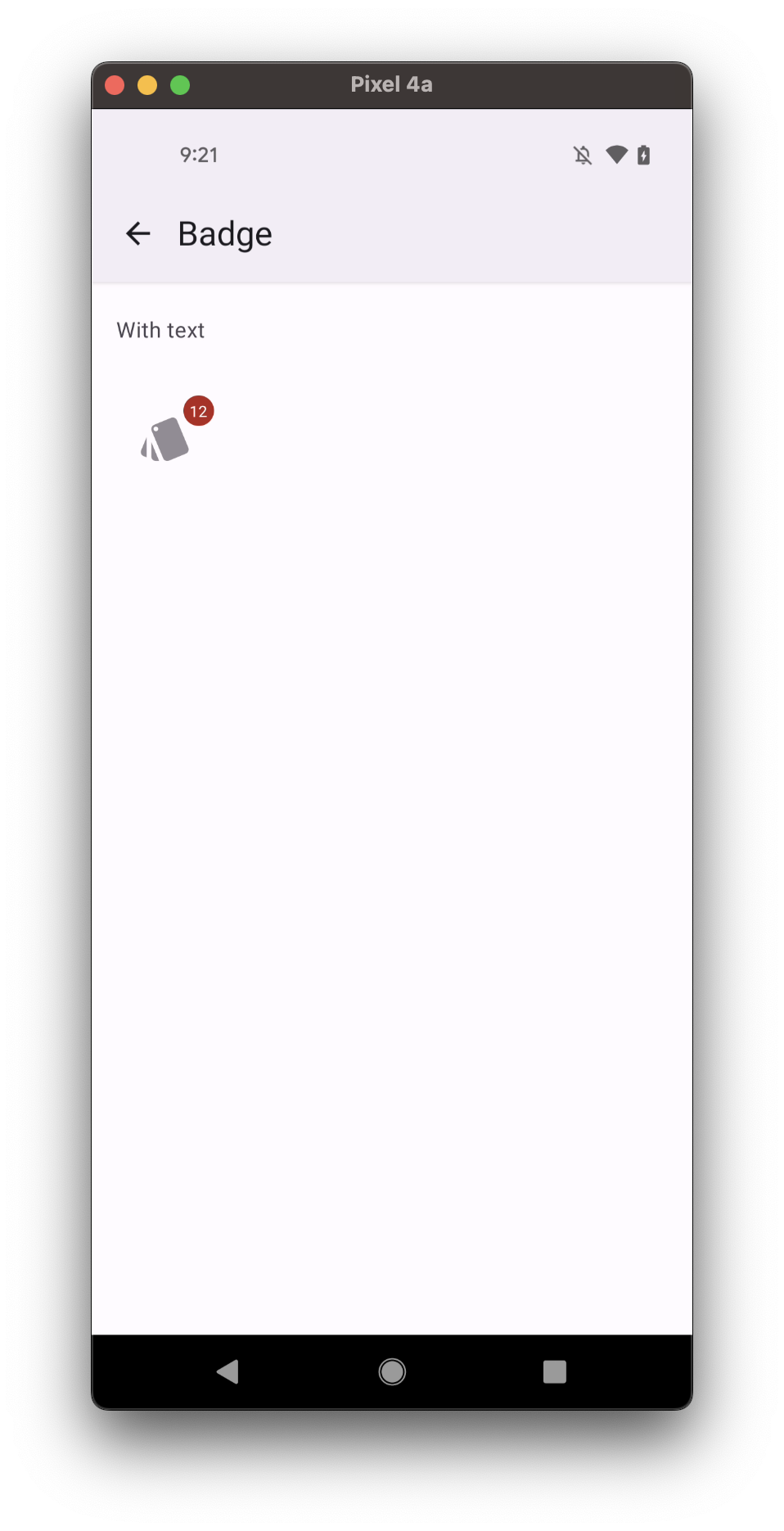
- with text
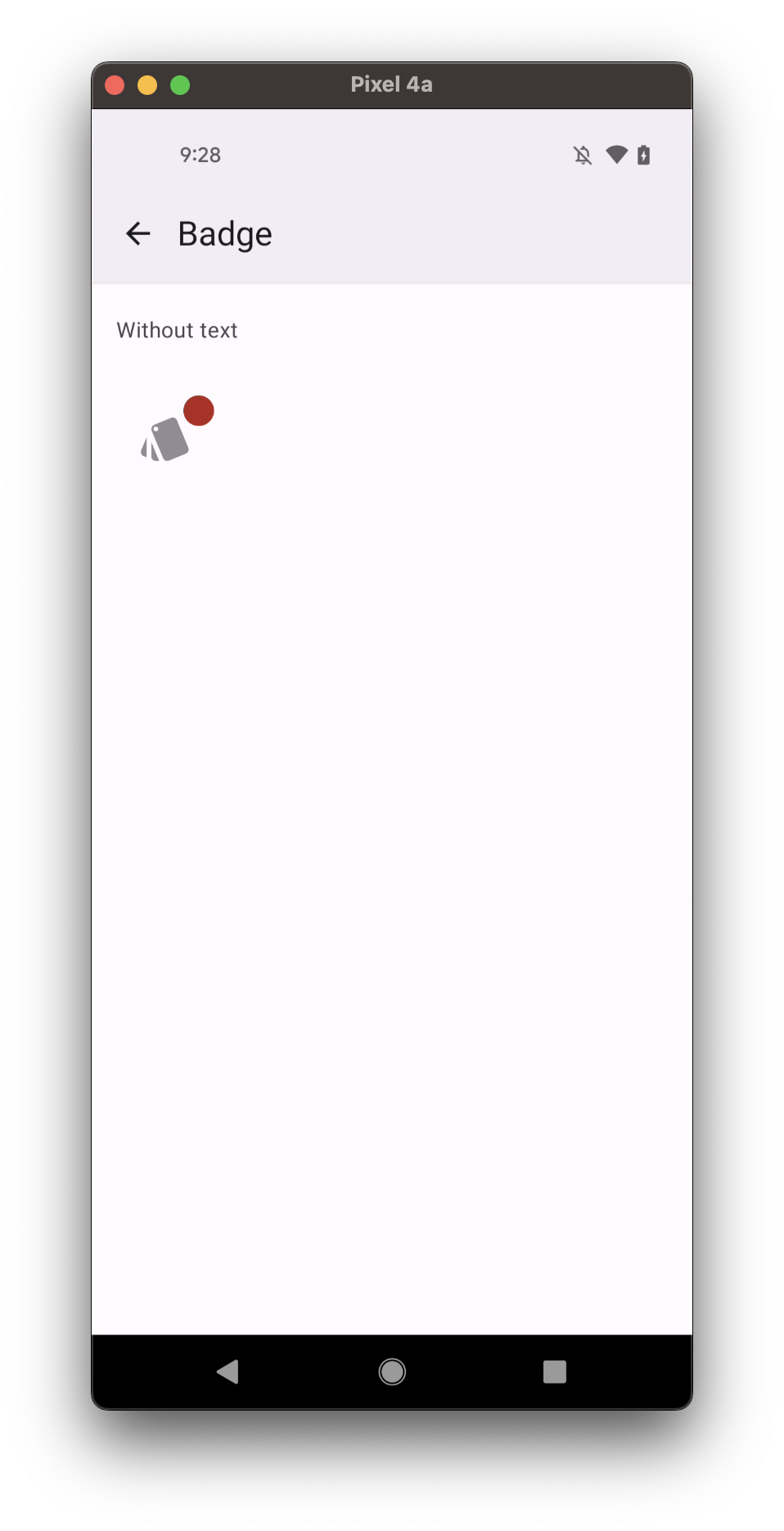
- without text
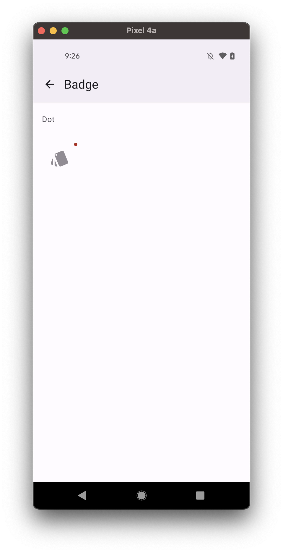
- dot
Usage
import * as React from 'react';
import { Badge } from 'react-native-paper';

const MyComponent = () => (
  <Badge>3</Badge>
);

export default MyComponent;
Props
visible
Type: boolean
Default value: true
Whether the badge is visible
children
Type: string | number
Content of the Badge.
size
Type: number
Default value: 20
Size of the Badge.
style
Type: StyleProp<TextStyle>
ref
Type: React.RefObject<typeof Animated.Text>
theme
Type: ThemeProp
Theme colors
info
The table below outlines the theme colors, specifically for MD3 (theme version 3) at the moment.
| mode | backgroundColor | textColor |
|---|---|---|
| - | theme.colors.error | theme.colors.onError |
tip
If a dedicated prop for a specific color is not available or the style prop does not allow color modification, you can customize it using the theme prop. It allows to override any color, within the component, based on the table above.
Example of overriding primary color:
<Badge theme={{ colors: { primary: 'green' } }} />