Appbar
A component to display action items in a bar. It can be placed at the top or bottom. The top bar usually contains the screen title, controls such as navigation buttons, menu button etc. The bottom bar usually provides access to a drawer and up to four actions.
By default Appbar uses primary color as a background, in dark theme with adaptive mode it will use surface colour instead.
See Dark Theme for more informations
Usage
Top bar
import * as React from 'react';
import { Appbar } from 'react-native-paper';
const MyComponent = () => (
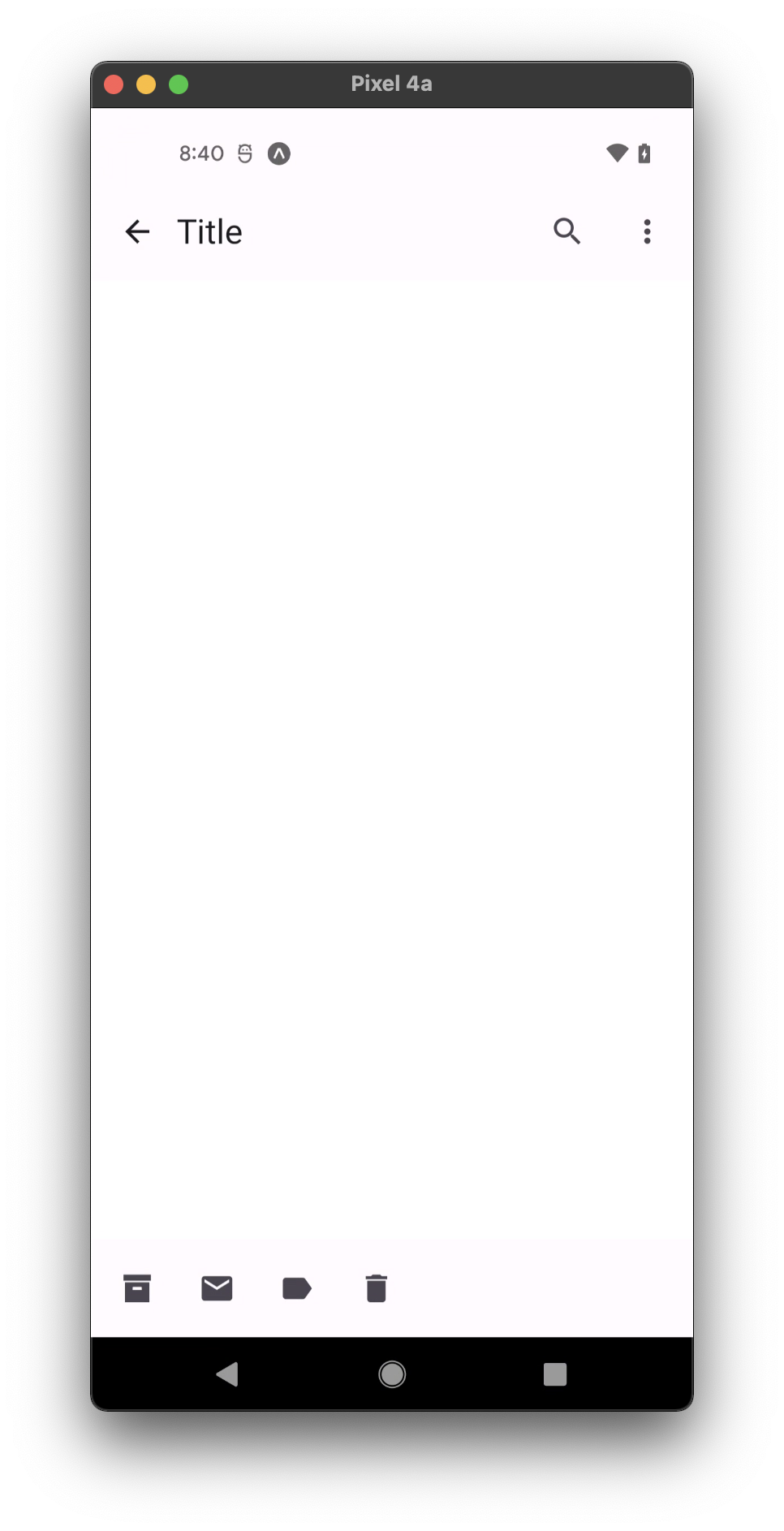
<Appbar.Header>
<Appbar.BackAction onPress={() => {}} />
<Appbar.Content title="Title" />
<Appbar.Action icon="calendar" onPress={() => {}} />
<Appbar.Action icon="magnify" onPress={() => {}} />
</Appbar.Header>
);
export default MyComponent;
Bottom bar
import * as React from 'react';
import { StyleSheet } from 'react-native';
import { Appbar, FAB, useTheme } from 'react-native-paper';
import { useSafeAreaInsets } from 'react-native-safe-area-context';

const BOTTOM_APPBAR_HEIGHT = 80;
const MEDIUM_FAB_HEIGHT = 56;

const MyComponent = () => {
  const { bottom } = useSafeAreaInsets();
  const theme = useTheme();

  return (
    <Appbar
      style={[
        styles.bottom,
        {
          height: BOTTOM_APPBAR_HEIGHT + bottom,
          backgroundColor: theme.colors.elevation.level2,
        },
      ]}
      safeAreaInsets={{ bottom }}
    >
      <Appbar.Action icon="archive" onPress={() => {}} />
      <Appbar.Action icon="email" onPress={() => {}} />
      <Appbar.Action icon="label" onPress={() => {}} />
      <Appbar.Action icon="delete" onPress={() => {}} />
      <FAB
        mode="flat"
        size="medium"
        icon="plus"
        onPress={() => {}}
        style={[
          styles.fab,
          { top: (BOTTOM_APPBAR_HEIGHT - MEDIUM_FAB_HEIGHT) / 2 },
        ]}
      />
    </Appbar>
  );
};

const styles = StyleSheet.create({
  bottom: {
    backgroundColor: 'aquamarine',
    position: 'absolute',
    left: 0,
    right: 0,
    bottom: 0,
  },
  fab: {
    position: 'absolute',
    right: 16,
  },
});

export default MyComponent;
Props
dark
Type: boolean
Whether the background color is a dark color. A dark appbar will render light text and vice-versa.
children (required)
Type: React.ReactNode
Content of the Appbar.
mode Available in v5.x with theme version 3
Type: 'small' | 'medium' | 'large' | 'center-aligned'
Default value: 'small'
Mode of the Appbar.
small- Appbar with default height (64).medium- Appbar with medium height (112).large- Appbar with large height (152).center-aligned- Appbar with default height and center-aligned title.
elevated Available in v5.x with theme version 3
Type: boolean
Whether Appbar background should have the elevation along with primary color pigment.
safeAreaInsets
Type: {
bottom?: number;
top?: number;
left?: number;
right?: number;
}
Safe area insets for the Appbar. This can be used to avoid elements like the navigation bar on Android and bottom safe area on iOS.
theme
Type: ThemeProp
style
Type: Animated.WithAnimatedValue<StyleProp<ViewStyle>>
Theme colors
| mode | backgroundColor |
|---|---|
| default | theme.colors.surface |
| elevated | theme.colors.elevation.level2 |
If a dedicated prop for a specific color is not available or the style prop does not allow color modification, you can customize it using the theme prop. It allows to override any color, within the component, based on the table above.
Example of overriding primary color:
<Appbar theme={{ colors: { primary: 'green' } }} />