Appbar.Content
A component used to display a title and optional subtitle in an appbar.
Usage
import * as React from 'react';
import { Appbar } from 'react-native-paper';
const MyComponent = () => (
<Appbar.Header>
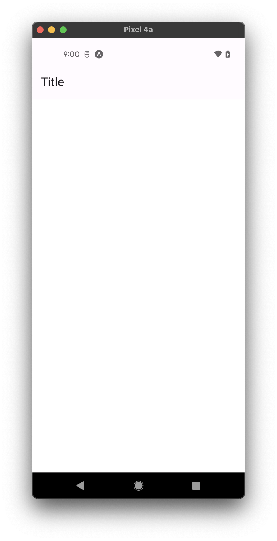
<Appbar.Content title="Title" />
</Appbar.Header>
);
export default MyComponent;
Props
title (required)
Type: React.ReactNode
Text or component for the title.
titleStyle
Type: StyleProp<TextStyle>
Style for the title, if title is a string.
titleRef
Type: React.RefObject<TextRef>
Reference for the title.
subtitle Deprecated in v5.x
Type: React.ReactNode
Text for the subtitle.
subtitleStyle Deprecated in v5.x
Type: StyleProp<TextStyle>
Style for the subtitle.
onPress
Type: (e: GestureResponderEvent) => void
Function to execute on press.
disabled
Type: boolean
If true, disable all interactions for this component.
color
Type: string
Custom color for the text.
titleMaxFontSizeMultiplier
Type: number
Specifies the largest possible scale a title font can reach.
style
Type: StyleProp<ViewStyle>
theme
Type: ThemeProp
testID
Type: string
Default value: 'appbar-content'
testID to be used on tests.
Theme colors
| mode | textColor |
|---|---|
| - | theme.colors.onSurface |
If a dedicated prop for a specific color is not available or the style prop does not allow color modification, you can customize it using the theme prop. It allows to override any color, within the component, based on the table above.
Example of overriding primary color:
<Appbar.Content theme={{ colors: { primary: 'green' } }} />