Appbar.Header
A component to use as a header at the top of the screen. It can contain the screen title, controls such as navigation buttons, menu button etc.
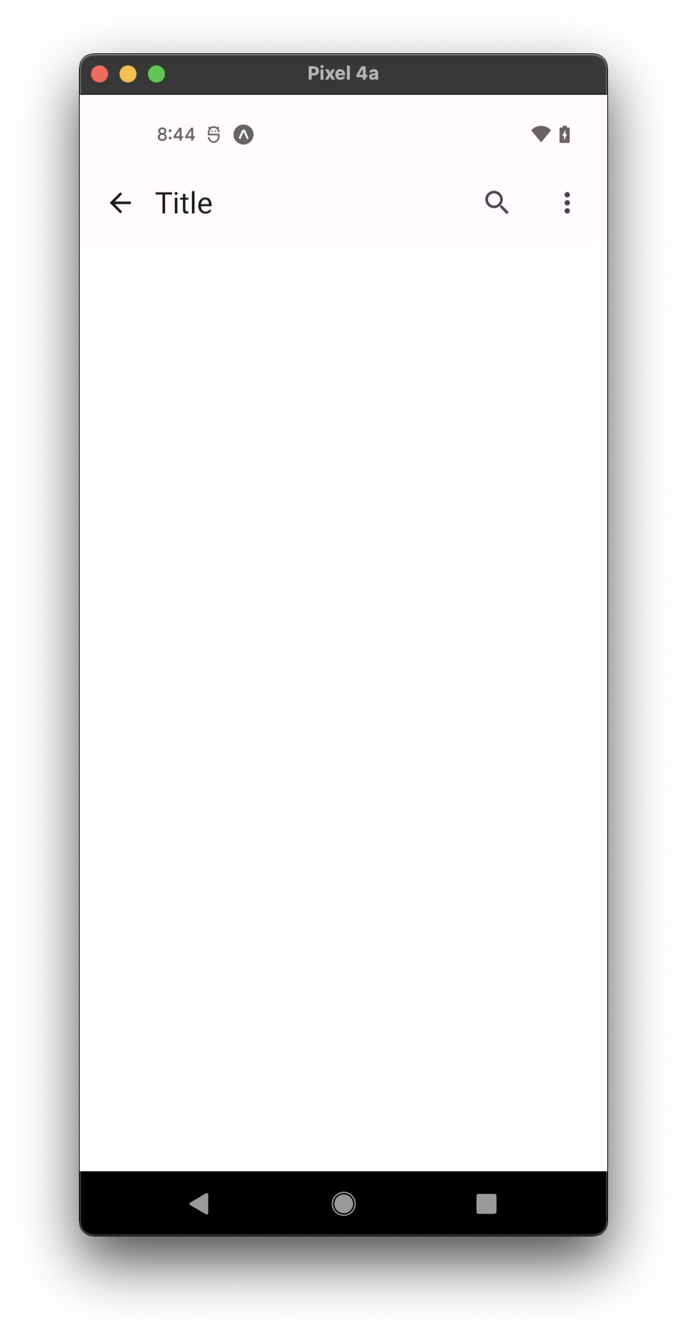
- small
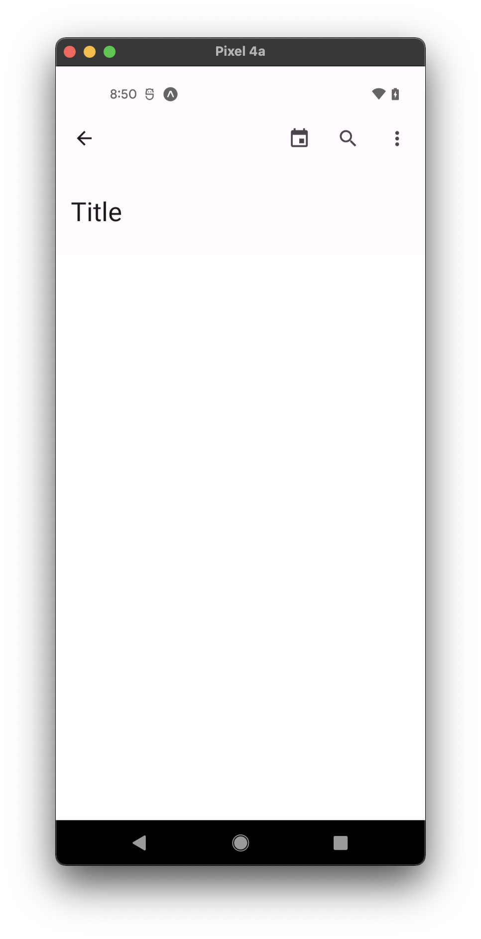
- medium
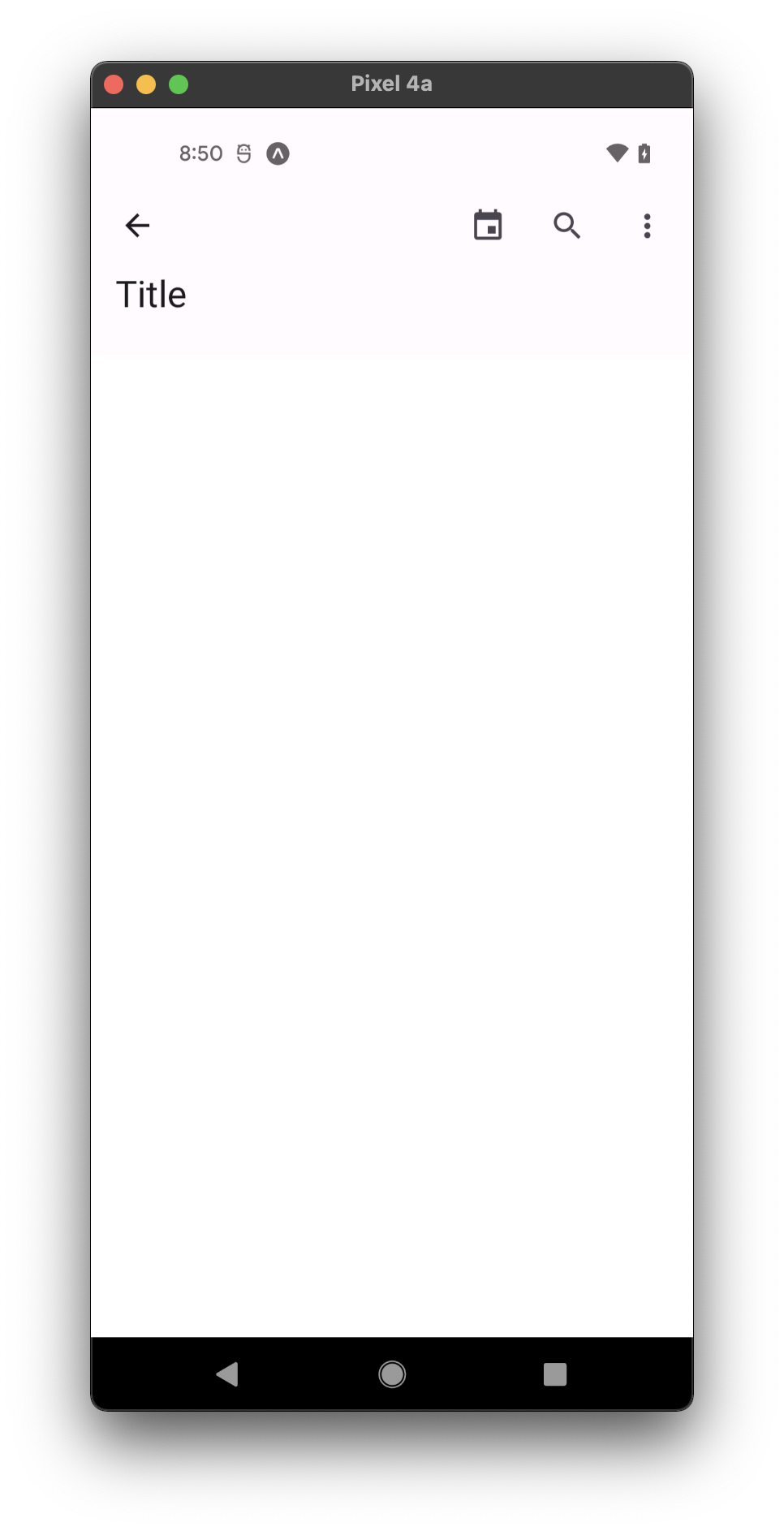
- large
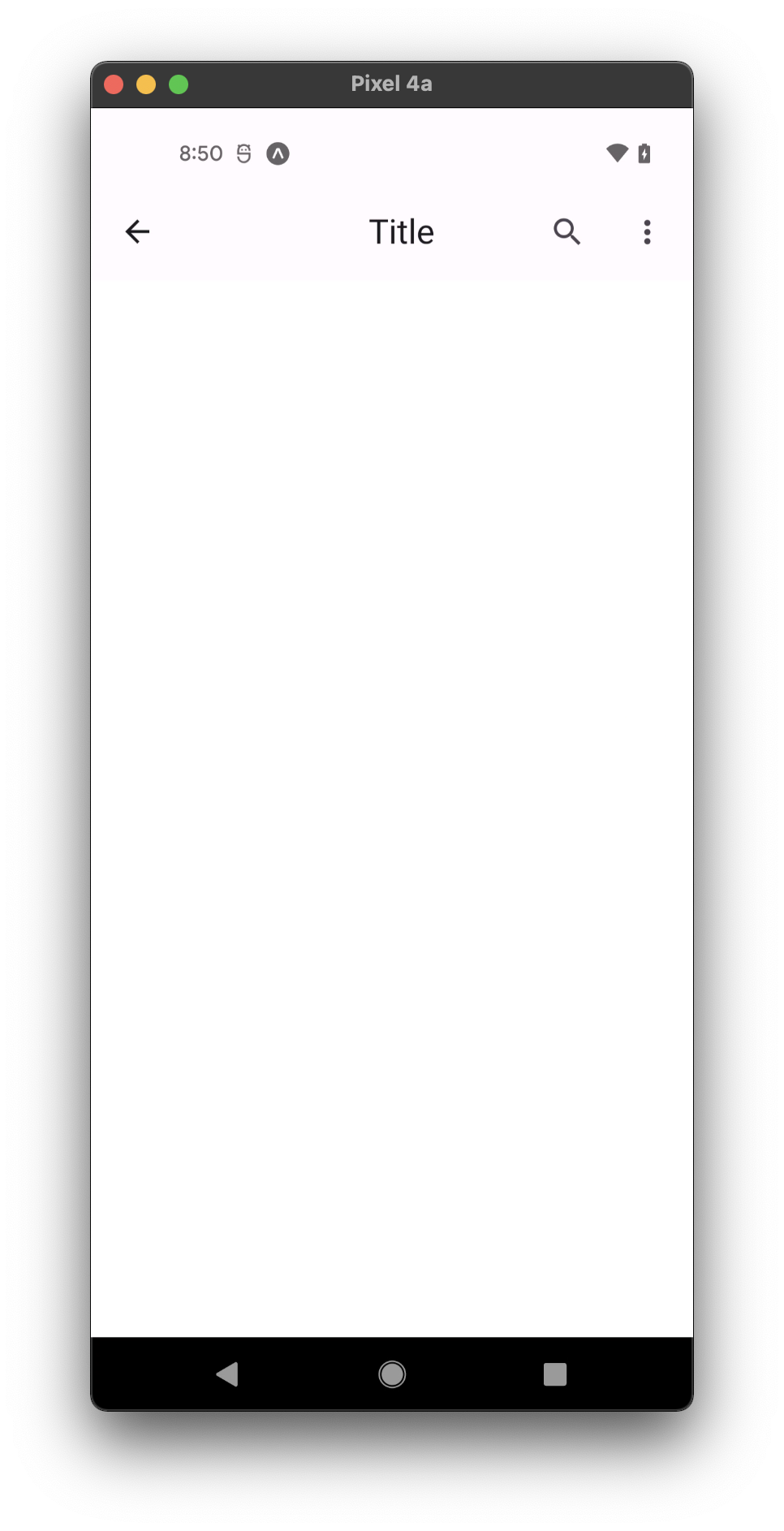
- center-aligned
Usage
import * as React from 'react';
import { Appbar } from 'react-native-paper';

const MyComponent = () => {
  const _goBack = () => console.log('Went back');

  const _handleSearch = () => console.log('Searching');

  const _handleMore = () => console.log('Shown more');

  return (
    <Appbar.Header>
      <Appbar.BackAction onPress={_goBack} />
      <Appbar.Content title="Title" />
      <Appbar.Action icon="magnify" onPress={_handleSearch} />
      <Appbar.Action icon="dots-vertical" onPress={_handleMore} />
    </Appbar.Header>
  );
};

export default MyComponent;
Props
dark
Type: boolean
Whether the background color is a dark color. A dark header will render light text and vice-versa.
statusBarHeight
Type: number
Extra padding to add at the top of header to account for translucent status bar.
This is automatically handled on iOS >= 11 including iPhone X using SafeAreaView.
If you are using Expo, we assume translucent status bar and set a height for status bar automatically.
Pass 0 or a custom value to disable the default behaviour, and customize the height.
children (required)
Type: React.ReactNode
Content of the header.
mode Available in v5.x with theme version 3
Type: 'small' | 'medium' | 'large' | 'center-aligned'
Default value: Platform.OS === 'ios' ? 'center-aligned' : 'small'
Mode of the Appbar.
small- Appbar with default height (64).medium- Appbar with medium height (112).large- Appbar with large height (152).center-aligned- Appbar with default height and center-aligned title.
elevated Available in v5.x with theme version 3
Type: boolean
Default value: false
Whether Appbar background should have the elevation along with primary color pigment.
theme
Type: ThemeProp
style
Type: Animated.WithAnimatedValue<StyleProp<ViewStyle>>
testID
Type:
Default value: 'appbar-header'
Theme colors
| mode | backgroundColor |
|---|---|
| default | theme.colors.surface |
| elevated | theme.colors.elevation.level2 |
If a dedicated prop for a specific color is not available or the style prop does not allow color modification, you can customize it using the theme prop. It allows to override any color, within the component, based on the table above.
Example of overriding primary color:
<Appbar.Header theme={{ colors: { primary: 'green' } }} />