Divider
A divider is a thin, lightweight separator that groups content in lists and page layouts.
Usage
import * as React from 'react';
import { View } from 'react-native';
import { Divider, Text } from 'react-native-paper';
const MyComponent = () => (
<View>
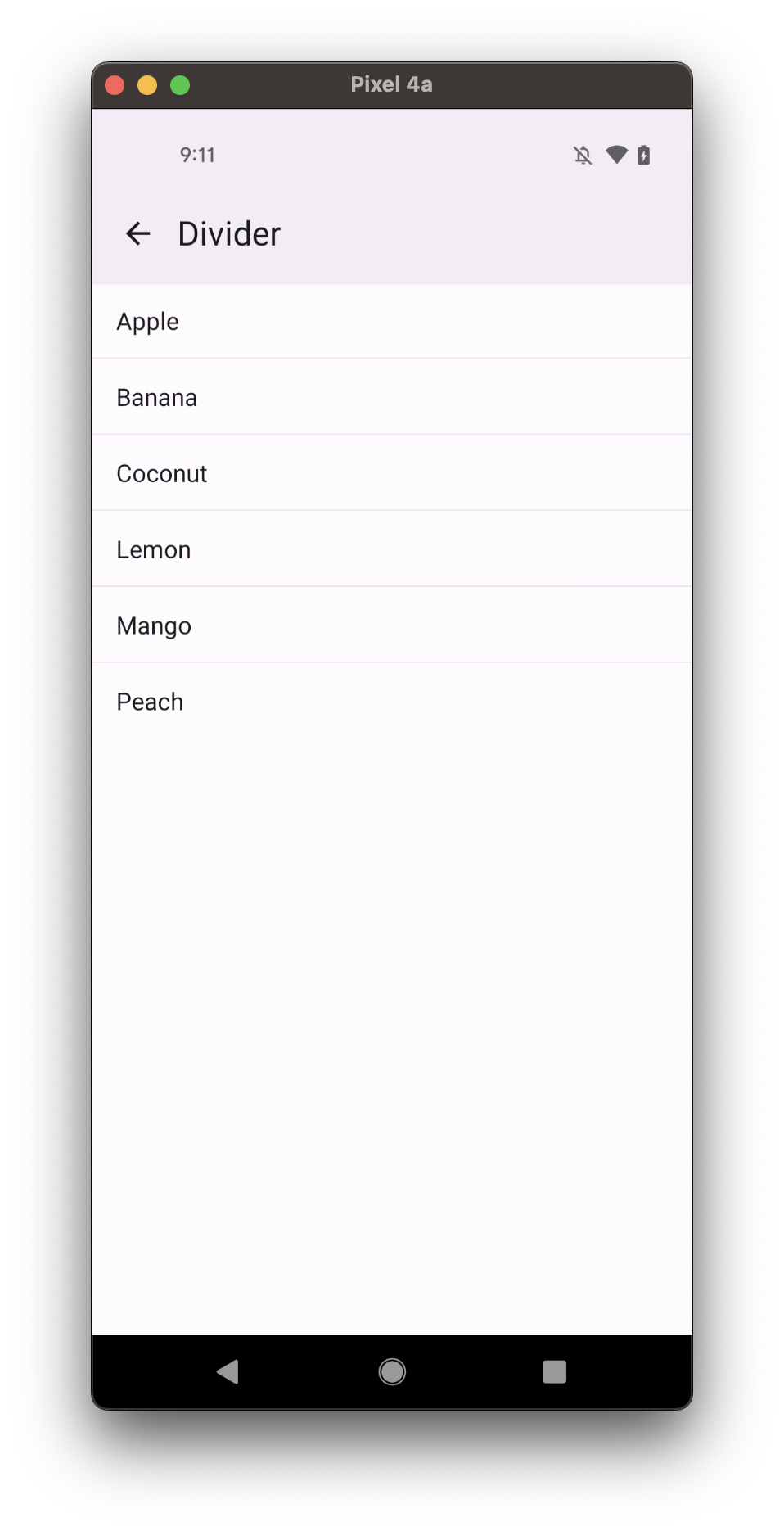
<Text>Lemon</Text>
<Divider />
<Text>Mango</Text>
<Divider />
</View>
);
export default MyComponent;
Props
leftInset Renamed from 'inset' to 'leftInset` in v5.x
Type: boolean
Whether divider has a left inset.
horizontalInset Available in v5.x with theme version 3
Type: boolean
Default value: false
Whether divider has a horizontal inset on both sides.
bold Available in v5.x with theme version 3
Type: boolean
Default value: false
Whether divider should be bolded.
style
Type: StyleProp<ViewStyle>
theme
Type: ThemeProp
Theme colors
info
The table below outlines the theme colors, specifically for MD3 (theme version 3) at the moment.
| mode | dividerColor |
|---|---|
| - | theme.colors.outlineVariant |
tip
If a dedicated prop for a specific color is not available or the style prop does not allow color modification, you can customize it using the theme prop. It allows to override any color, within the component, based on the table above.
Example of overriding primary color:
<Divider theme={{ colors: { primary: 'green' } }} />