List.Accordion
A component used to display an expandable list item.
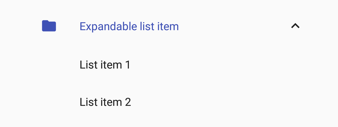
- with left icon
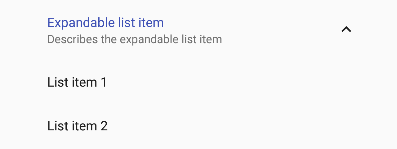
- with description
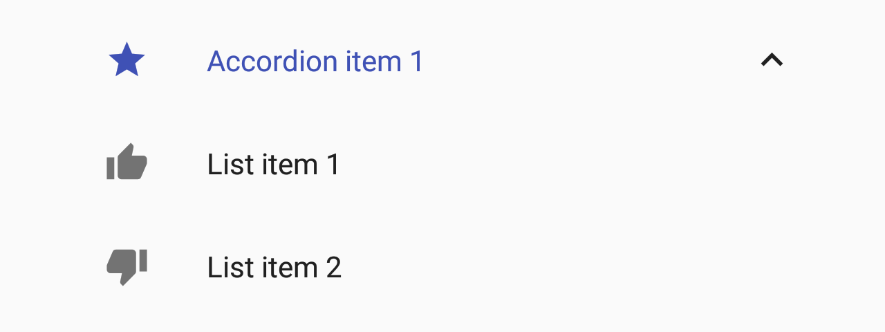
- items with icon


Usage
import * as React from 'react';
import { List } from 'react-native-paper';

const MyComponent = () => {
  const [expanded, setExpanded] = React.useState(true);

  const handlePress = () => setExpanded(!expanded);

  return (
    <List.Section title="Accordions">
      <List.Accordion
        title="Uncontrolled Accordion"
        left={props => <List.Icon {...props} icon="folder" />}>
        <List.Item title="First item" />
        <List.Item title="Second item" />
      </List.Accordion>

      <List.Accordion
        title="Controlled Accordion"
        left={props => <List.Icon {...props} icon="folder" />}
        expanded={expanded}
        onPress={handlePress}>
        <List.Item title="First item" />
        <List.Item title="Second item" />
      </List.Accordion>
    </List.Section>
  );
};

export default MyComponent;
Props
title (required)
Type: React.ReactNode
Title text for the list accordion.
description
Type: React.ReactNode
Description text for the list accordion.
left
Type: (props: { color: string; style: Style }) => React.ReactNode
Callback which returns a React element to display on the left side.
right
Type: (props: { isExpanded: boolean }) => React.ReactNode
Callback which returns a React element to display on the right side.
expanded
Type: boolean
Whether the accordion is expanded
If this prop is provided, the accordion will behave as a "controlled component".
You'll need to update this prop when you want to toggle the component or on onPress.
onPress
Type: (e: GestureResponderEvent) => void
Function to execute on press.
onLongPress
Type: (e: GestureResponderEvent) => void
Function to execute on long press.
delayLongPress
Type: number
The number of milliseconds a user must touch the element before executing onLongPress.
children (required)
Type: React.ReactNode
Content of the section.
theme
Type: ThemeProp
background
Type: PressableAndroidRippleConfig
Type of background drawabale to display the feedback (Android). https://reactnative.dev/docs/pressable#rippleconfig
style
Type: StyleProp<ViewStyle>
Style that is passed to the root TouchableRipple container.
containerStyle
Type: StyleProp<ViewStyle>
Style that is passed to the outermost container that wraps the entire content, including left and right items and both title and description.
contentStyle
Type: StyleProp<ViewStyle>
Style that is passed to the content container, which wraps the title and description.
titleStyle
Type: StyleProp<TextStyle>
Style that is passed to Title element.
descriptionStyle
Type: StyleProp<TextStyle>
Style that is passed to Description element.
rippleColor
Type: ColorValue
Color of the ripple effect.
titleNumberOfLines
Type: number
Default value: 1
Truncate Title text such that the total number of lines does not exceed this number.
descriptionNumberOfLines
Type: number
Default value: 2
Truncate Description text such that the total number of lines does not exceed this number.
titleMaxFontSizeMultiplier
Type: number
Specifies the largest possible scale a title font can reach.
descriptionMaxFontSizeMultiplier
Type: number
Specifies the largest possible scale a description font can reach.
id
Type: string | number
Id is used for distinguishing specific accordion when using List.AccordionGroup. Property is required when using List.AccordionGroup and has no impact on behavior when using standalone List.Accordion.
testID
Type: string
TestID used for testing purposes
accessibilityLabel
Type: string
Accessibility label for the TouchableRipple. This is read by the screen reader when the user taps the touchable.
pointerEvents
Type: ViewProps['pointerEvents']
Default value: 'none'
pointerEvents passed to the View container
hitSlop
Type: TouchableRippleProps['hitSlop']
Amount of space between the touchable area and the edge of the component. This can be used to enlarge the touchable area beyond the visible component.