List.Item
A component to show tiles inside a List.
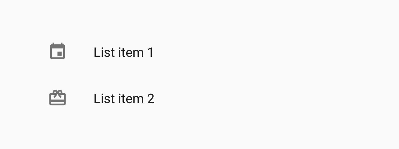
- with left icon
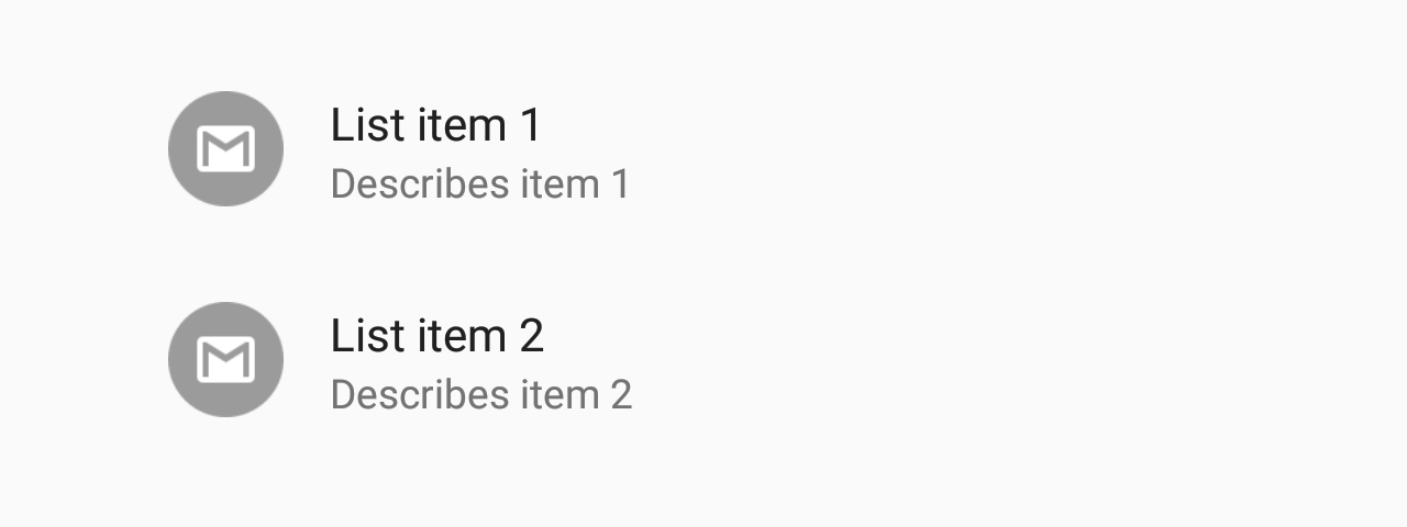
- with description
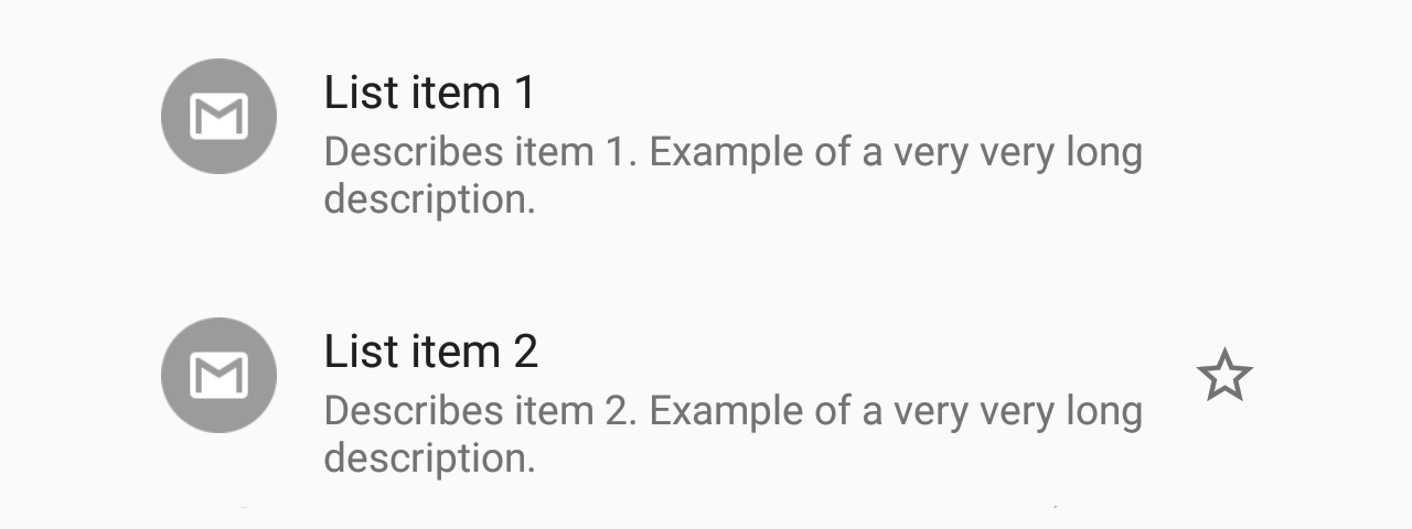
- with right element
Usage
import * as React from 'react';
import { List } from 'react-native-paper';

const MyComponent = () => (
  <List.Item
    title="First Item"
    description="Item description"
    left={props => <List.Icon {...props} icon="folder" />}
  />
);

export default MyComponent;
Props
TouchableRipple props
...TouchableRipple propstitle (required)
Type: | React.ReactNode
| ((props: {
selectable: boolean;
ellipsizeMode: EllipsizeProp | undefined;
color: string;
fontSize: number;
}) => React.ReactNode)
Title text for the list item.
description
Type: | React.ReactNode
| ((props: {
selectable: boolean;
ellipsizeMode: EllipsizeProp | undefined;
color: string;
fontSize: number;
}) => React.ReactNode)
Description text for the list item or callback which returns a React element to display the description.
left
Type: (props: { color: string; style: Style }) => React.ReactNode
Callback which returns a React element to display on the left side.
right
Type: (props: { color: string; style?: Style }) => React.ReactNode
Callback which returns a React element to display on the right side.
onPress
Type: (e: GestureResponderEvent) => void
Function to execute on press.
theme
Type: ThemeProp
style
Type: StyleProp<ViewStyle>
Style that is passed to the root TouchableRipple container.
containerStyle
Type: StyleProp<ViewStyle>
Style that is passed to the outermost container that wraps the entire content, including left and right items and both title and description.
contentStyle
Type: StyleProp<ViewStyle>
Style that is passed to the content container, which wraps the title and description.
titleStyle
Type: StyleProp<TextStyle>
Style that is passed to Title element.
descriptionStyle
Type: StyleProp<TextStyle>
Style that is passed to Description element.
titleNumberOfLines
Type: number
Default value: 1
Truncate Title text such that the total number of lines does not exceed this number.
descriptionNumberOfLines
Type: number
Default value: 2
Truncate Description text such that the total number of lines does not exceed this number.
titleEllipsizeMode
Type: EllipsizeProp
Ellipsize Mode for the Title. One of 'head', 'middle', 'tail', 'clip'.
See ellipsizeMode
descriptionEllipsizeMode
Type: EllipsizeProp
Ellipsize Mode for the Description. One of 'head', 'middle', 'tail', 'clip'.
See ellipsizeMode
titleMaxFontSizeMultiplier
Type: number
Specifies the largest possible scale a title font can reach.
descriptionMaxFontSizeMultiplier
Type: number
Specifies the largest possible scale a description font can reach.
testID
Type: string
TestID used for testing purposes