Modal
The Modal component is a simple way to present content above an enclosing view.
To render the Modal above other components, you'll need to wrap it with the Portal component.
Note that this modal is NOT accessible by default; if you need an accessible modal, please use the React Native Modal.
Usage
import * as React from 'react';
import { Modal, Portal, Text, Button, PaperProvider } from 'react-native-paper';
const MyComponent = () => {
const [visible, setVisible] = React.useState(false);
const showModal = () => setVisible(true);
const hideModal = () => setVisible(false);
const containerStyle = {backgroundColor: 'white', padding: 20};
return (
<PaperProvider>
<Portal>
<Modal visible={visible} onDismiss={hideModal} contentContainerStyle={containerStyle}>
<Text>Example Modal. Click outside this area to dismiss.</Text>
</Modal>
</Portal>
<Button style={{marginTop: 30}} onPress={showModal}>
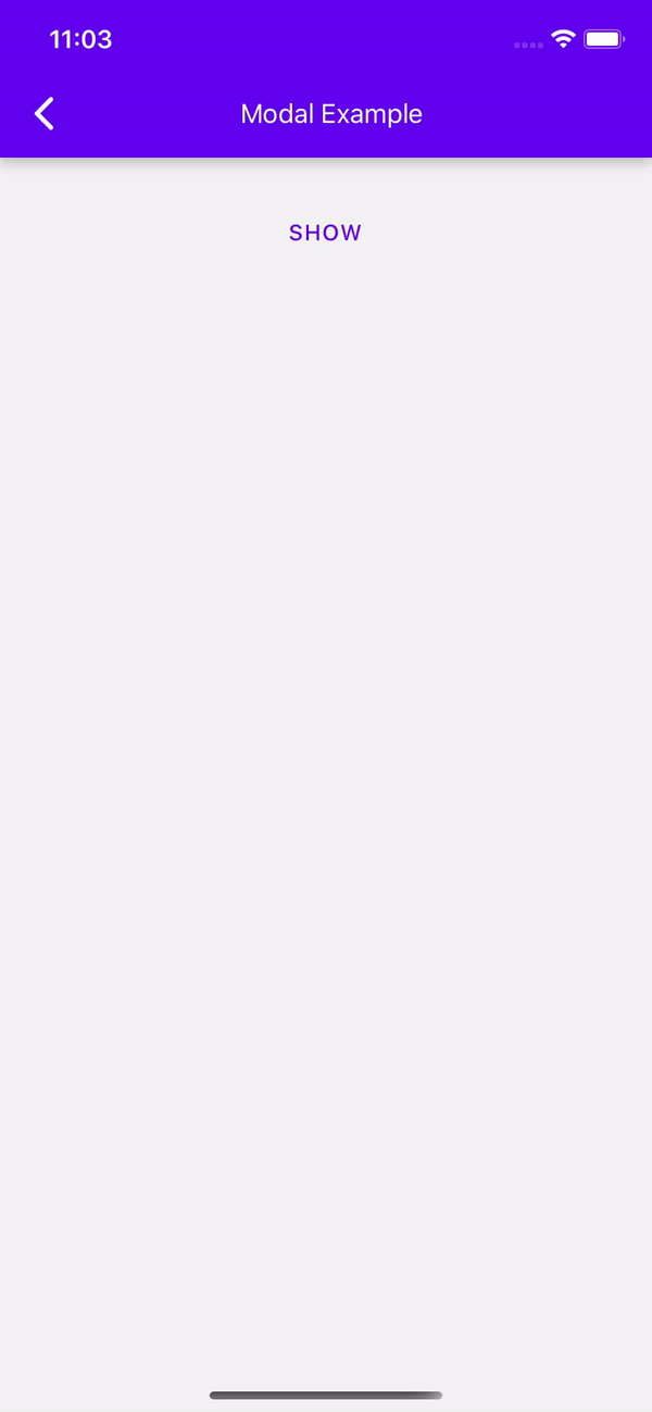
Show
</Button>
</PaperProvider>
);
};
export default MyComponent;
Props
dismissable
Type: boolean
Default value: true
Determines whether clicking outside the modal dismisses it.
dismissableBackButton
Type: boolean
Default value: dismissable
Determines whether clicking Android hardware back button dismisses the dialog.
onDismiss
Type: () => void
Default value: () => {}
Callback that is called when the user dismisses the modal.
overlayAccessibilityLabel
Type: string
Default value: 'Close modal'
Accessibility label for the overlay. This is read by the screen reader when the user taps outside the modal.
visible
Type: boolean
Default value: false
Determines Whether the modal is visible.
children (required)
Type: React.ReactNode
Content of the Modal.
contentContainerStyle
Type: Animated.WithAnimatedValue<StyleProp<ViewStyle>>
Style for the content of the modal
style
Type: StyleProp<ViewStyle>
Style for the wrapper of the modal. Use this prop to change the default wrapper style or to override safe area insets with marginTop and marginBottom.
theme
Type: ThemeProp
testID
Type: string
Default value: 'modal'
testID to be used on tests.
Theme colors
| mode | backgroundColor |
|---|---|
| - | theme.colors.backdrop |
If a dedicated prop for a specific color is not available or the style prop does not allow color modification, you can customize it using the theme prop. It allows to override any color, within the component, based on the table above.
Example of overriding primary color:
<Modal theme={{ colors: { primary: 'green' } }} />