Menu.Item
A component to show a single list item inside a Menu.
Usage
import * as React from 'react';
import { View } from 'react-native';
import { Menu } from 'react-native-paper';
const MyComponent = () => (
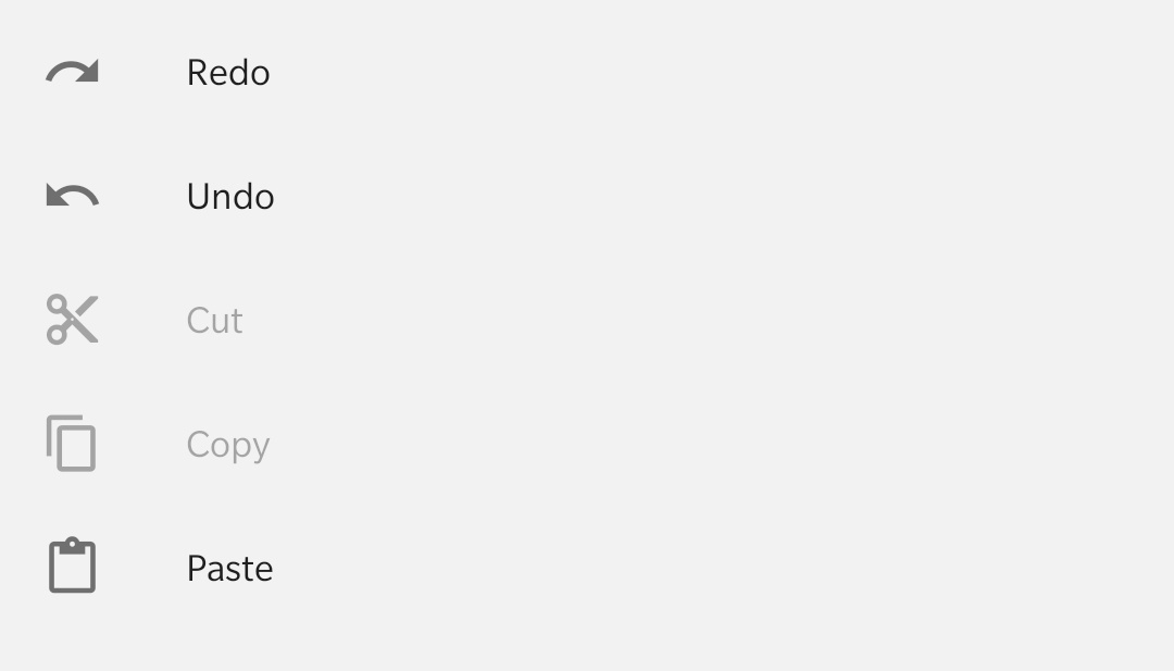
<View style={{ flex: 1 }}>
<Menu.Item leadingIcon="redo" onPress={() => {}} title="Redo" />
<Menu.Item leadingIcon="undo" onPress={() => {}} title="Undo" />
<Menu.Item leadingIcon="content-cut" onPress={() => {}} title="Cut" disabled />
<Menu.Item leadingIcon="content-copy" onPress={() => {}} title="Copy" disabled />
<Menu.Item leadingIcon="content-paste" onPress={() => {}} title="Paste" />
</View>
);
export default MyComponent;
Props
title (required)
Type: React.ReactNode
Title text for the MenuItem.
leadingIcon Renamed from 'icon' to 'leadingIcon' in v5.x
Type: IconSource
Leading icon to display for the MenuItem.
trailingIcon Available in v5.x with theme version 3
Type: IconSource
Trailing icon to display for the MenuItem.
disabled
Type: boolean
Whether the 'item' is disabled. A disabled 'item' is greyed out and onPress is not called on touch.
dense Available in v5.x with theme version 3
Type: boolean
Sets min height with densed layout.
background
Type: PressableAndroidRippleConfig
Type of background drawabale to display the feedback (Android). https://reactnative.dev/docs/pressable#rippleconfig
onPress
Type: (e: GestureResponderEvent) => void
Function to execute on press.
titleMaxFontSizeMultiplier
Type: number
Default value: 1.5
Specifies the largest possible scale a title font can reach.
style
Type: StyleProp<ViewStyle>
Style that is passed to the root TouchableRipple container.
containerStyle
Type: StyleProp<ViewStyle>
Style that is passed to the outermost container that wraps the entire content, including leading and trailing icons and title text.
contentStyle
Type: StyleProp<ViewStyle>
Style that is passed to the content container, which wraps the title text.
titleStyle
Type: StyleProp<TextStyle>
Style that is passed to the Title element.
rippleColor
Type: ColorValue
Color of the ripple effect.
theme
Type: ThemeProp
hitSlop
Type: TouchableRippleProps['hitSlop']
Sets additional distance outside of element in which a press can be detected.
testID
Type: string
Default value: 'menu-item'
TestID used for testing purposes
accessibilityLabel
Type: string
Accessibility label for the Touchable. This is read by the screen reader when the user taps the component.
accessibilityState
Type: AccessibilityState
Accessibility state for the Touchable. This is read by the screen reader when the user taps the component.
Theme colors
| mode | textColor | iconColor |
|---|---|---|
| default | theme.colors.onSurface | theme.colors.onSurfaceVariant |
| disabled | theme.colors.onSurfaceDisabled | theme.colors.onSurfaceDisabled |
If a dedicated prop for a specific color is not available or the style prop does not allow color modification, you can customize it using the theme prop. It allows to override any color, within the component, based on the table above.
Example of overriding primary color:
<Menu.Item theme={{ colors: { primary: 'green' } }} />