TouchableRipple
A wrapper for views that should respond to touches. Provides a material "ink ripple" interaction effect for supported platforms (>= Android Lollipop). On unsupported platforms, it falls back to a highlight effect.
Usage
import * as React from 'react';
import { View } from 'react-native';
import { Text, TouchableRipple } from 'react-native-paper';
const MyComponent = () => (
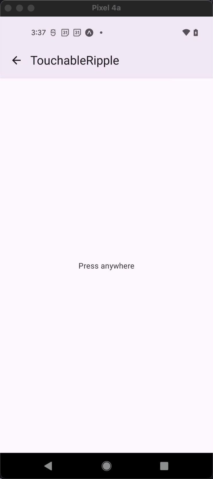
<TouchableRipple
onPress={() => console.log('Pressed')}
rippleColor="rgba(0, 0, 0, .32)"
>
<Text>Press anywhere</Text>
</TouchableRipple>
);
export default MyComponent;
Props
Pressable props
...Pressable propsborderless
Type: boolean
Default value: false
Whether to render the ripple outside the view bounds.
background
Type: Object
Type of background drawabale to display the feedback (Android). https://reactnative.dev/docs/pressable#rippleconfig
centered
Type: boolean
Whether to start the ripple at the center (Web).
disabled
Type: boolean
Whether to prevent interaction with the touchable.
onPress
Type: (e: GestureResponderEvent) => void
Function to execute on press. If not set, will cause the touchable to be disabled.
onLongPress
Type: (e: GestureResponderEvent) => void
Function to execute on long press.
onPressIn
Type: (e: GestureResponderEvent) => void
Function to execute immediately when a touch is engaged, before onPressOut and onPress.
onPressOut
Type: (e: GestureResponderEvent) => void
Function to execute when a touch is released.
rippleColor
Type: ColorValue
Color of the ripple effect (Android >= 5.0 and Web).
underlayColor
Type: string
Color of the underlay for the highlight effect (Android < 5.0 and iOS).
children (required)
Type: | ((state: PressableStateCallbackType) => React.ReactNode)
| React.ReactNode
Content of the TouchableRipple.
style
Type: | StyleProp<ViewStyle>
| ((state: PressableStateCallbackType) => StyleProp<ViewStyle>)
| undefined
theme
Type: ThemeProp