Chip
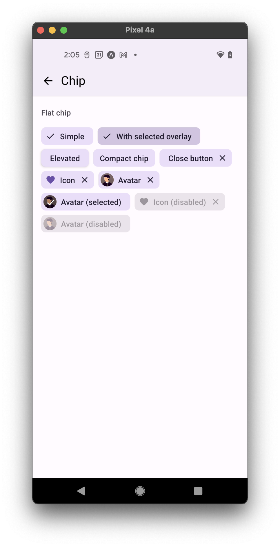
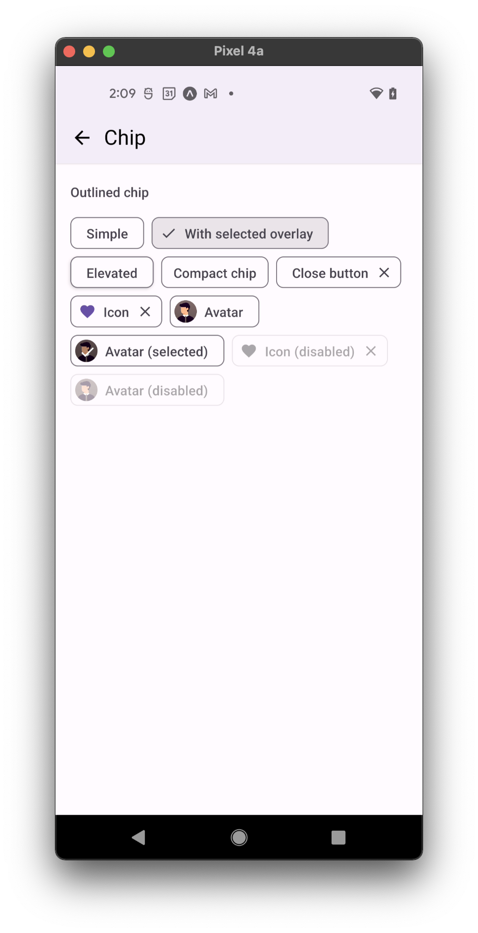
Chips are compact elements that can represent inputs, attributes, or actions. They can have an icon or avatar on the left, and a close button icon on the right. They are typically used to:
- Present multiple options
- Represent attributes active or chosen
- Present filter options
- Trigger actions related to primary content
- flat
- outlined
Usage
import * as React from 'react';
import { Chip } from 'react-native-paper';

const MyComponent = () => (
  <Chip icon="information" onPress={() => console.log('Pressed')}>Example Chip</Chip>
);

export default MyComponent;
Props
mode
Type: 'flat' | 'outlined'
Default value: 'flat'
Mode of the chip.
flat- flat chip without outline.outlined- chip with an outline.
children (required)
Type: React.ReactNode
Text content of the Chip.
icon
Type: IconSource
Icon to display for the Chip. Both icon and avatar cannot be specified.
avatar
Type: React.ReactNode
Avatar to display for the Chip. Both icon and avatar cannot be specified.
closeIcon
Type: IconSource
Icon to display as the close button for the Chip. The icon appears only when the onClose prop is specified.
selected
Type: boolean
Default value: false
Whether chip is selected.
selectedColor
Type: string
Whether to style the chip color as selected.
Note: With theme version 3 selectedColor doesn't apply to the icon.
If you want specify custom color for the icon, render your own Icon component.
showSelectedOverlay Available in v5.x with theme version 3
Type: boolean
Default value: false
Whether to display overlay on selected chip
showSelectedCheck
Type: boolean
Default value: true
Whether to display default check icon on selected chip.
Note: Check will not be shown if icon is specified. If specified, icon will be shown regardless of selected.
rippleColor
Type: ColorValue
Color of the ripple effect.
disabled
Type: boolean
Default value: false
Whether the chip is disabled. A disabled chip is greyed out and onPress is not called on touch.
background
Type: PressableAndroidRippleConfig
Type of background drawabale to display the feedback (Android). https://reactnative.dev/docs/pressable#rippleconfig
accessibilityLabel
Type: string
Accessibility label for the chip. This is read by the screen reader when the user taps the chip.
closeIconAccessibilityLabel
Type: string
Default value: 'Close'
Accessibility label for the close icon. This is read by the screen reader when the user taps the close icon.
onPress
Type: (e: GestureResponderEvent) => void
Function to execute on press.
onLongPress
Type: () => void
Function to execute on long press.
onPressIn
Type: (e: GestureResponderEvent) => void
Function to execute as soon as the touchable element is pressed and invoked even before onPress.
onPressOut
Type: (e: GestureResponderEvent) => void
Function to execute as soon as the touch is released even before onPress.
onClose
Type: () => void
Function to execute on close button press. The close button appears only when this prop is specified.
delayLongPress
Type: number
The number of milliseconds a user must touch the element before executing onLongPress.
compact Available in v5.x with theme version 3
Type: boolean
Sets smaller horizontal paddings 12dp around label, when there is only label.
elevated Available in v5.x with theme version 3
Type: boolean
Default value: false
Whether chip should have the elevation.
textStyle
Type: StyleProp<TextStyle>
Style of chip's text
style
Type: Animated.WithAnimatedValue<StyleProp<ViewStyle>>
theme
Type: ThemeProp
testID
Type: string
Default value: 'chip'
Pass down testID from chip props to touchable for Detox tests.
ellipsizeMode
Type: EllipsizeProp
Ellipsize Mode for the children text
maxFontSizeMultiplier
Type: number
Specifies the largest possible scale a text font can reach.