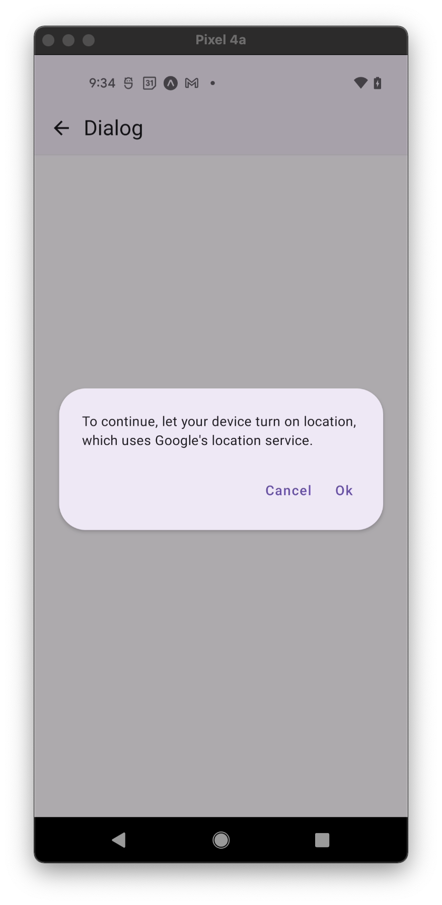
Dialog
Dialogs inform users about a specific task and may contain critical information, require decisions, or involve multiple tasks.
To render the Dialog above other components, you'll need to wrap it with the Portal component.
Usage
import * as React from 'react';
import { View } from 'react-native';
import { Button, Dialog, Portal, PaperProvider, Text } from 'react-native-paper';

const MyComponent = () => {
  const [visible, setVisible] = React.useState(false);

  const showDialog = () => setVisible(true);

  const hideDialog = () => setVisible(false);

  return (
    <PaperProvider>
      <View>
        <Button onPress={showDialog}>Show Dialog</Button>
        <Portal>
          <Dialog visible={visible} onDismiss={hideDialog}>
            <Dialog.Title>Alert</Dialog.Title>
            <Dialog.Content>
              <Text variant="bodyMedium">This is simple dialog</Text>
            </Dialog.Content>
            <Dialog.Actions>
              <Button onPress={hideDialog}>Done</Button>
            </Dialog.Actions>
          </Dialog>
        </Portal>
      </View>
    </PaperProvider>
  );
};

export default MyComponent;
Props
dismissable
Type: boolean
Default value: true
Determines whether clicking outside the dialog dismiss it.
dismissableBackButton
Type: boolean
Default value: dismissable
Determines whether clicking Android hardware back button dismiss dialog.
onDismiss
Type: () => void
Callback that is called when the user dismisses the dialog.
visible
Type: boolean
Default value: false
Determines Whether the dialog is visible.
children (required)
Type: React.ReactNode
Content of the Dialog.
style
Type: Animated.WithAnimatedValue<StyleProp<ViewStyle>>
theme
Type: ThemeProp
testID
Type: string
testID to be used on tests.
Theme colors
| mode | backgroundColor |
|---|---|
| - | theme.colors.elevation.level3 |
If a dedicated prop for a specific color is not available or the style prop does not allow color modification, you can customize it using the theme prop. It allows to override any color, within the component, based on the table above.
Example of overriding primary color:
<Dialog theme={{ colors: { primary: 'green' } }} />