Dialog.Icon
@supported Available in v5.x with theme version 3 A component to show an icon in a Dialog.
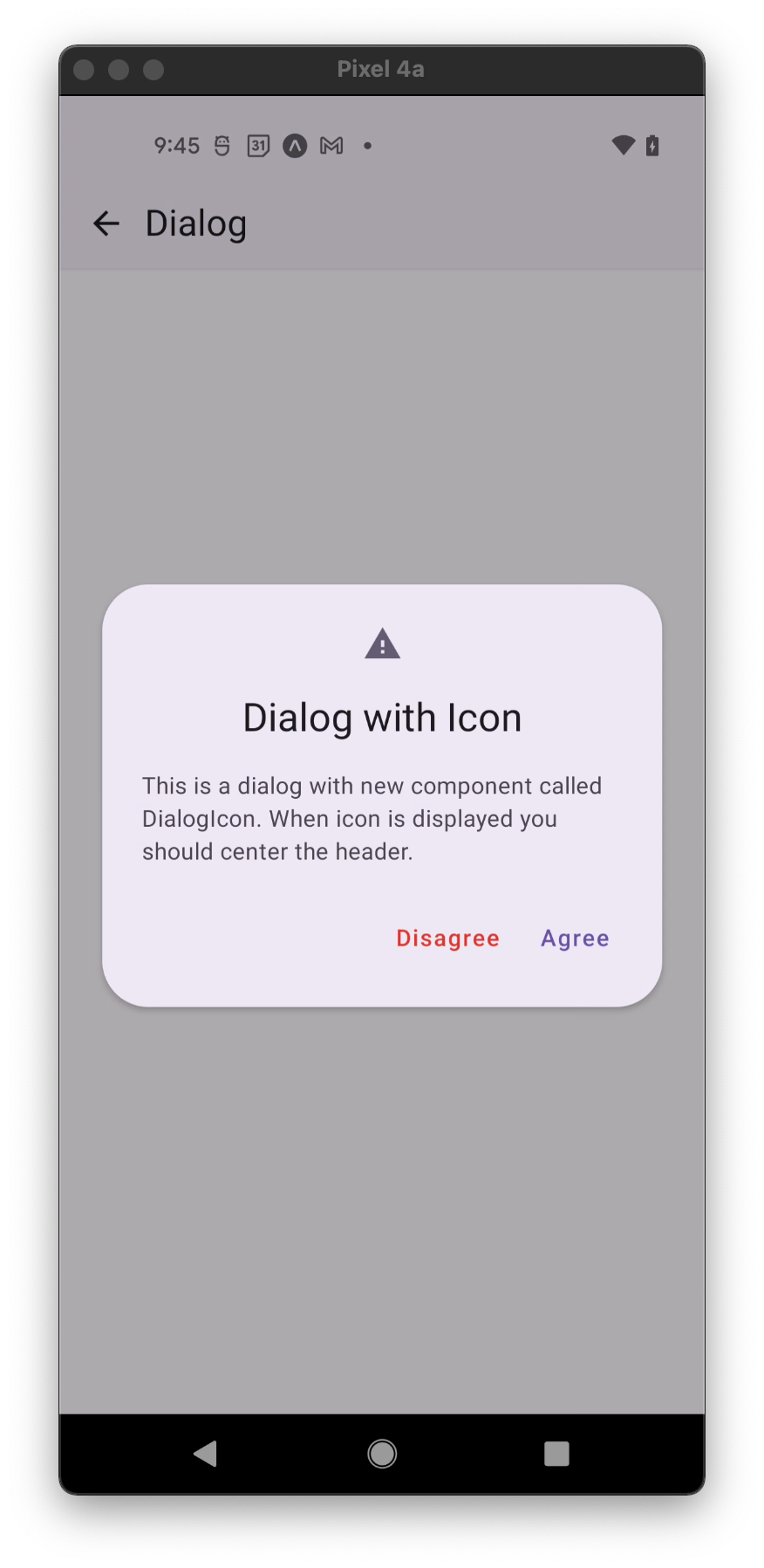
Usage
import * as React from 'react';
import { StyleSheet } from 'react-native';
import { Dialog, Portal, Text } from 'react-native-paper';

const MyComponent = () => {
  const [visible, setVisible] = React.useState(false);

  const hideDialog = () => setVisible(false);

  return (
    <Portal>
      <Dialog visible={visible} onDismiss={hideDialog}>
        <Dialog.Icon icon="alert" />
        <Dialog.Title style={styles.title}>This is a title</Dialog.Title>
        <Dialog.Content>
          <Text variant="bodyMedium">This is simple dialog</Text>
        </Dialog.Content>
      </Dialog>
    </Portal>
  );
};

const styles = StyleSheet.create({
  title: {
    textAlign: 'center',
  },
})

export default MyComponent;
Props
color
Type: string
Custom color for action icon.
icon (required)
Type: IconSource
Name of the icon to show.
size
Type: number
Default value: 24
Optional icon size.
theme
Type: ThemeProp
Theme colors
info
The table below outlines the theme colors, specifically for MD3 (theme version 3) at the moment.
| mode | iconColor |
|---|---|
| - | theme.colors.secondary |
tip
If a dedicated prop for a specific color is not available or the style prop does not allow color modification, you can customize it using the theme prop. It allows to override any color, within the component, based on the table above.
Example of overriding primary color:
<Dialog.Icon theme={{ colors: { primary: 'green' } }} />