Checkbox
Checkboxes allow the selection of multiple options from a set.
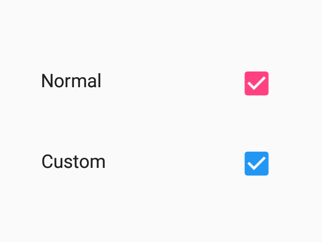
- Android (enabled)
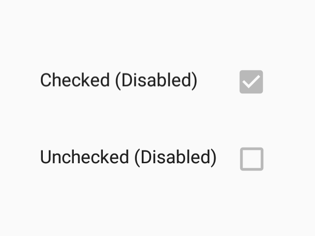
- Android (disabled)
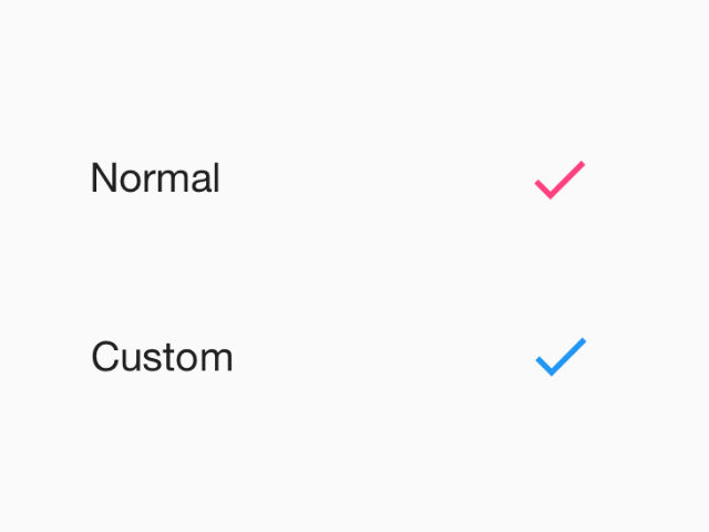
- iOS (enabled)
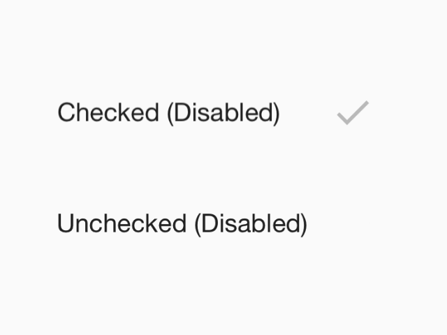
- iOS (disabled)
Usage
import * as React from 'react';
import { Checkbox } from 'react-native-paper';

const MyComponent = () => {
  const [checked, setChecked] = React.useState(false);

  return (
    <Checkbox
      status={checked ? 'checked' : 'unchecked'}
      onPress={() => {
        setChecked(!checked);
      }}
    />
  );
};

export default MyComponent;
Props
status (required)
Type: 'checked' | 'unchecked' | 'indeterminate'
Status of checkbox.
disabled
Type: boolean
Whether checkbox is disabled.
onPress
Type: (e: GestureResponderEvent) => void
Function to execute on press.
uncheckedColor
Type: string
Custom color for unchecked checkbox.
color
Type: string
Custom color for checkbox.
theme
Type: ThemeProp
testID
Type: string
testID to be used on tests.