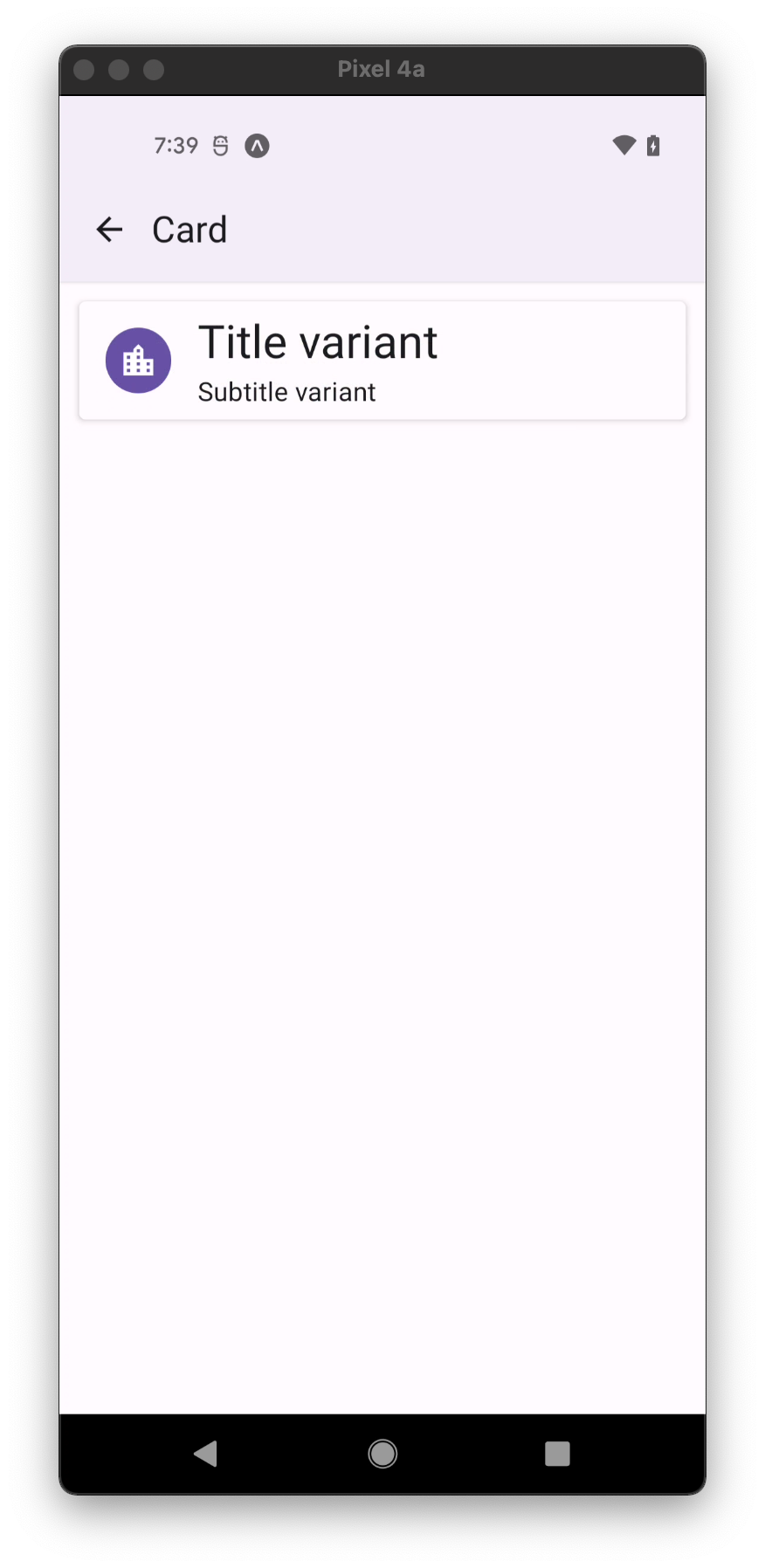
Card.Title
A component to show a title, subtitle and an avatar inside a Card.
Usage
import * as React from 'react';
import { Avatar, Card, IconButton } from 'react-native-paper';

const MyComponent = () => (
  <Card.Title
    title="Card Title"
    subtitle="Card Subtitle"
    left={(props) => <Avatar.Icon {...props} icon="folder" />}
    right={(props) => <IconButton {...props} icon="dots-vertical" onPress={() => {}} />}
  />
);

export default MyComponent;
Props
title (required)
Type: React.ReactNode
Text for the title. Note that this will only accept a string or <Text>-based node.
titleStyle
Type: StyleProp<TextStyle>
Style for the title.
titleNumberOfLines
Type: number
Default value: 1
Number of lines for the title.
titleVariant Available in v5.x with theme version 3
Type: unknown
Default value: 'bodyLarge'
Title text variant defines appropriate text styles for type role and its size. Available variants:
Display: displayLarge, displayMedium, displaySmall
Headline: headlineLarge, headlineMedium, headlineSmall
Title: titleLarge, titleMedium, titleSmall
Label: labelLarge, labelMedium, labelSmall
Body: bodyLarge, bodyMedium, bodySmall
subtitle
Type: React.ReactNode
Text for the subtitle. Note that this will only accept a string or <Text>-based node.
subtitleStyle
Type: StyleProp<TextStyle>
Style for the subtitle.
subtitleNumberOfLines
Type: number
Default value: 1
Number of lines for the subtitle.
subtitleVariant Available in v5.x with theme version 3
Type: unknown
Default value: 'bodyMedium'
Subtitle text variant defines appropriate text styles for type role and its size. Available variants:
Display: displayLarge, displayMedium, displaySmall
Headline: headlineLarge, headlineMedium, headlineSmall
Title: titleLarge, titleMedium, titleSmall
Label: labelLarge, labelMedium, labelSmall
Body: bodyLarge, bodyMedium, bodySmall
left
Type: (props: { size: number }) => React.ReactNode
Callback which returns a React element to display on the left side.
leftStyle
Type: StyleProp<ViewStyle>
Style for the left element wrapper.
right
Type: (props: { size: number }) => React.ReactNode
Callback which returns a React element to display on the right side.
rightStyle
Type: StyleProp<ViewStyle>
Style for the right element wrapper.
titleMaxFontSizeMultiplier
Type: number
Specifies the largest possible scale a title font can reach.
subtitleMaxFontSizeMultiplier
Type: number
Specifies the largest possible scale a subtitle font can reach.
style
Type: StyleProp<ViewStyle>
theme
Type: ThemeProp