FAB
A floating action button represents the primary action on a screen. It appears in front of all screen content.
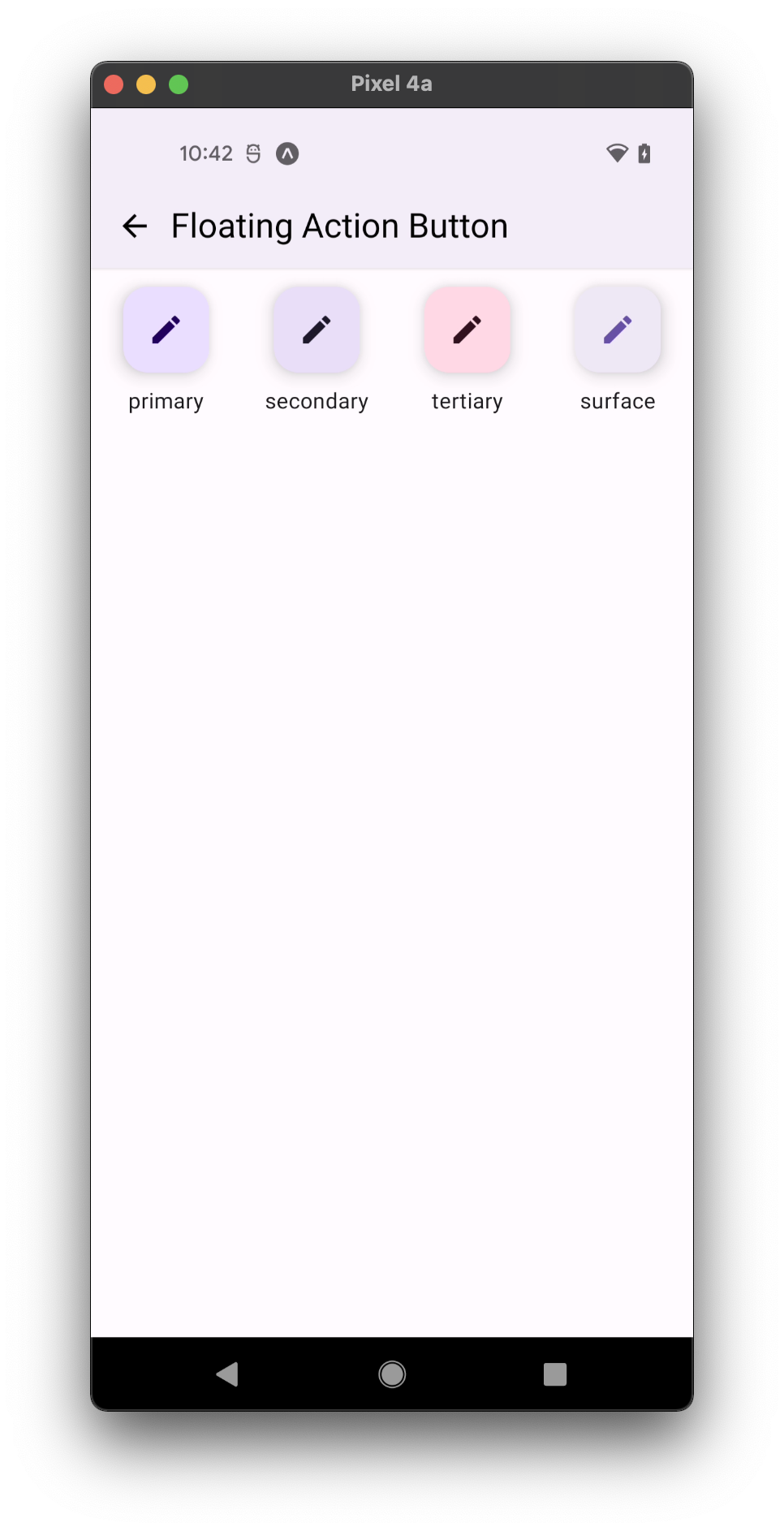
- all variants
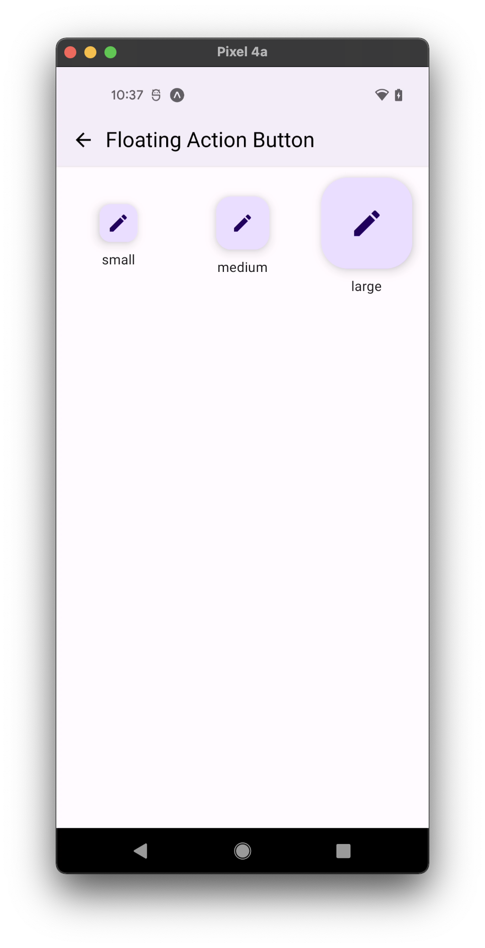
- all sizes
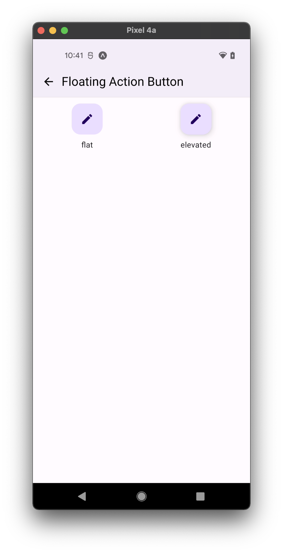
- all modes
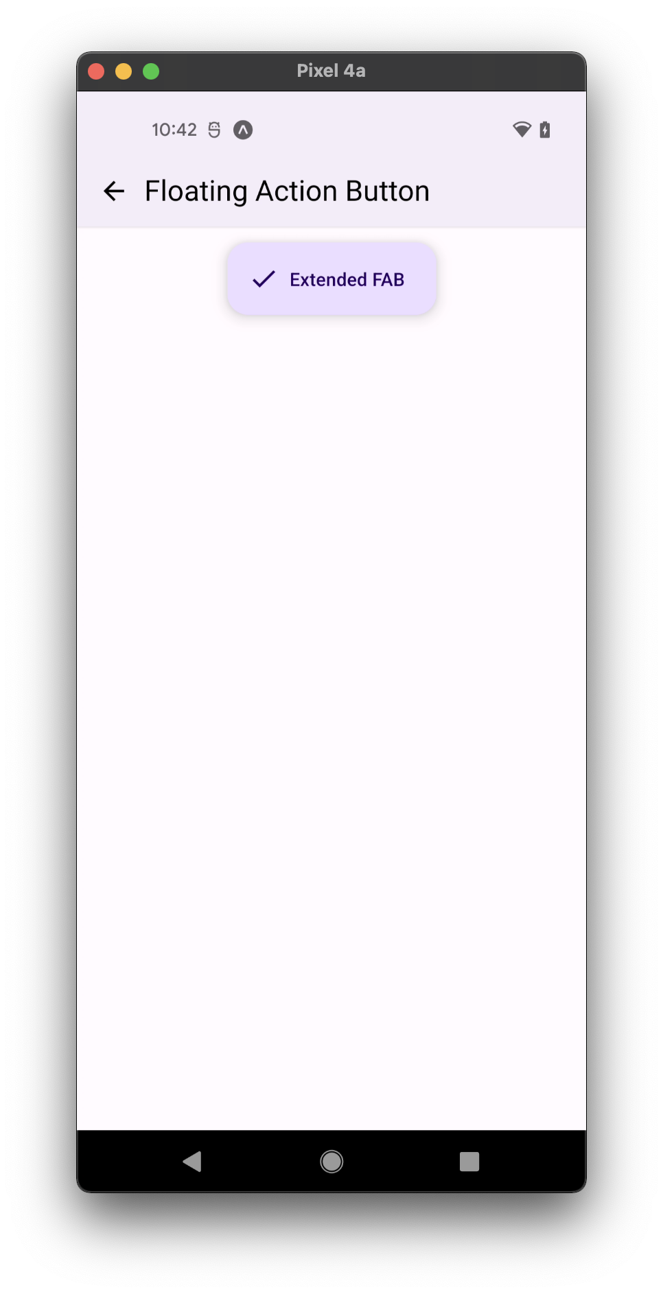
- with label
Usage
import * as React from 'react';
import { StyleSheet } from 'react-native';
import { FAB } from 'react-native-paper';

const MyComponent = () => (
  <FAB
    icon="plus"
    style={styles.fab}
    onPress={() => console.log('Pressed')}
  />
);

const styles = StyleSheet.create({
  fab: {
    position: 'absolute',
    margin: 16,
    right: 0,
    bottom: 0,
  },
})

export default MyComponent;
Props
icon
Type: IconSource
Icon to display for the FAB. It's optional only if label is defined.
label
Type: string
Optional label for extended FAB. It's optional only if icon is defined.
uppercase
Type: boolean
Make the label text uppercased.
background
Type: PressableAndroidRippleConfig
Type of background drawabale to display the feedback (Android). https://reactnative.dev/docs/pressable#rippleconfig
accessibilityLabel
Type: string
Default value: label
Accessibility label for the FAB. This is read by the screen reader when the user taps the FAB.
Uses label by default if specified.
accessibilityState
Type: AccessibilityState
Accessibility state for the FAB. This is read by the screen reader when the user taps the FAB.
animated
Type: boolean
Default value: true
Whether an icon change is animated.
small Deprecated in v.5x - use prop size="small".
Type: boolean
Whether FAB is mini-sized, used to create visual continuity with other elements. This has no effect if label is specified.
color
Type: string
Custom color for the icon and label of the FAB.
rippleColor
Type: ColorValue
Color of the ripple effect.
disabled
Type: boolean
Whether FAB is disabled. A disabled button is greyed out and onPress is not called on touch.
visible
Type: boolean
Default value: true
Whether FAB is currently visible.
loading
Type: boolean
Whether to show a loading indicator.
onPress
Type: (e: GestureResponderEvent) => void
Function to execute on press.
onLongPress
Type: (e: GestureResponderEvent) => void
Function to execute on long press.
delayLongPress
Type: number
The number of milliseconds a user must touch the element before executing onLongPress.
size Available in v5.x with theme version 3
Type: 'small' | 'medium' | 'large'
Default value: 'medium'
Size of the FAB.
small- FAB with small height (40).medium- FAB with default medium height (56).large- FAB with large height (96).
customSize
Type: number
Custom size for the FAB. This prop takes precedence over size prop
mode Available in v5.x with theme version 3
Type: 'flat' | 'elevated'
Default value: 'elevated'
Mode of the FAB. You can change the mode to adjust the the shadow:
flat- button without a shadow.elevated- button with a shadow.
variant Available in v5.x with theme version 3
Type: 'primary' | 'secondary' | 'tertiary' | 'surface'
Default value: 'primary'
Color mappings variant for combinations of container and icon colors.
labelMaxFontSizeMultiplier
Type: number
Specifies the largest possible scale a label font can reach.
style
Type: Animated.WithAnimatedValue<StyleProp<ViewStyle>>
theme
Type: ThemeProp
testID
Type: string
Default value: 'fab'
TestID used for testing purposes
ref
Type: React.RefObject<View>
Theme colors
| mode | backgroundColor | textColor/iconColor |
|---|---|---|
| disabled | theme.colors.surfaceDisabled | theme.colors.onSurfaceDisabled |
| primary | theme.colors.primaryContainer | theme.colors.onPrimaryContainer |
| secondary | theme.colors.secondaryContainer | theme.colors.onSecondaryContainer |
| tertiary | theme.colors.tertiaryContainer | theme.colors.onTertiaryContainer |
| surface | theme.colors.elevarion.level3 | theme.colors.primary |
If a dedicated prop for a specific color is not available or the style prop does not allow color modification, you can customize it using the theme prop. It allows to override any color, within the component, based on the table above.
Example of overriding primary color:
<FAB theme={{ colors: { primary: 'green' } }} />