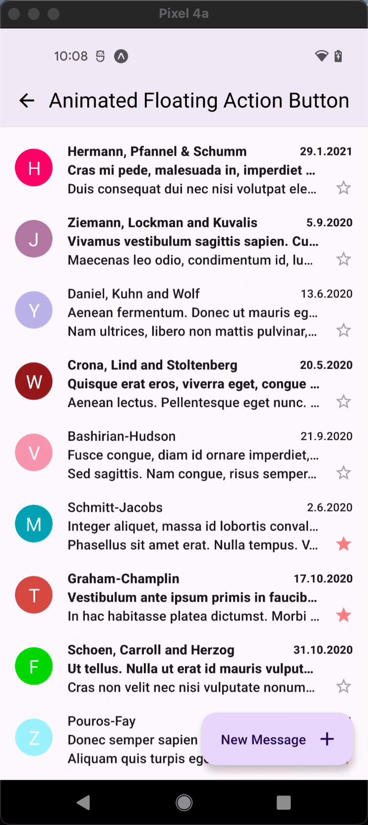
AnimatedFAB
An animated, extending horizontally floating action button represents the primary action in an application.
Usage
import React from 'react';
import {
  StyleProp,
  ViewStyle,
  Animated,
  StyleSheet,
  Platform,
  ScrollView,
  Text,
  SafeAreaView,
  I18nManager,
} from 'react-native';
import { AnimatedFAB } from 'react-native-paper';

const MyComponent = ({
  animatedValue,
  visible,
  extended,
  label,
  animateFrom,
  style,
  iconMode,
}) => {
  const [isExtended, setIsExtended] = React.useState(true);

  const isIOS = Platform.OS === 'ios';

  const onScroll = ({ nativeEvent }) => {
    const currentScrollPosition =
      Math.floor(nativeEvent?.contentOffset?.y) ?? 0;

    setIsExtended(currentScrollPosition <= 0);
  };

  const fabStyle = { [animateFrom]: 16 };

  return (
    <SafeAreaView style={styles.container}>
      <ScrollView onScroll={onScroll}>
        {[...new Array(100).keys()].map((_, i) => (
          <Text>{i}</Text>
        ))}
      </ScrollView>
      <AnimatedFAB
        icon={'plus'}
        label={'Label'}
        extended={isExtended}
        onPress={() => console.log('Pressed')}
        visible={visible}
        animateFrom={'right'}
        iconMode={'static'}
        style={[styles.fabStyle, style, fabStyle]}
      />
    </SafeAreaView>
  );
};

export default MyComponent;

const styles = StyleSheet.create({
  container: {
    flexGrow: 1,
  },
  fabStyle: {
    bottom: 16,
    right: 16,
    position: 'absolute',
  },
});
Props
icon (required)
Type: IconSource
Icon to display for the FAB.
label (required)
Type: string
Label for extended FAB.
uppercase
Type: boolean
Make the label text uppercased.
background
Type: PressableAndroidRippleConfig
Type of background drawabale to display the feedback (Android). https://reactnative.dev/docs/pressable#rippleconfig
accessibilityLabel
Type: string
Default value: label
Accessibility label for the FAB. This is read by the screen reader when the user taps the FAB.
Uses label by default if specified.
accessibilityState
Type: AccessibilityState
Accessibility state for the FAB. This is read by the screen reader when the user taps the FAB.
color
Type: string
Custom color for the icon and label of the FAB.
rippleColor
Type: ColorValue
Color of the ripple effect.
disabled
Type: boolean
Whether FAB is disabled. A disabled button is greyed out and onPress is not called on touch.
visible
Type: boolean
Default value: true
Whether FAB is currently visible.
onPress
Type: (e: GestureResponderEvent) => void
Function to execute on press.
onLongPress
Type: (e: GestureResponderEvent) => void
Function to execute on long press.
delayLongPress
Type: number
The number of milliseconds a user must touch the element before executing onLongPress.
iconMode
Type: 'static' | 'dynamic'
Default value: 'dynamic'
Whether icon should be translated to the end of extended FAB or be static and stay in the same place. The default value is dynamic.
animateFrom
Type: 'left' | 'right'
Default value: 'right'
Indicates from which direction animation should be performed. The default value is right.
extended
Type: boolean
Default value: false
Whether FAB should start animation to extend.
labelMaxFontSizeMultiplier
Type: number
Specifies the largest possible scale a label font can reach.
variant Available in v5.x with theme version 3
Type: 'primary' | 'secondary' | 'tertiary' | 'surface'
Default value: 'primary'
Color mappings variant for combinations of container and icon colors.
style
Type: Animated.WithAnimatedValue<StyleProp<ViewStyle>>
hitSlop
Type: TouchableRippleProps['hitSlop']
Sets additional distance outside of element in which a press can be detected.
theme
Type: ThemeProp
testID
Type: string
Default value: 'animated-fab'
TestID used for testing purposes
Theme colors
| mode | backgroundColor | textColor/iconColor |
|---|---|---|
| disabled | theme.colors.surfaceDisabled | theme.colors.onSurfaceDisabled |
| primary | theme.colors.primaryContainer | theme.colors.onPrimaryContainer |
| secondary | theme.colors.secondaryContainer | theme.colors.onSecondaryContainer |
| tertiary | theme.colors.tertiaryContainer | theme.colors.onTertiaryContainer |
| surface | theme.colors.elevarion.level3 | theme.colors.primary |
If a dedicated prop for a specific color is not available or the style prop does not allow color modification, you can customize it using the theme prop. It allows to override any color, within the component, based on the table above.
Example of overriding primary color:
<AnimatedFAB theme={{ colors: { primary: 'green' } }} />