Text
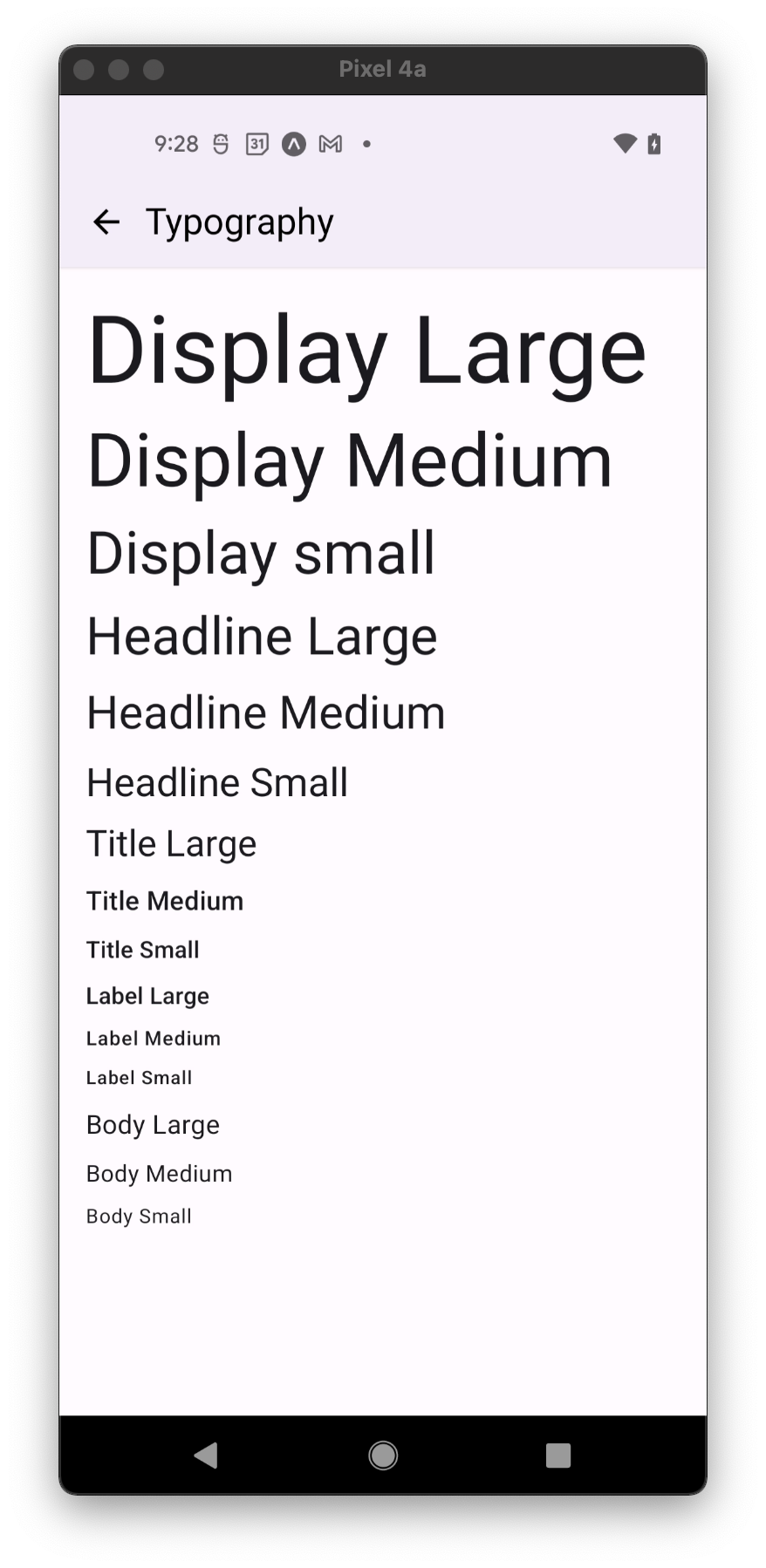
Typography component showing styles complied with passed variant prop and supported by the type system.
Usage
import * as React from 'react';
import { Text } from 'react-native-paper';

const MyComponent = () => (
  <>
    <Text variant="displayLarge">Display Large</Text>
    <Text variant="displayMedium">Display Medium</Text>
    <Text variant="displaySmall">Display small</Text>

    <Text variant="headlineLarge">Headline Large</Text>
    <Text variant="headlineMedium">Headline Medium</Text>
    <Text variant="headlineSmall">Headline Small</Text>

    <Text variant="titleLarge">Title Large</Text>
    <Text variant="titleMedium">Title Medium</Text>
    <Text variant="titleSmall">Title Small</Text>

    <Text variant="bodyLarge">Body Large</Text>
    <Text variant="bodyMedium">Body Medium</Text>
    <Text variant="bodySmall">Body Small</Text>

    <Text variant="labelLarge">Label Large</Text>
    <Text variant="labelMedium">Label Medium</Text>
    <Text variant="labelSmall">Label Small</Text>
 </>
);

export default MyComponent;
Props
Text props
...Text propsvariant Available in v5.x with theme version 3
Type: VariantProp<T>
Variant defines appropriate text styles for type role and its size. Available variants:
Display: displayLarge, displayMedium, displaySmall
Headline: headlineLarge, headlineMedium, headlineSmall
Title: titleLarge, titleMedium, titleSmall
Label: labelLarge, labelMedium, labelSmall
Body: bodyLarge, bodyMedium, bodySmall
children (required)
Type: React.ReactNode
theme
Type: ThemeProp
style
Type: StyleProp<TextStyle>
Theme colors
| mode | textColor |
|---|---|
| - | theme.colors.onSurface |
If a dedicated prop for a specific color is not available or the style prop does not allow color modification, you can customize it using the theme prop. It allows to override any color, within the component, based on the table above.
Example of overriding primary color:
<Text theme={{ colors: { primary: 'green' } }} />