IconButton
An icon button is a button which displays only an icon without a label.
- default
- outlined
- contained
- contained-tonal
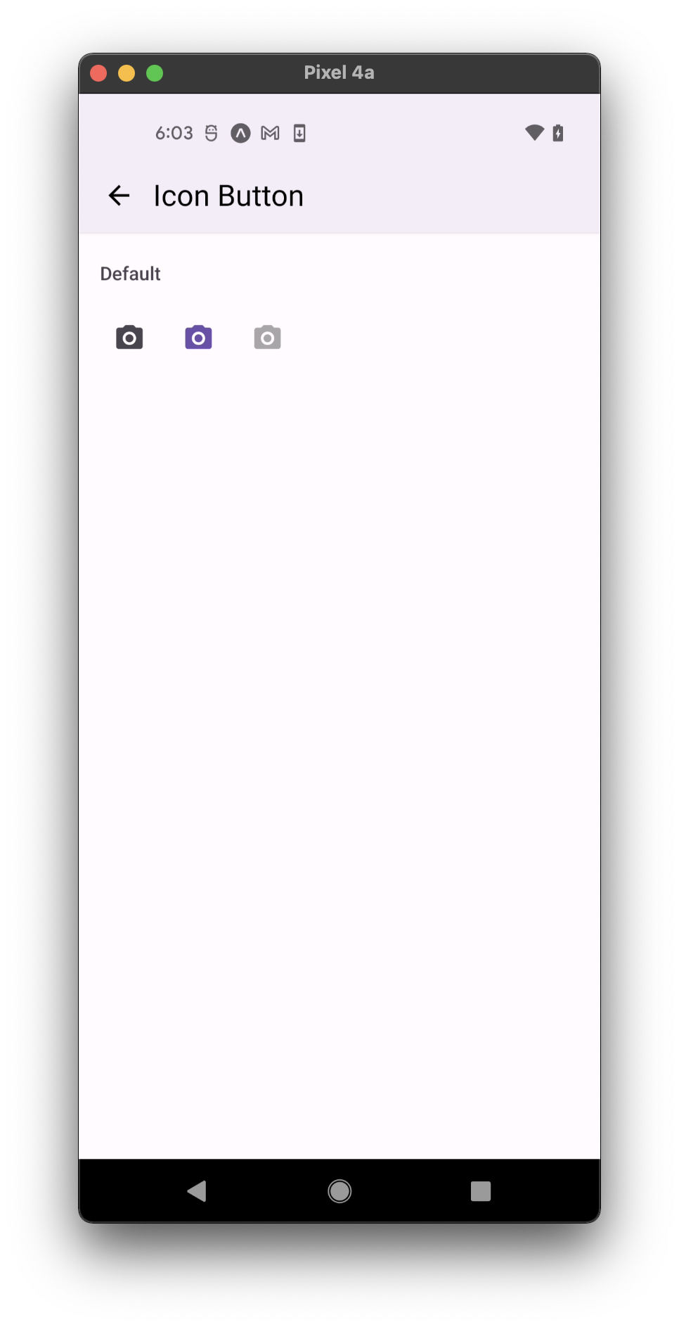
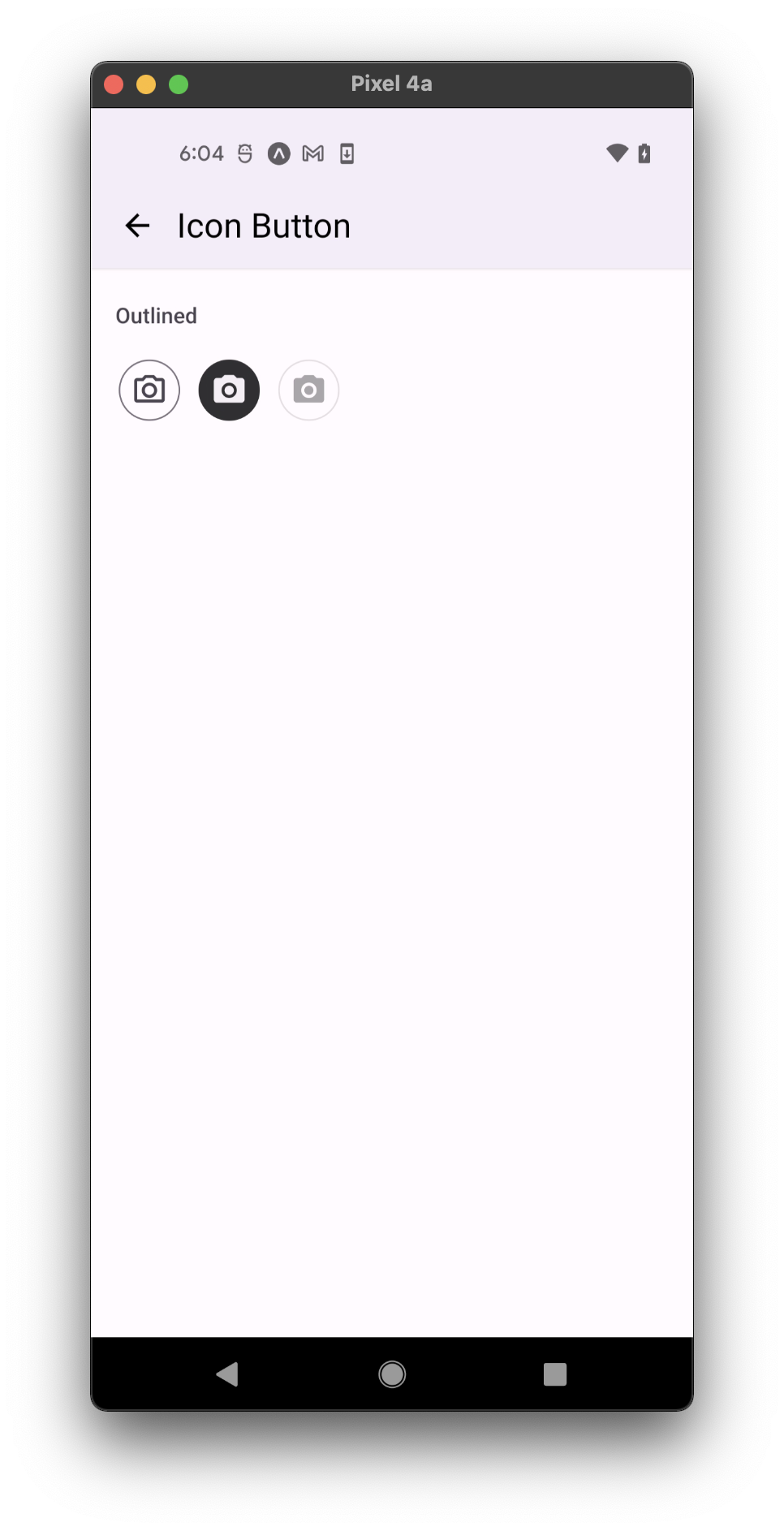
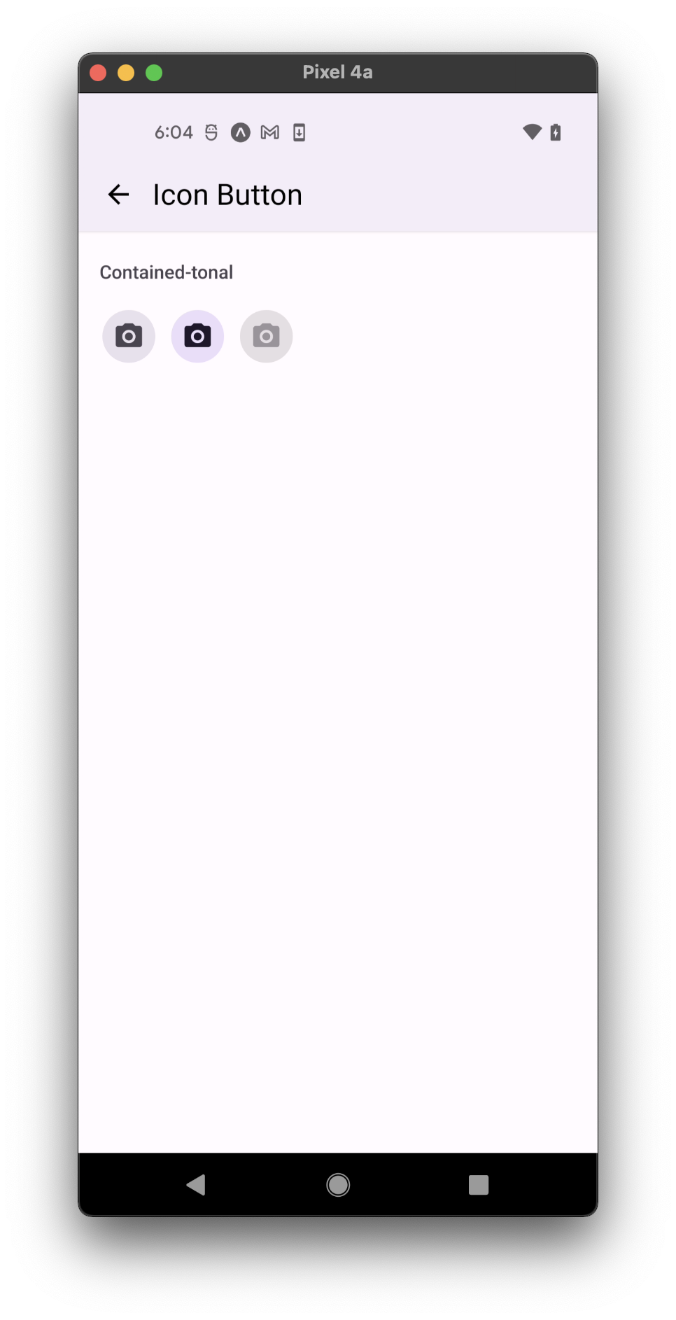
Usage
import * as React from 'react';
import { IconButton, MD3Colors } from 'react-native-paper';

const MyComponent = () => (
  <IconButton
    icon="camera"
    iconColor={MD3Colors.error50}
    size={20}
    onPress={() => console.log('Pressed')}
  />
);

export default MyComponent;
Props
TouchableRipple props
...TouchableRipple propsicon (required)
Type: IconSource
Icon to display.
mode Available in v5.x with theme version 3
Type: 'outlined' | 'contained' | 'contained-tonal'
Mode of the icon button. By default there is no specified mode - only pressable icon will be rendered.
iconColor Renamed from 'color' to 'iconColor' in v5.x
Type: string
Color of the icon.
containerColor
Type: string
Background color of the icon container.
rippleColor
Type: ColorValue
Color of the ripple effect.
selected Available in v5.x with theme version 3
Type: boolean
Default value: false
Whether icon button is selected. A selected button receives alternative combination of icon and container colors.
size
Type: number
Default value: 24
Size of the icon.
disabled
Type: boolean
Whether the button is disabled. A disabled button is greyed out and onPress is not called on touch.
animated
Type: boolean
Default value: false
Whether an icon change is animated.
accessibilityLabel
Type: string
Accessibility label for the button. This is read by the screen reader when the user taps the button.
contentStyle
Type: StyleProp<ViewStyle>
Style of button's inner content. Use this prop to apply custom height and width or to set a custom padding`.
onPress
Type: (e: GestureResponderEvent) => void
Function to execute on press.
style
Type: Animated.WithAnimatedValue<StyleProp<ViewStyle>>
ref
Type: React.RefObject<View>
testID
Type: string
Default value: 'icon-button'
TestID used for testing purposes
theme
Type: ThemeProp
loading
Type: boolean
Default value: false
Whether to show a loading indicator.
Theme colors
- selected
- unselected
- disabled
| mode | iconColor | backgroundColor | borderColor |
|---|---|---|---|
| default | theme.colors.primary | ||
| outlined | theme.colors.inverseOnSurface | theme.colors.inverseSurface | |
| contained | theme.colors.onPrimary | theme.colors.primary | |
| contained-tonal | theme.colors.onSecondaryContainer | theme.colors.secondaryContainer |
| mode | iconColor | backgroundColor | borderColor |
|---|---|---|---|
| default | theme.colors.onSurfaceVariant | ||
| outlined | theme.colors.onSurfaceVariant | theme.colors.outline | |
| contained | theme.colors.primary | theme.colors.surfaceVariant | |
| contained-tonal | theme.colors.onSurfaceVariant | theme.colors.surfaceVariant |
| mode | iconColor | backgroundColor | borderColor |
|---|---|---|---|
| default | theme.colors.onSurfaceDisabled | ||
| outlined | theme.colors.onSurfaceDisabled | theme.colors.surfaceDisabled | theme.colors.surfaceDisabled |
| contained | theme.colors.onSurfaceDisabled | theme.colors.surfaceDisabled | |
| contained-tonal | theme.colors.onSurfaceDisabled | theme.colors.surfaceDisabled |
If a dedicated prop for a specific color is not available or the style prop does not allow color modification, you can customize it using the theme prop. It allows to override any color, within the component, based on the table above.
Example of overriding primary color:
<IconButton theme={{ colors: { primary: 'green' } }} />