Button
A button is component that the user can press to trigger an action.
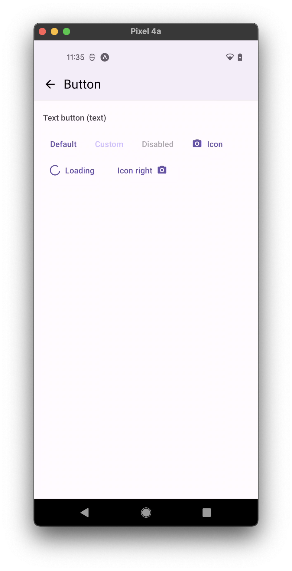
- text
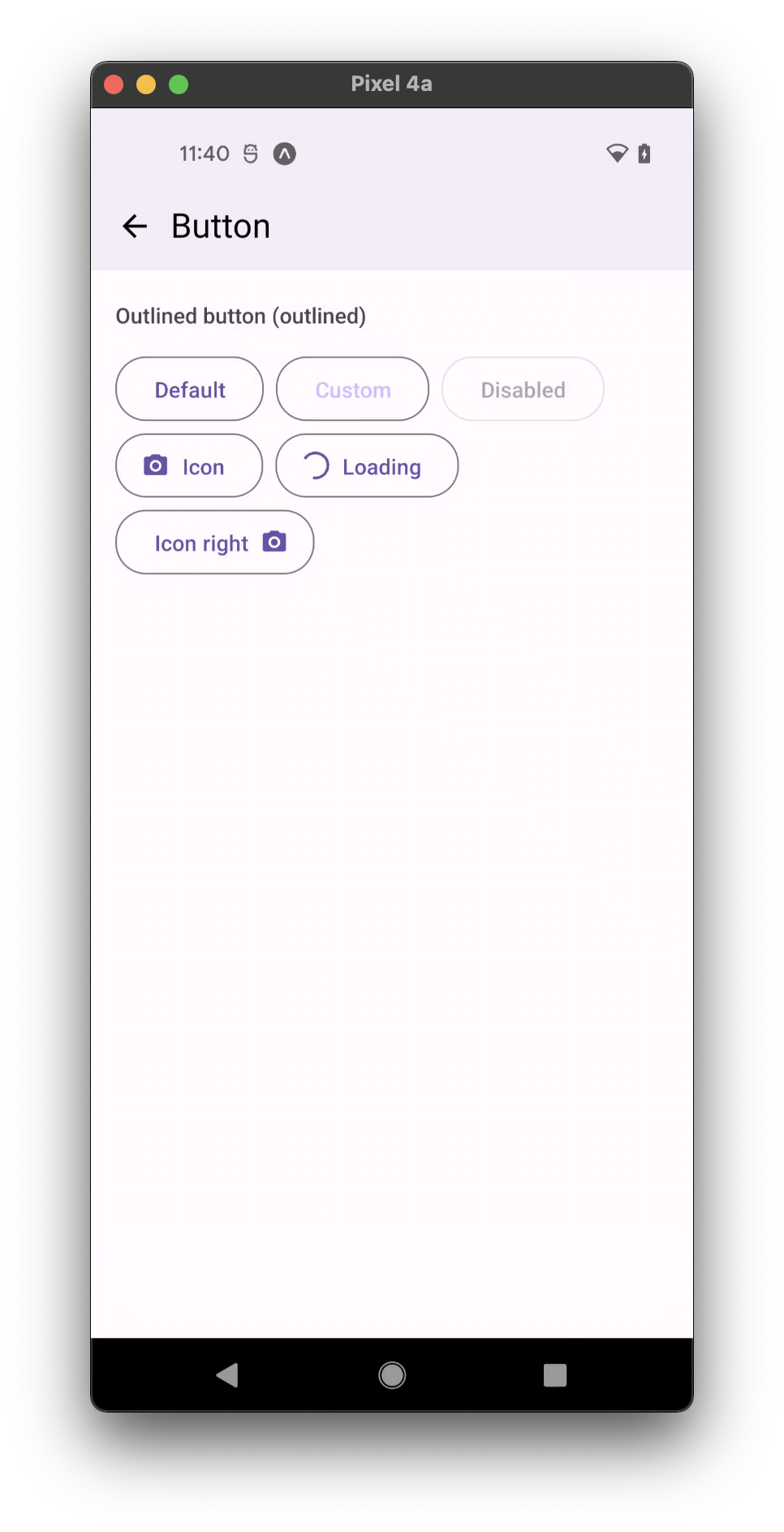
- outlined
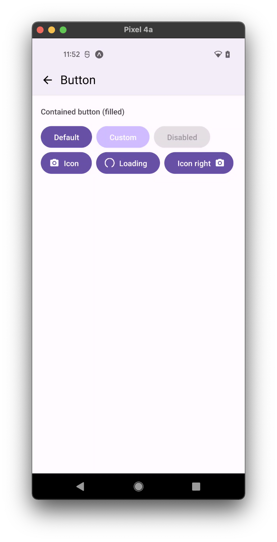
- contained
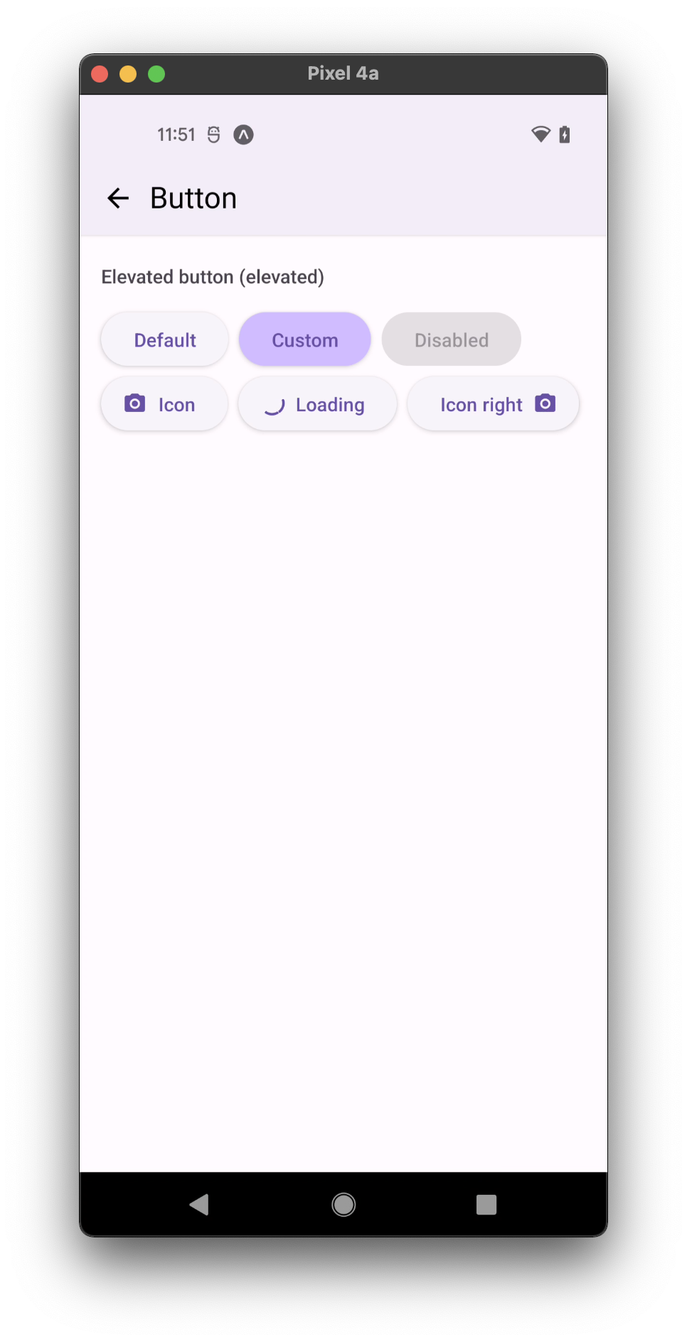
- elevated
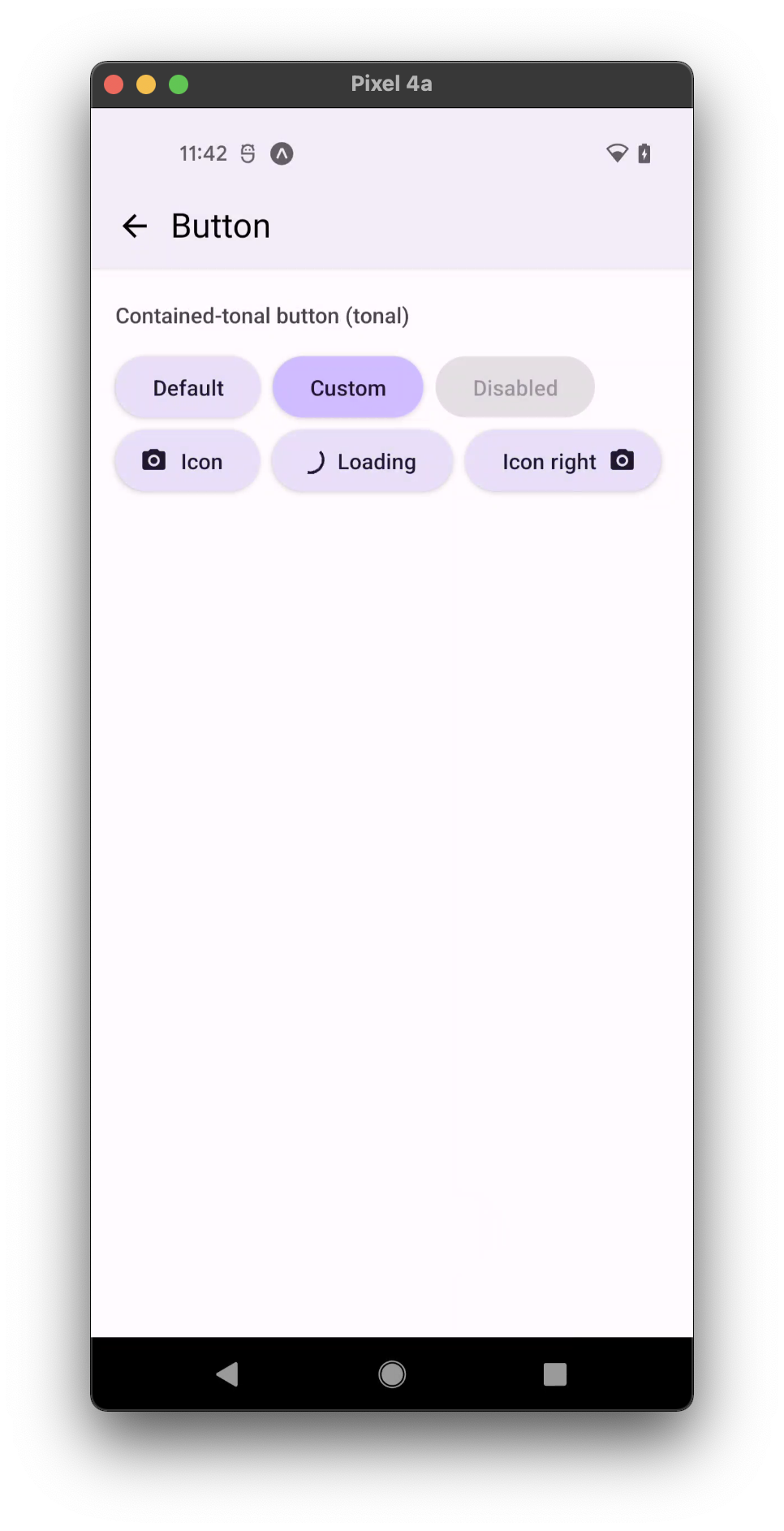
- contained-tonal
Usage
import * as React from 'react';
import { Button } from 'react-native-paper';

const MyComponent = () => (
  <Button icon="camera" mode="contained" onPress={() => console.log('Pressed')}>
    Press me
  </Button>
);

export default MyComponent;
Props
mode
Type: 'text' | 'outlined' | 'contained' | 'elevated' | 'contained-tonal'
Default value: 'text'
Mode of the button. You can change the mode to adjust the styling to give it desired emphasis.
text- flat button without background or outline, used for the lowest priority actions, especially when presenting multiple options.outlined- button with an outline without background, typically used for important, but not primary action – represents medium emphasis.contained- button with a background color, used for important action, have the most visual impact and high emphasis.elevated- button with a background color and elevation, used when absolutely necessary e.g. button requires visual separation from a patterned background. Available in v5.x with theme version 3contained-tonal- button with a secondary background color, an alternative middle ground between contained and outlined buttons. Available in v5.x with theme version 3
dark
Type: boolean
Whether the color is a dark color. A dark button will render light text and vice-versa. Only applicable for:
containedmode for theme version 2contained,contained-tonalandelevatedmodes for theme version 3.
compact
Type: boolean
Use a compact look, useful for text buttons in a row.
color Deprecated in v5.x - use buttonColor or textColor instead.
Type: string
Custom text color for flat button, or background color for contained button.
buttonColor
Type: string
Custom button's background color.
textColor
Type: string
Custom button's text color.
rippleColor
Type: ColorValue
Color of the ripple effect.
loading
Type: boolean
Whether to show a loading indicator.
icon
Type: IconSource
Icon to display for the Button.
disabled
Type: boolean
Whether the button is disabled. A disabled button is greyed out and onPress is not called on touch.
children (required)
Type: React.ReactNode
Label text of the button.
uppercase
Type: boolean
Make the label text uppercased. Note that this won't work if you pass React elements as children.
background
Type: PressableAndroidRippleConfig
Type of background drawabale to display the feedback (Android). https://reactnative.dev/docs/pressable#rippleconfig
accessibilityLabel
Type: string
Accessibility label for the button. This is read by the screen reader when the user taps the button.
accessibilityHint
Type: string
Accessibility hint for the button. This is read by the screen reader when the user taps the button.
accessibilityRole
Type: AccessibilityRole
Default value: 'button'
Accessibility role for the button. The "button" role is set by default.
onPress
Type: (e: GestureResponderEvent) => void
Function to execute on press.
onPressIn
Type: (e: GestureResponderEvent) => void
Function to execute as soon as the touchable element is pressed and invoked even before onPress.
onPressOut
Type: (e: GestureResponderEvent) => void
Function to execute as soon as the touch is released even before onPress.
onLongPress
Type: (e: GestureResponderEvent) => void
Function to execute on long press.
delayLongPress
Type: number
The number of milliseconds a user must touch the element before executing onLongPress.
contentStyle
Type: StyleProp<ViewStyle>
Style of button's inner content.
Use this prop to apply custom height and width and to set the icon on the right with flexDirection: 'row-reverse'.
maxFontSizeMultiplier
Type: number
Specifies the largest possible scale a text font can reach.
style
Type: Animated.WithAnimatedValue<StyleProp<ViewStyle>>
labelStyle
Type: StyleProp<TextStyle>
Style for the button text.
theme
Type: ThemeProp
testID
Type: string
Default value: 'button'
testID to be used on tests.
Theme colors
- active
- disabled
| mode | backgroundColor | textColor | borderColor |
|---|---|---|---|
| elevated | theme.colors.elevation.level1 | theme.colors.primary | |
| contained | theme.colors.primary | theme.colors.onPrimary | |
| contained-tonal | theme.colors.secondaryContainer | theme.colors.onSecondaryContainer | |
| outlined | theme.colors.primary | theme.colors.outline | |
| text | theme.colors.primary |
| mode | backgroundColor | textColor | borderColor |
|---|---|---|---|
| elevated | theme.colors.surfaceDisabled | theme.colors.onSurfaceDisabled | |
| contained | theme.colors.surfaceDisabled | theme.colors.onSurfaceDisabled | |
| contained-tonal | theme.colors.surfaceDisabled | theme.colors.onSurfaceDisabled | |
| outlined | theme.colors.onSurfaceDisabled | theme.colors.surfaceDisabled | |
| text | theme.colors.onSurfaceDisabled |
If a dedicated prop for a specific color is not available or the style prop does not allow color modification, you can customize it using the theme prop. It allows to override any color, within the component, based on the table above.
Example of overriding primary color:
<Button theme={{ colors: { primary: 'green' } }} />