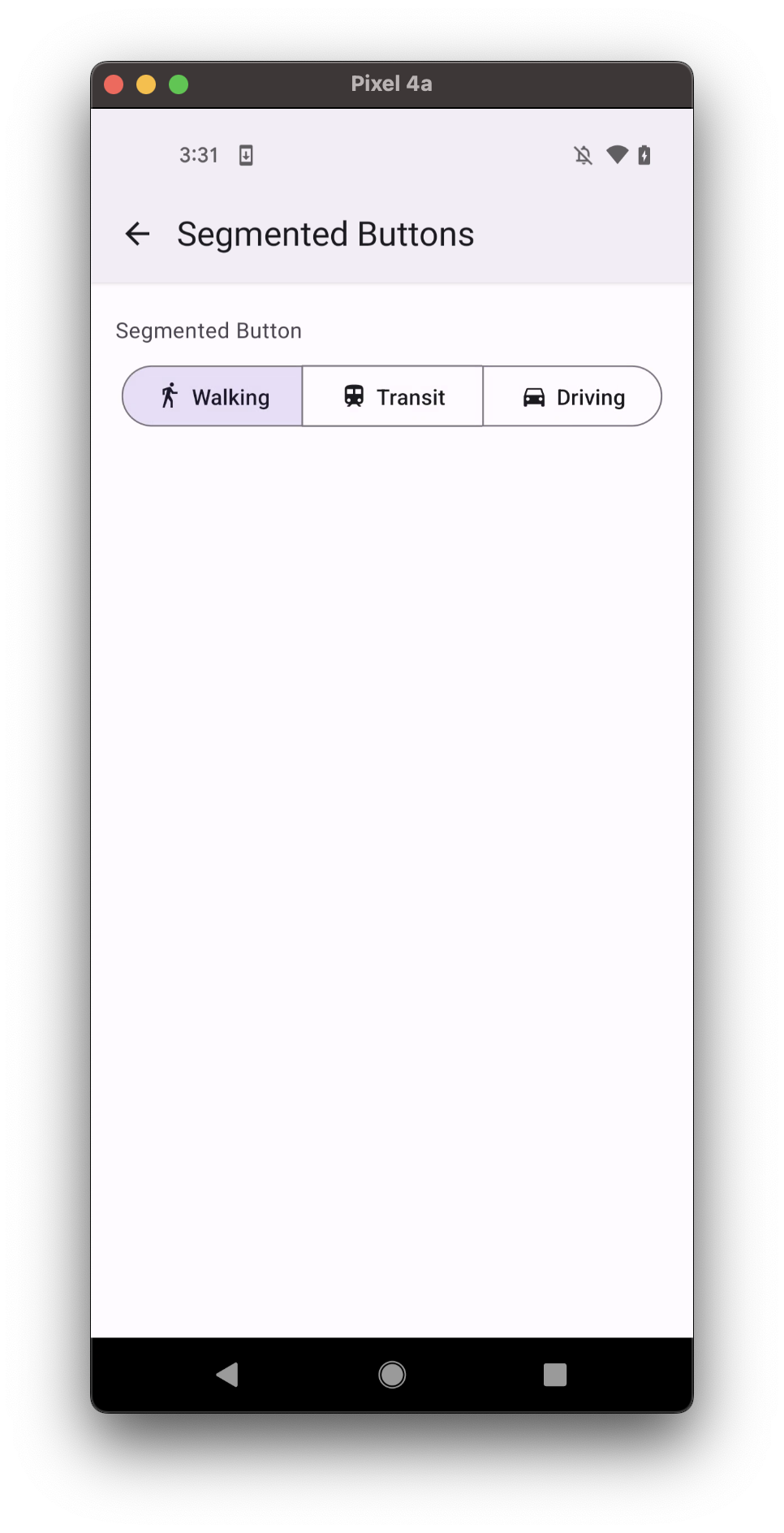
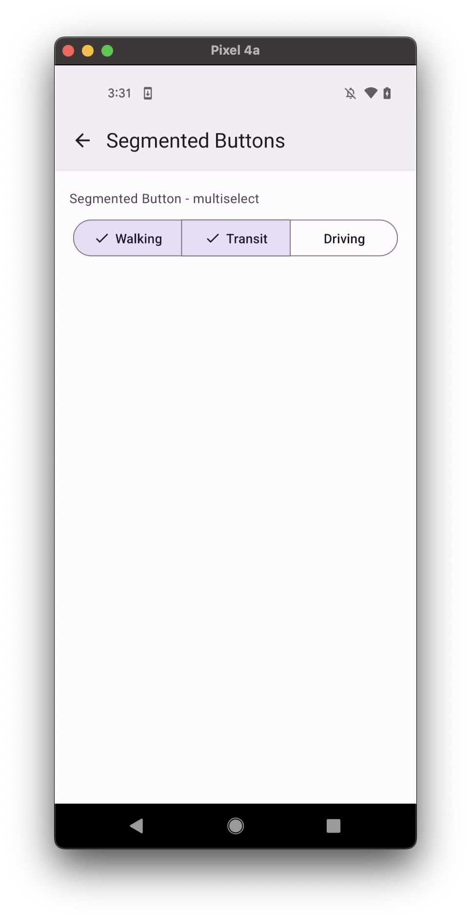
SegmentedButtons
Segmented buttons can be used to select options, switch views or sort elements.
- single select
- multiselect
Usage
import * as React from 'react';
import { SafeAreaView, StyleSheet } from 'react-native';
import { SegmentedButtons } from 'react-native-paper';

const MyComponent = () => {
  const [value, setValue] = React.useState('');

  return (
    <SafeAreaView style={styles.container}>
      <SegmentedButtons
        value={value}
        onValueChange={setValue}
        buttons={[
          {
            value: 'walk',
            label: 'Walking',
          },
          {
            value: 'train',
            label: 'Transit',
          },
          { value: 'drive', label: 'Driving' },
        ]}
      />
    </SafeAreaView>
  );
};

const styles = StyleSheet.create({
  container: {
    flex: 1,
    alignItems: 'center',
  },
});

export default MyComponent;
Props
buttons (required)
Type: {
value: T;
icon?: IconSource;
disabled?: boolean;
accessibilityLabel?: string;
checkedColor?: string;
uncheckedColor?: string;
onPress?: (event: GestureResponderEvent) => void;
label?: string;
showSelectedCheck?: boolean;
style?: StyleProp<ViewStyle>;
labelStyle?: StyleProp<TextStyle>;
testID?: string;
}[]
Buttons to display as options in toggle button. Button should contain the following properties:
value: value of button (required)icon: icon to display for the itemdisabled: whether the button is disabledaccessibilityLabel: acccessibility label for the button. This is read by the screen reader when the user taps the button.checkedColor: custom color for checked Text and IconuncheckedColor: custom color for unchecked Text and IcononPress: callback that is called when button is pressedlabel: label text of the buttonshowSelectedCheck: show optional check icon to indicate selected statestyle: pass additional styles for the buttontestID: testID to be used on tests
density
Type: 'regular' | 'small' | 'medium' | 'high'
Density is applied to the height, to allow usage in denser UIs
style
Type: StyleProp<ViewStyle>
theme
Type: ThemeProp
Theme colors
- checked
- unchecked
- disabled
| mode | backgroundColor | textColor | borderColor |
|---|---|---|---|
| - | theme.colors.secondaryContainer | theme.colors.onSecondaryContainer | theme.colors.primary |
| mode | backgroundColor | textColor | borderColor |
|---|---|---|---|
| - | theme.colors.onSurface | theme.colors.outline |
| mode | backgroundColor | textColor | borderColor |
|---|---|---|---|
| - | theme.colors.onSurfaceDisabled | theme.colors.surfaceDisabled |
If a dedicated prop for a specific color is not available or the style prop does not allow color modification, you can customize it using the theme prop. It allows to override any color, within the component, based on the table above.
Example of overriding primary color:
<SegmentedButtons theme={{ colors: { primary: 'green' } }} />