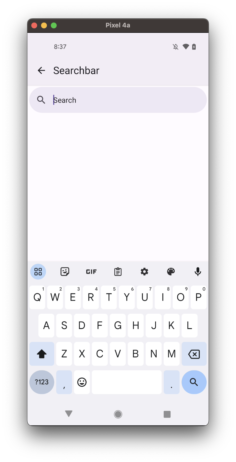
Searchbar
Searchbar is a simple input box where users can type search queries.
- bar
- view
Usage
import * as React from 'react';
import { Searchbar } from 'react-native-paper';

const MyComponent = () => {
  const [searchQuery, setSearchQuery] = React.useState('');

  return (
    <Searchbar
      placeholder="Search"
      onChangeText={setSearchQuery}
      value={searchQuery}
    />
  );
};

export default MyComponent;
Props
placeholder
Type: string
Hint text shown when the input is empty.
value (required)
Type: string
The value of the text input.
onChangeText
Type: (query: string) => void
Callback that is called when the text input's text changes.
mode Available in v5.x with theme version 3
Type: 'bar' | 'view'
Default value: 'bar'
Search layout mode, the default value is "bar".
icon
Type: IconSource
Icon name for the left icon button (see onIconPress).
iconColor
Type: string
Custom color for icon, default will be derived from theme
rippleColor
Type: ColorValue
Color of the ripple effect.
onIconPress
Type: (e: GestureResponderEvent) => void
Callback to execute if we want the left icon to act as button.
onClearIconPress
Type: (e: GestureResponderEvent) => void
Callback to execute if we want to add custom behaviour to close icon button.
searchAccessibilityLabel
Type: string
Default value: 'search'
Accessibility label for the button. This is read by the screen reader when the user taps the button.
clearIcon
Type: IconSource
Custom icon for clear button, default will be icon close. It's visible when loading is set to false.
In v5.x with theme version 3, clearIcon is visible only right prop is not defined.
clearAccessibilityLabel
Type: string
Default value: 'clear'
Accessibility label for the button. This is read by the screen reader when the user taps the button.
traileringIcon Available in v5.x with theme version 3
Type: IconSource
Icon name for the right trailering icon button.
Works only when mode is set to "bar". It won't be displayed if loading is set to true.
traileringIconColor Available in v5.x with theme version 3
Type: string
Custom color for the right trailering icon, default will be derived from theme
traileringRippleColor Available in v5.x with theme version 3
Type: ColorValue
Color of the trailering icon ripple effect.
onTraileringIconPress Available in v5.x with theme version 3
Type: (e: GestureResponderEvent) => void
Callback to execute on the right trailering icon button press.
traileringIconAccessibilityLabel
Type: string
Accessibility label for the right trailering icon button. This is read by the screen reader when the user taps the button.
right Available in v5.x with theme version 3
Type: (props: {
color: string;
style: Style;
testID: string;
}) => React.ReactNode
Callback which returns a React element to display on the right side.
Works only when mode is set to "bar".
showDivider Available in v5.x with theme version 3
Type: boolean
Default value: true
Whether to show Divider at the bottom of the search.
Works only when mode is set to "view". True by default.
elevation Available in v5.x with theme version 3
Type: 0 | 1 | 2 | 3 | 4 | 5 | Animated.Value
Default value: 0
Changes Searchbar shadow and background on iOS and Android.
inputStyle
Type: StyleProp<TextStyle>
Set style of the TextInput component inside the searchbar
style
Type: Animated.WithAnimatedValue<StyleProp<ViewStyle>>
loading
Type: Boolean
Default value: false
Custom flag for replacing clear button with activity indicator.
testID
Type: string
Default value: 'search-bar'
TestID used for testing purposes
theme
Type: ThemeProp
Theme colors
| mode | backgroundColor | placeholderTextColor | textColor | selectionColor | iconColor | trailingIconColor | dividerColor |
|---|---|---|---|---|---|---|---|
| - | theme.colors.elevation.level3 | theme.colors.onSurface | theme.colors.onSurfaceVariant | theme.colors.primary | theme.colors.onSurfaceVariant | theme.colors.onSurfaceVariant | theme.colors.outline |
If a dedicated prop for a specific color is not available or the style prop does not allow color modification, you can customize it using the theme prop. It allows to override any color, within the component, based on the table above.
Example of overriding primary color:
<Searchbar theme={{ colors: { primary: 'green' } }} />