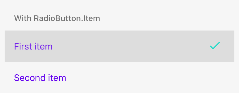
RadioButton.Item
RadioButton.Item allows you to press the whole row (item) instead of only the RadioButton.
Usage
import * as React from 'react';
import { RadioButton } from 'react-native-paper';

const MyComponent = () => {
  const [value, setValue] = React.useState('first');

  return (
    <RadioButton.Group onValueChange={value => setValue(value)} value={value}>
      <RadioButton.Item label="First item" value="first" />
      <RadioButton.Item label="Second item" value="second" />
    </RadioButton.Group>
  );
};

export default MyComponent;
Props
value (required)
Type: string
Value of the radio button.
label (required)
Type: string
Label to be displayed on the item.
disabled
Type: boolean
Whether radio is disabled.
background
Type: PressableAndroidRippleConfig
Type of background drawabale to display the feedback (Android). https://reactnative.dev/docs/pressable#rippleconfig
onPress
Type: (e: GestureResponderEvent) => void
Function to execute on press.
onLongPress
Type: (e: GestureResponderEvent) => void
Function to execute on long press.
accessibilityLabel
Type: string
Default value: label
Accessibility label for the touchable. This is read by the screen reader when the user taps the touchable.
uncheckedColor
Type: string
Custom color for unchecked radio.
color
Type: string
Custom color for radio.
rippleColor
Type: ColorValue
Color of the ripple effect.
status
Type: 'checked' | 'unchecked'
Status of radio button.
style
Type: StyleProp<ViewStyle>
Additional styles for container View.
labelStyle
Type: StyleProp<TextStyle>
Style that is passed to Label element.
labelVariant Available in v5.x with theme version 3
Type: unknown
Default value: 'bodyLarge'
Label text variant defines appropriate text styles for type role and its size. Available variants:
Display: displayLarge, displayMedium, displaySmall
Headline: headlineLarge, headlineMedium, headlineSmall
Title: titleLarge, titleMedium, titleSmall
Label: labelLarge, labelMedium, labelSmall
Body: bodyLarge, bodyMedium, bodySmall
labelMaxFontSizeMultiplier
Type: number
Specifies the largest possible scale a label font can reach.
theme
Type: ThemeProp
testID
Type: string
testID to be used on tests.
mode
Type: 'android' | 'ios'
Whether <RadioButton.Android /> or <RadioButton.IOS /> should be used.
Left undefined <RadioButton /> will be used.
position
Type: 'leading' | 'trailing'
Default value: 'trailing'
Radio button control position.
hitSlop
Type: TouchableRippleProps['hitSlop']
Sets additional distance outside of element in which a press can be detected.