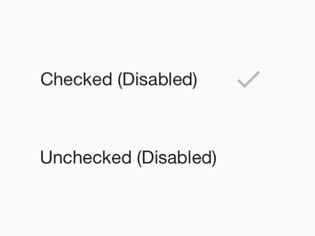
RadioButton.IOS
- enabled
- disabled
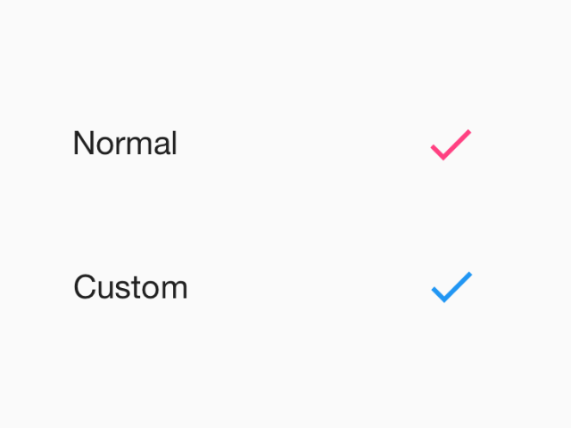
Radio buttons allow the selection a single option from a set. This component follows platform guidelines for iOS, but can be used on any platform.
Props
TouchableRipple props
Extends:
...TouchableRipple propsvalue (required)
Type: string
Value of the radio button
status
Type: 'checked' | 'unchecked'
Status of radio button.
disabled
Type: boolean
Whether radio is disabled.
onPress
Type: (e: GestureResponderEvent) => void
Function to execute on press.
color
Type: string
Custom color for radio.
theme
Type: ThemeProp
testID
Type: string
testID to be used on tests.