Drawer.CollapsedItem
Note: Available in v5.x with theme version 3
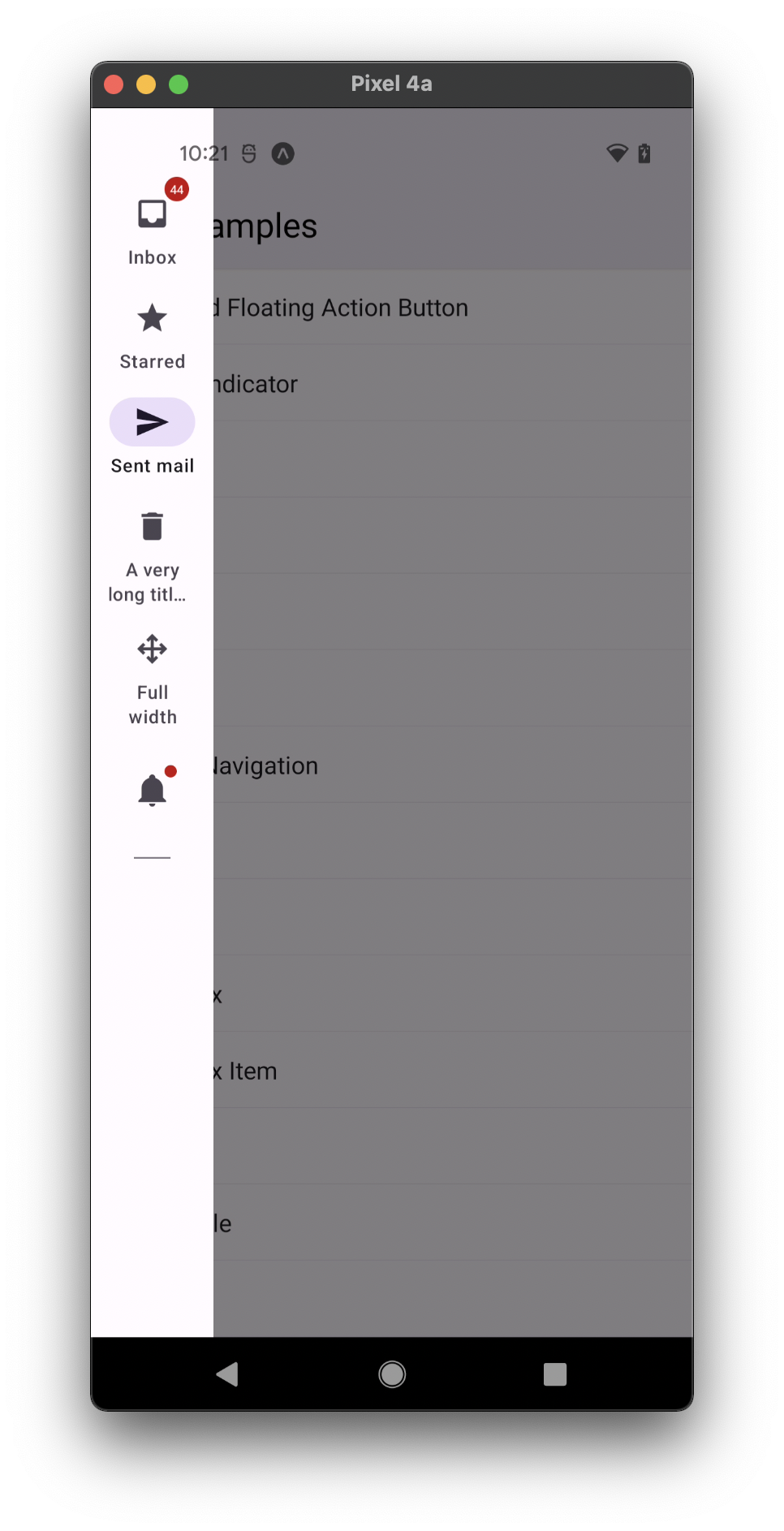
Collapsed component used to show an action item with an icon and optionally label in a navigation drawer.
Usage
import * as React from 'react';
import { Drawer } from 'react-native-paper';

const MyComponent = () => (
   <Drawer.CollapsedItem
     focusedIcon="inbox"
     unfocusedIcon="inbox-outline"
     label="Inbox"
   />
);

export default MyComponent;
Props
label
Type: string
The label text of the item.
badge
Type: string | number | boolean
Default value: false
Badge to show on the icon, can be true to show a dot, string or number to show text.
disabled
Type: boolean
Whether the item is disabled.
focusedIcon Renamed from 'icon' to 'focusedIcon' in v5.x
Type: IconSource
Icon to use as the focused destination icon, can be a string, an image source or a react component
unfocusedIcon Renamed from 'icon' to 'focusedIcon' in v5.x
Type: IconSource
Icon to use as the unfocused destination icon, can be a string, an image source or a react component
active
Type: boolean
Whether to highlight the drawer item as active.
onPress
Type: (e: GestureResponderEvent) => void
Function to execute on press.
labelMaxFontSizeMultiplier
Type: number
Specifies the largest possible scale a label font can reach.
accessibilityLabel
Type: string
Accessibility label for the button. This is read by the screen reader when the user taps the button.
style
Type: StyleProp<ViewStyle>
theme
Type: ThemeProp
testID
Type: string
Default value: 'drawer-collapsed-item'
TestID used for testing purposes
Theme colors
| mode | backgroundColor | textColor | iconColor |
|---|---|---|---|
| active | theme.colors.secondaryContainer | theme.colors.onSurface | theme.colors.onSecondaryContainer |
| inactive | theme.colors.onSurfaceVariant | theme.colors.onSurfaceVariant |
If a dedicated prop for a specific color is not available or the style prop does not allow color modification, you can customize it using the theme prop. It allows to override any color, within the component, based on the table above.
Example of overriding primary color:
<Drawer.CollapsedItem theme={{ colors: { primary: 'green' } }} />