Drawer.Section
A component to group content inside a navigation drawer.
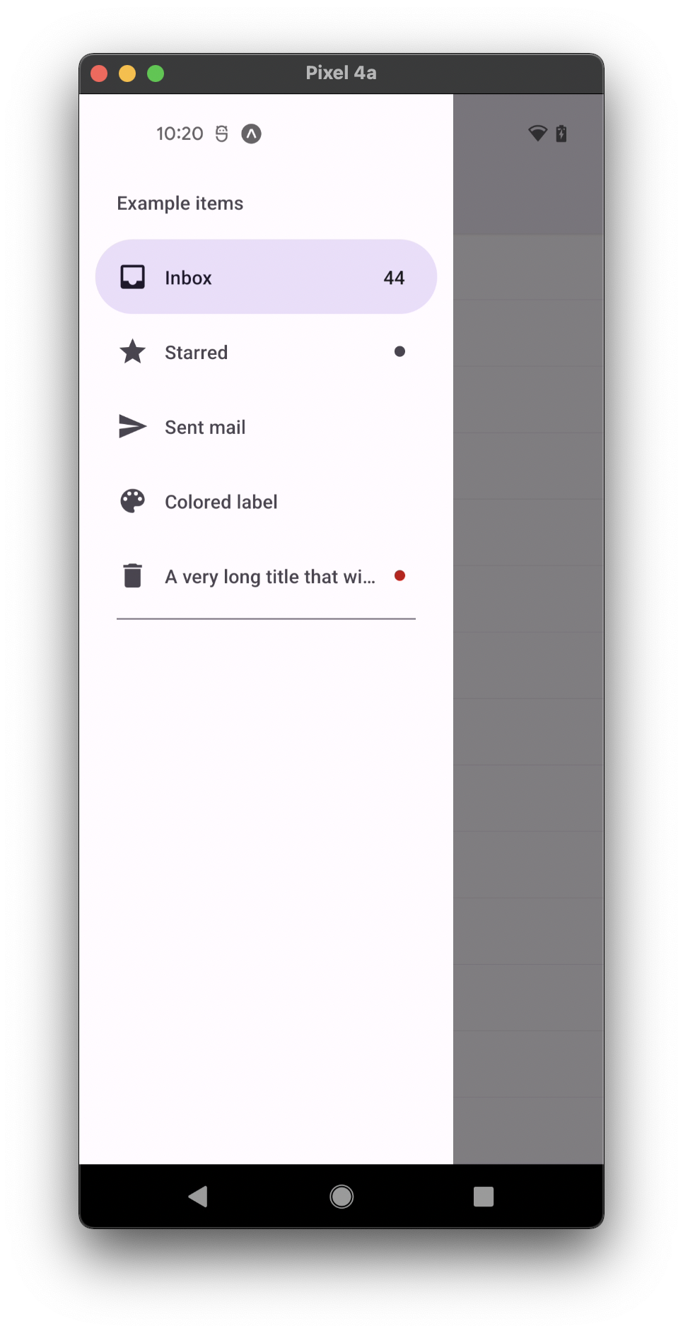
Usage
import * as React from 'react';
import { Drawer } from 'react-native-paper';

const MyComponent = () => {
  const [active, setActive] = React.useState('');

  return (
    <Drawer.Section title="Some title">
      <Drawer.Item
        label="First Item"
        active={active === 'first'}
        onPress={() => setActive('first')}
      />
      <Drawer.Item
        label="Second Item"
        active={active === 'second'}
        onPress={() => setActive('second')}
      />
    </Drawer.Section>
  );
};

export default MyComponent;
Props
title
Type: string
Title to show as the header for the section.
children (required)
Type: React.ReactNode
Content of the Drawer.Section.
showDivider
Type: boolean
Default value: true
Whether to show Divider at the end of the section. True by default.
titleMaxFontSizeMultiplier
Type: number
Specifies the largest possible scale a title font can reach.
style
Type: StyleProp<ViewStyle>
theme
Type: ThemeProp
Theme colors
info
The table below outlines the theme colors, specifically for MD3 (theme version 3) at the moment.
| mode | titleColor |
|---|---|
| - | theme.colors.onSurfaceVariant |
tip
If a dedicated prop for a specific color is not available or the style prop does not allow color modification, you can customize it using the theme prop. It allows to override any color, within the component, based on the table above.
Example of overriding primary color:
<Drawer.Section theme={{ colors: { primary: 'green' } }} />