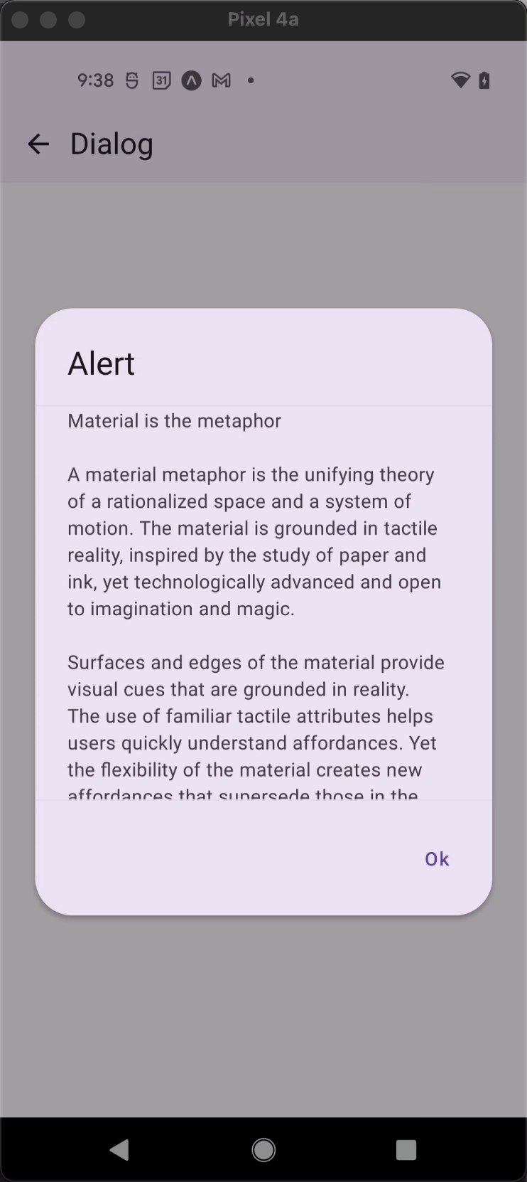
Dialog.ScrollArea
A component to show a scrollable content in a Dialog. The component only provides appropriate styling.
For the scrollable content you can use ScrollView, FlatList etc. depending on your requirement.
Usage
import * as React from 'react';
import { ScrollView } from 'react-native';
import { Dialog, Portal, Text } from 'react-native-paper';

const MyComponent = () => {
  const [visible, setVisible] = React.useState(false);

  const hideDialog = () => setVisible(false);

  return (
    <Portal>
      <Dialog visible={visible} onDismiss={hideDialog}>
        <Dialog.ScrollArea>
          <ScrollView contentContainerStyle={{paddingHorizontal: 24}}>
            <Text>This is a scrollable area</Text>
          </ScrollView>
        </Dialog.ScrollArea>
      </Dialog>
    </Portal>
  );
};

export default MyComponent;
Props
children (required)
Type: React.ReactNode
Content of the DialogScrollArea.
style
Type: StyleProp<ViewStyle>
theme
Type: ThemeProp
Theme colors
info
The table below outlines the theme colors, specifically for MD3 (theme version 3) at the moment.
| mode | borderColor |
|---|---|
| - | theme.colors.surfaceVariant |
tip
If a dedicated prop for a specific color is not available or the style prop does not allow color modification, you can customize it using the theme prop. It allows to override any color, within the component, based on the table above.
Example of overriding primary color:
<Dialog.ScrollArea theme={{ colors: { primary: 'green' } }} />