Appbar.Action
A component used to display an action item in the appbar.
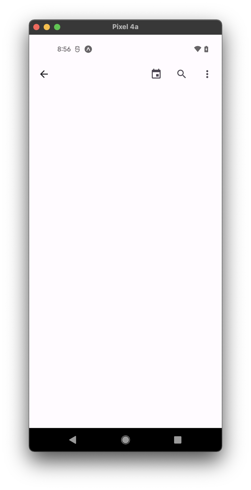
Usage
import * as React from 'react';
import { Appbar } from 'react-native-paper';
import { Platform } from 'react-native';

const MORE_ICON = Platform.OS === 'ios' ? 'dots-horizontal' : 'dots-vertical';

const MyComponent = () => (
    <Appbar.Header>
       <Appbar.Content title="Title" subtitle={'Subtitle'} />
        <Appbar.Action icon="magnify" onPress={() => {}} />
        <Appbar.Action icon={MORE_ICON} onPress={() => {}} />
    </Appbar.Header>
);

export default MyComponent;
Props
color
Type: string
Custom color for action icon.
rippleColor
Type: ColorValue
Color of the ripple effect.
icon (required)
Type: IconSource
Name of the icon to show.
size
Type: number
Default value: 24
Optional icon size.
disabled
Type: boolean
Whether the button is disabled. A disabled button is greyed out and onPress is not called on touch.
accessibilityLabel
Type: string
Accessibility label for the button. This is read by the screen reader when the user taps the button.
onPress
Type: () => void
Function to execute on press.
isLeading Available in v5.x with theme version 3
Type: boolean
Whether it's the leading button. Note: If Appbar.BackAction is present, it will be rendered before any isLeading icons.
style
Type: Animated.WithAnimatedValue<StyleProp<ViewStyle>>
ref
Type: React.RefObject<View>
theme
Type: ThemeProp
Theme colors
| mode | iconColor |
|---|---|
| leading icon | theme.colors.onSurface |
| not leading icon | theme.colors.onSurfaceVariant |
If a dedicated prop for a specific color is not available or the style prop does not allow color modification, you can customize it using the theme prop. It allows to override any color, within the component, based on the table above.
Example of overriding primary color:
<Appbar.Action theme={{ colors: { primary: 'green' } }} />