Button

A button is component that the user can press to trigger an action.

Usage

import * as React from 'react';
import { Button } from 'react-native-paper';

const MyComponent = () => (
  <Button raised onPress={() => console.log('Pressed')}>
    Press me
  </Button>
);

Props

disabled
Type: boolean

Whether the button is disabled. A disabled button is greyed out and onPress is not called on touch.
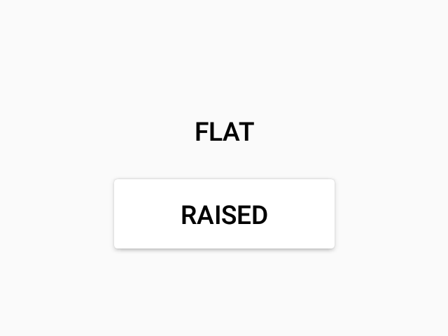
compact
Type: boolean

Use a compact look, useful for flat buttons in a row.

raised
Type: boolean

Add elevation to button, as opposed to default flat appearance. Typically used on a flat surface.

primary
Type: boolean

Use to primary color from theme. Typically used to emphasize an action.

dark
Type: boolean

Text color of button, a dark button will render light text and vice-versa.

loading
Type: boolean

Whether to show a loading indicator.

icon
Type: IconSource

Icon to display for the Button.

color
Type: string

Custom text color for flat button, or background color for raised button.

children (required)
Type: string | Array<string>

Label text of the button.

onPress
Type: () => mixed

Function to execute on press.

style
Type: any
theme
Type: Theme