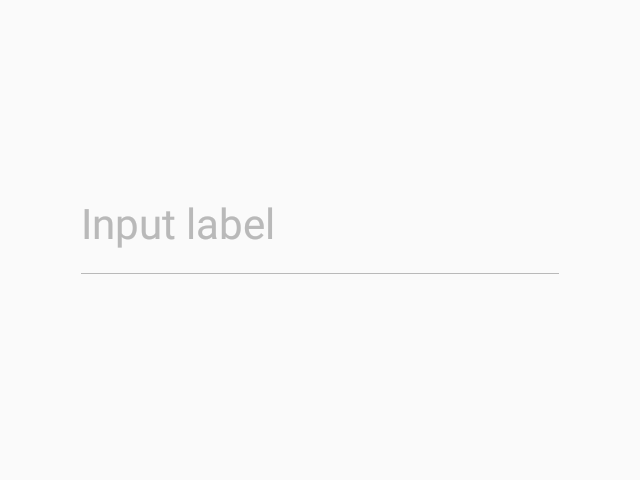
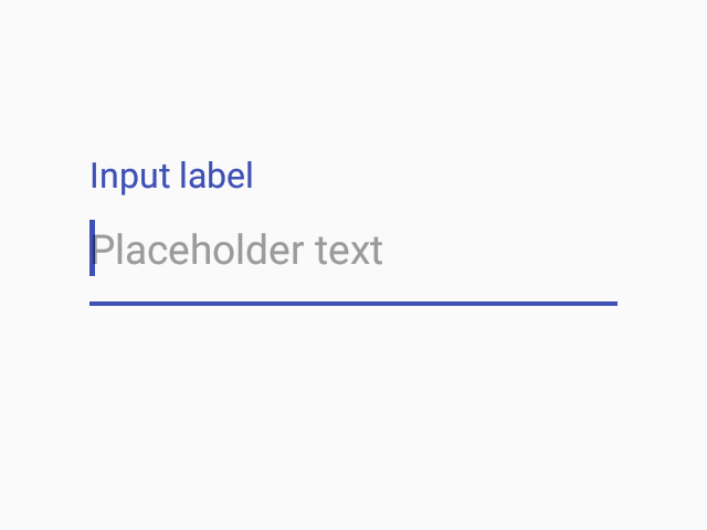
TextInput
TextInputs allow users to input text.
Usage
import * as React from 'react';
import { TextInput } from 'react-native-paper';

class MyComponent extends React.Component {
  state = {
    text: ''
  };

  render(){
    return (
      <TextInput
        label='Email'
        value={this.state.text}
        onChangeText={text => this.setState({ text })}
      />
    );
  }
}
Props
disabledType:
booleanDefault value:
falseIf true, user won't be able to interact with the component.
onChangeTextType:
FunctionCallback that is called when the text input's text changes. Changed text is passed as an argument to the callback handler.
selectionColorType:
stringColor for the text selection background. Defaults to the theme's primary color.
styleType:
any...TextInput propsMethods
isFocusedReturns true if the input is currently focused, false otherwise.
clearRemoves all text from the TextInput.
focusFocuses the input.
blurRemoves focus from the input.