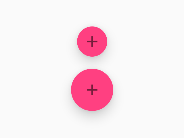
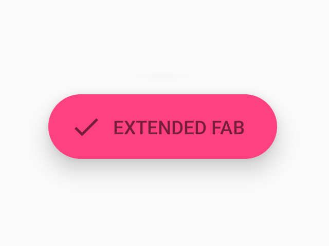
FAB
A floating action button represents the primary action in an application.
Usage
import * as React from 'react';
import { FAB } from 'react-native-paper';

const MyComponent = () => (
  <FAB
    small
    icon="add"
    onPress={() => {}}
  />
);
Props
smallType:
booleanWhether FAB is mini-sized, used to create visual continuity with other elements. This has no effect if label is specified.
styleType:
any