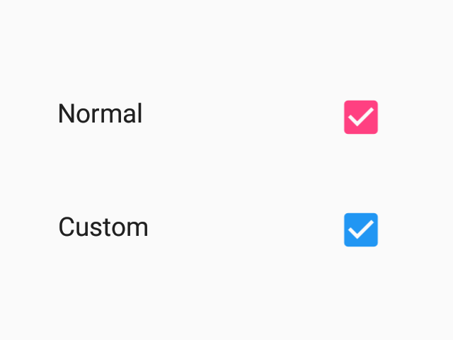
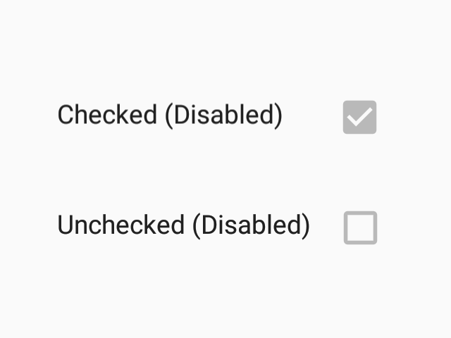
Checkbox

Checkboxes allow the selection of multiple options from a set.

Android (enabled)
Android (disabled)
iOS (enabled)
iOS (disabled)

Usage

import * as React from 'react';
import { Checkbox } from 'react-native-paper';

export default class MyComponent extends React.Component {
  state = {
    checked: false,
  };

  render() {
    const { checked } = this.state;
    return (
      <Checkbox
        checked={checked}
        onPress={() => { this.setState({ checked: !checked }); }}
      />
    );
  }
}

Props

checked (required)
Type: boolean

Whether checkbox is checked.

disabled
Type: boolean

Whether checkbox is disabled.

onPress
Type: () => mixed

Function to execute on press.

uncheckedColor
Type: string

Custom color for unchecked checkbox.

color
Type: string

Custom color for checkbox.

theme
Type: Theme