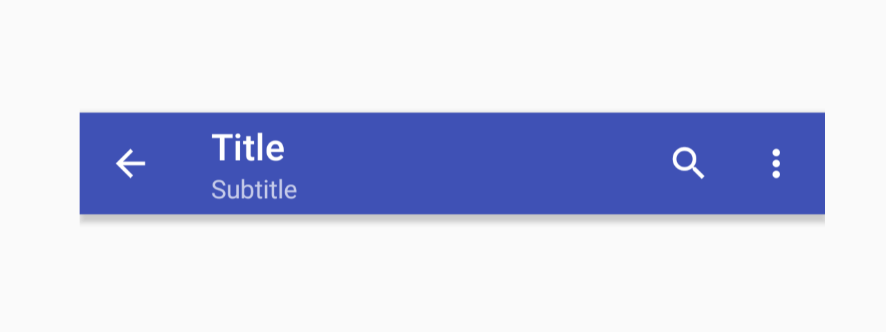
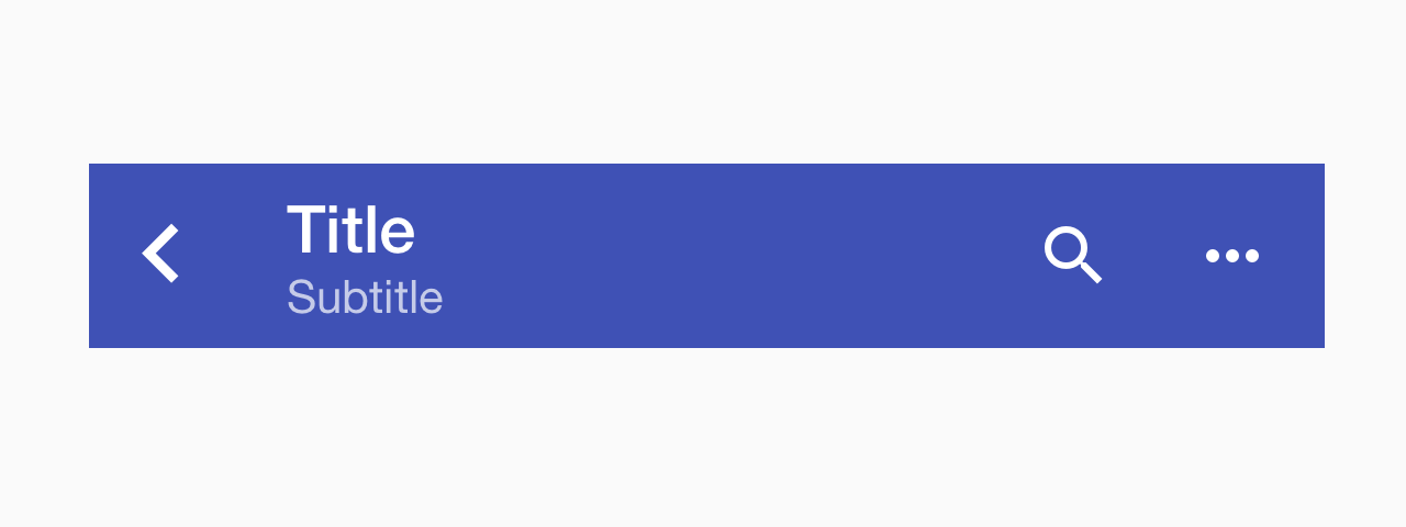
Toolbar
Toolbar is usually used as a header placed at the top of the screen. It can contain the screen title, controls such as navigation buttons, menu button etc.
Usage
import * as React from 'react';
import { Toolbar, ToolbarBackAction, ToolbarContent, ToolbarAction } from 'react-native-paper';

export default class MyComponent extends React.Component {
  render() {
    return (
      <Toolbar>
        <ToolbarBackAction
          onPress={this._goBack}
        />
        <ToolbarContent
          title="Title"
          subtitle="Subtitle"
        />
        <ToolbarAction icon="search" onPress={this._onSearch} />
        <ToolbarAction icon="more-vert" onPress={this._onMore} />
      </Toolbar>
    );
  }
}
Props
darkType:
booleanTheme color for the toolbar, a dark toolbar will render light text and vice-versa Child elements can override this prop independently.
statusBarHeightType:
numberDefault value:
Platform.select({
  android: DEFAULT_STATUSBAR_HEIGHT_EXPO,
  ios:
    Platform.Version < 11
      ? DEFAULT_STATUSBAR_HEIGHT_EXPO === undefined
        ? StatusBar.currentHeight
        : DEFAULT_STATUSBAR_HEIGHT_EXPO
      : undefined,
})
Extra padding to add at the top of toolbar to account for translucent status bar.
This is automatically handled on iOS including iPhone X.
If you are using Android and use Expo, we assume translucent status bar and set a height for status bar automatically.
Pass 0 or a custom value to disable the default behaviour.
styleType:
any