FABGroup
FABGroup displays a stack of FABs with related actions in a speed dial.
Usage
import React from 'react';
import { FABGroup, StyleSheet } from 'react-native-paper';
export default class MyComponent extends React.Component {
state = {
open: false,
};
render() {
return (
<FABGroup
open={this.state.open}
icon={this.state.open ? 'today' : 'add'}
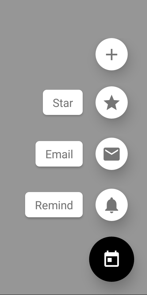
actions={[
{ icon: 'add', onPress: () => {} },
{ icon: 'star', label: 'Star', onPress: () => {} },
{ icon: 'email', label: 'Email', onPress: () => {} },
{ icon: 'notifications', label: 'Remind', onPress: () => {} },
]}
onStateChange={({ open }) => this.setState({ open })}
onPress={() => {
if (this.state.open) {
// do something if the speed dial is open
}
}}
/>
);
}
}
Props
actions (required)Type:
Array<{
  icon: string,
  label?: string,
  color?: string,
  onPress: () => mixed,
}>
Action items to display in the form of a speed dial. An action item should contain the following properties:
icon: icon to display (required)label: optional label textcolor: custom icon color of the action itemonPress: callback that is called whenFABis pressed (required)
icon (required)Type:
IconSourceIcon to display for the FAB.
You can toggle it based on whether the speed dial is open to display a different icon.
onStateChange (required)Type:
(state: { open: boolean }) => mixedCallback which is called on opening and closing the speed dial. The open state needs to be updated when it's called, otherwise the change is dropped.
styleType:
anyStyle for the group. You can use it to pass additional styles if you need. For example, you can set an additional margin if you have a tab bar at the bottom.