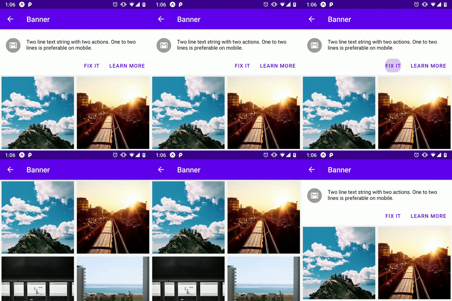
Banner
Banner displays a prominent message and related actions.

Usage
import * as React from 'react';
import { Image } from 'react-native';
import { Banner } from 'react-native-paper';

const MyComponent = () => {
  const [visible, setVisible] = React.useState(true);

  return (
    <Banner
      visible={visible}
      actions={[
        {
          label: 'Fix it',
          onPress: () => setVisible(false),
        },
        {
          label: 'Learn more',
          onPress: () => setVisible(false),
        },
      ]}
      icon={({size}) => (
        <Image
          source={{
            uri: 'https://avatars3.githubusercontent.com/u/17571969?s=400&v=4',
          }}
          style={{
            width: size,
            height: size,
          }}
        />
      )}>
      There was a problem processing a transaction on your credit card.
    </Banner>
  );
};

export default MyComponent;
Props
actions (required)Type:
Array<{
  label: string;
  onPress: () => void;
}>
Action items to shown in the banner. An action item should contain the following properties:
label: label of the action button (required)onPress: callback that is called when button is pressed (required)
To customize button you can pass other props that button component takes.
contentStyleType:
StyleProp<ViewStyle>Style of banner's inner content. Use this prop to apply custom width for wide layouts.
styleType:
StyleProp<ViewStyle>refType:
React.RefObject<View>themeType:
Theme