List.AccordionGroup
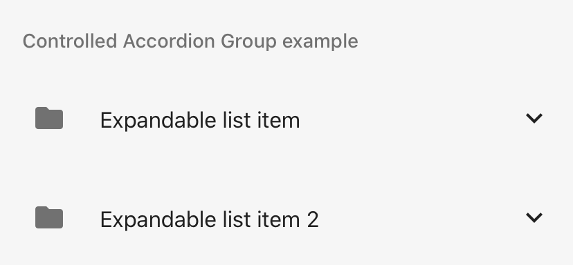
List.AccordionGroup allows to control a group of List Accordions. Id prop for List.Accordion is required in order to group to work. List.AccordionGroup can be controlled or uncontrolled component. Example shows uncontrolled version. At most one Accordion will be expanded in given time.
Usage
import * as React from 'react';
import { View, Text } from 'react-native';
import { List } from 'react-native-paper';

const MyComponent = () => (
  <List.AccordionGroup>
    <List.Accordion title="Accordion 1" id="1">
      <List.Item title="Item 1" />
    </List.Accordion>
    <List.Accordion title="Accordion 2" id="2">
      <List.Item title="Item 2" />
    </List.Accordion>
    <View>
      <Text>
        List.Accordion can be wrapped because implementation uses React.Context.
      </Text>
      <List.Accordion title="Accordion 3" id="3">
        <List.Item title="Item 3" />
      </List.Accordion>
    </View>
  </List.AccordionGroup>
);

export default MyComponent;