RadioButton.IOS
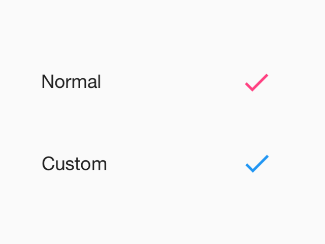
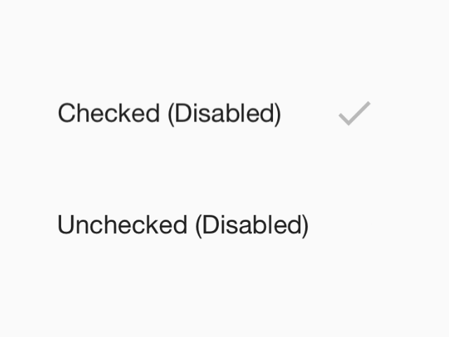
Radio buttons allow the selection a single option from a set. This component follows platform guidelines for iOS.
Props
themeType:
ThemeRadio buttons allow the selection a single option from a set. This component follows platform guidelines for iOS.
themeTheme