ProgressBar
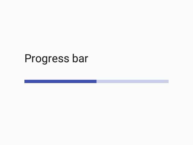
Progress bar is an indicator used to present progress of some activity in the app.

Usage
import * as React from 'react';
import { ProgressBar, Colors } from 'react-native-paper';

const MyComponent = () => (
  <ProgressBar progress={0.5} color={Colors.red800} />
);

export default MyComponent;
Props
colorType:
stringColor of the progress bar. The background color will be calculated based on this but you can change it by passing backgroundColor to style prop.
visibleType:
booleanDefault value:
trueWhether to show the ProgressBar (true, the default) or hide it (false).
styleType:
StyleProp<ViewStyle>themeType:
Theme