List.Accordion
A component used to display an expandable list item.
Usage
import * as React from 'react';
import { List } from 'react-native-paper';
const MyComponent = () => {
const [expanded, setExpanded] = React.useState(true);
const handlePress = () => setExpanded(!expanded);
return (
<List.Section title="Accordions">
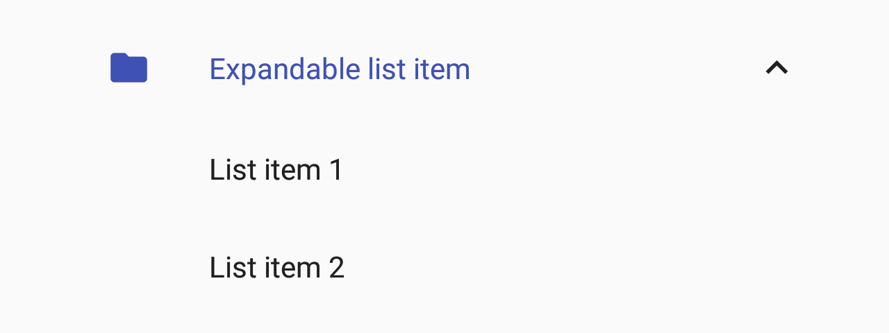
<List.Accordion
title="Uncontrolled Accordion"
left={props => <List.Icon {...props} icon="folder" />}>
<List.Item title="First item" />
<List.Item title="Second item" />
</List.Accordion>
<List.Accordion
title="Controlled Accordion"
left={props => <List.Icon {...props} icon="folder" />}
expanded={expanded}
onPress={handlePress}>
<List.Item title="First item" />
<List.Item title="Second item" />
</List.Accordion>
</List.Section>
);
};
export default MyComponent;Props
leftType:
(props: { color: string }) => React.ReactNodeCallback which returns a React element to display on the left side.
expandedType:
booleanWhether the accordion is expanded
If this prop is provided, the accordion will behave as a "controlled component".
You'll need to update this prop when you want to toggle the component or on onPress.
themeType:
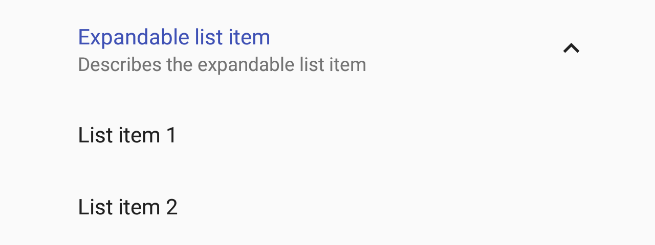
ThemetitleNumberOfLinesType:
numberDefault value:
1Truncate Title text such that the total number of lines does not exceed this number.
descriptionNumberOfLinesType:
numberDefault value:
2Truncate Description text such that the total number of lines does not exceed this number.
idType:
string | numberId is used for distinguishing specific accordion when using List.AccordionGroup. Property is required when using List.AccordionGroup and has no impact on behavior when using standalone List.Accordion.