Chip
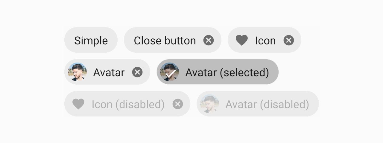
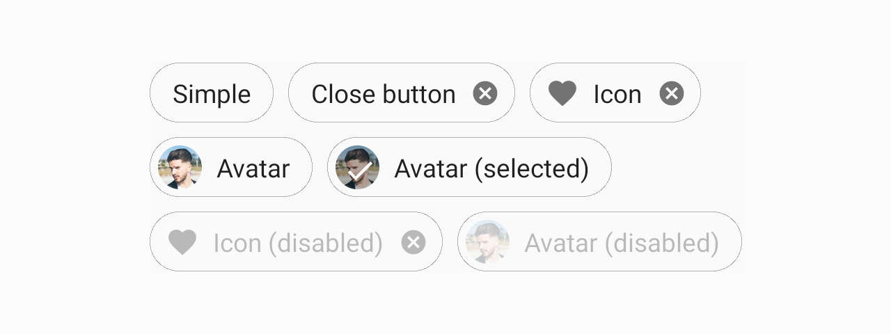
Chips can be used to display entities in small blocks.


Usage
import * as React from 'react';
import { Chip } from 'react-native-paper';

const MyComponent = () => (
  <Chip icon="information" onPress={() => console.log('Pressed')}>Example Chip</Chip>
);

export default MyComponent;
Props
modeType:
'flat' | 'outlined'Default value:
'flat'Mode of the chip.
flat- flat chip without outline.outlined- chip with an outline.
avatarType:
React.ReactNodeAvatar to display for the Chip. Both icon and avatar cannot be specified.
disabledType:
booleanDefault value:
falseWhether the chip is disabled. A disabled chip is greyed out and onPress is not called on touch.
accessibilityLabelType:
stringAccessibility label for the chip. This is read by the screen reader when the user taps the chip.
onCloseType:
() => voidFunction to execute on close button press. The close button appears only when this prop is specified.
styleType:
StyleProp<ViewStyle>themeType:
Theme