Checkbox
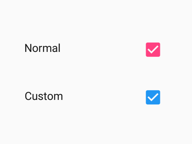
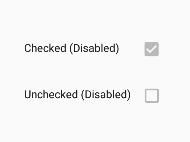
Checkboxes allow the selection of multiple options from a set.
Usage
import * as React from 'react';
import { Checkbox } from 'react-native-paper';

const MyComponent = () => {
  const [checked, setChecked] = React.useState(false);

  return (
    <Checkbox
      status={checked ? 'checked' : 'unchecked'}
      onPress={() => {
        setChecked(!checked);
      }}
    />
  );
};

export default MyComponent;
Props
themeType:
ThemeStatic properties
These properties can be accessed on Checkbox by using the dot notation, e.g. Checkbox.Item.
ItemType:
staticAndroidType:
staticIOSType:
static